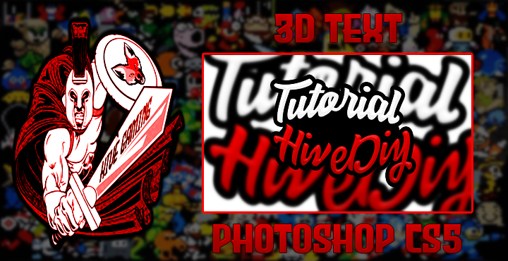
(ENG/ESP) Session #1: A Spartan Gamer in Photoshop | 3D Text (Basic Tutorial - Photoshop Cs5) | My first content in the "Hive DIY" Community

What's up colleagues!
It's a pleasure to be here sharing my first content in this community. For a long time I have been using the program "Photoshop Cs5" to elaborate the covers of my contents, I consider myself an amateur in this photoshop but even so I want to share with all of you a little of what I have learned over time.
I think this is the first time I go out of my comfort zone in terms of my contents, for those who don't know me I'm a content creator about videogames and most of the time I'm in the "HiveGaming Community". I hope I can leave my mark in this community and I take this opportunity to thank the good work team of "Hive DIY" for allowing me to bring this kind of content, at least I appreciate it very much, I know it will help me to vary a little the content of my blog, that's always good.
And good colleagues! Without further ado I will start my first content in "Hive DIY" ;) LET'S GET STARTED!!!
¡Qué tal colegas!
Es un placer estar aquí compartiendo mi primer contenido en esta comunidad. Desde hace tiempo vengo utilizando el programa "Photoshop Cs5" para elaborar las portadas de mis contenidos, me considero un amateur en esto del photoshop pero aun así quiero compartir con todos ustedes un poco de lo que he aprendido con el tiempo.
Creo que es la primera vez que salgo de mi zona de confort en cuanto a mis contenidos, para los que no me conocen soy creador de contenidos sobre videojuegos y la mayor parte del tiempo estoy en la "Comunidad HiveGaming". Espero poder dejar mi huella en esta comunidad y aprovecho para agradecer al buen equipo de trabajo de "Hive DIY" por permitirme traer este tipo de contenidos, al menos yo lo agradezco mucho, sé que me ayudará a variar un poco el contenido de mi blog, eso siempre es bueno.
¡Y bueno colegas! Sin más preámbulo voy a empezar mi primer contenido en "Hive DIY" ;) EMPECEMOS!!!
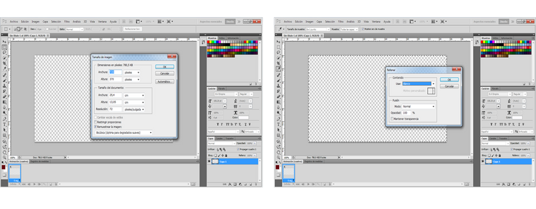
For this basic Tutorial the first thing I did was to create a workspace with dimensions of 720x370 Pixels, then I added a white background in order to start the elaboration of the Text.
Para este Tutorial basico lo primero que hice fue crear un espacio de trabajo con dimensiones de 720x370 Pixeles, luego añadí un fondo de color blanco para así poder dar inicio a la elaboración del Texto.
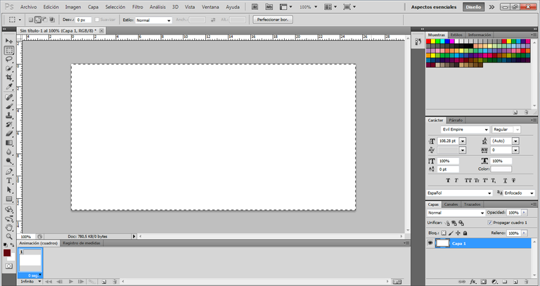
Once my workspace was ready, I selected the Text tool to start the tutorial. For the text I used the font named "Natasya", I liked this font very much for this tutorial, that's why I chose it.
Una vez listo mi espacio de trabajo me dispuse a seleccionar la herramienta de Texto para dar inicio al mismo. Para el texto use la fuente que tiene por nombre "Natasya", este tipo de letra me gusto bastante para este tutorial, por eso lo elegí.
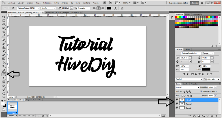
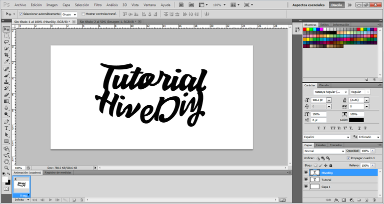
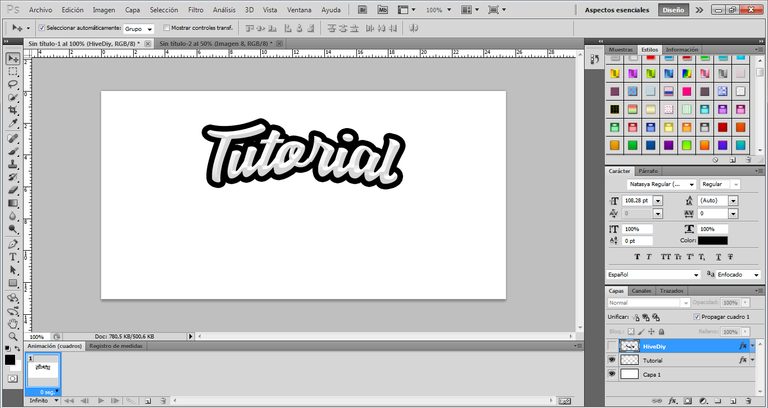
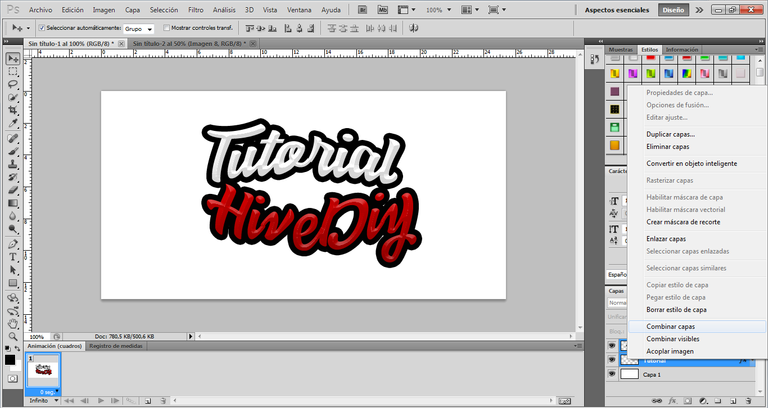
As this is my first content in the community I decided to use the name of the community and to be honest it hasn't looked bad from the beginning, I also liked the way it looked. I have used a different font size for both texts, as you can see the text is divided into two layers, I did this because I used different effects in each of the texts, you can see this below.
Como es mi primer contenido en la comunidad decidí usar el nombre de la misma y para ser honesto no se ha visto nada mal desde el principio, también me gusto mucho como se veía. He usado un tamaño de letra distinto para ambos textos, como podrán darse cuenta el texto esta dividido en dos capas, esto lo hice ya que use diferentes efectos en cada uno de los textos, esto lo podrán ir viendo a continuación.
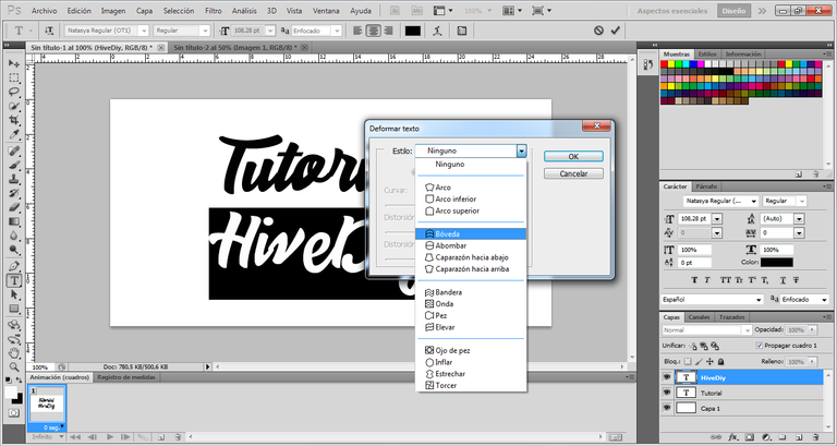
For the text with the name of the community, I started giving it a Vault effect, I did it this way because I wanted to find a way to unite both texts from their first and last letters, I also had to adjust a little the location of the text "Tutorial" so that it could be as I wanted, it has turned out well in the end at this point.
Para el texto con el nombre de la comunidad, empece dándole un efecto de Bóveda, lo hice así porque quise buscar una forma de lograr unir ambos textos desde sus primeras y últimas letras, también tuve que ajustar un poco la ubicación del texto "Tutorial" para que pudiera quedar como quería, me ha salido bien al final en este punto.
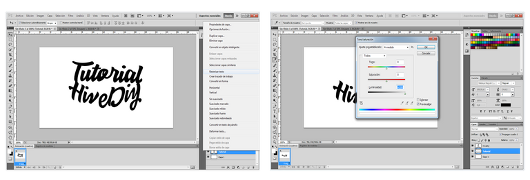
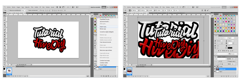
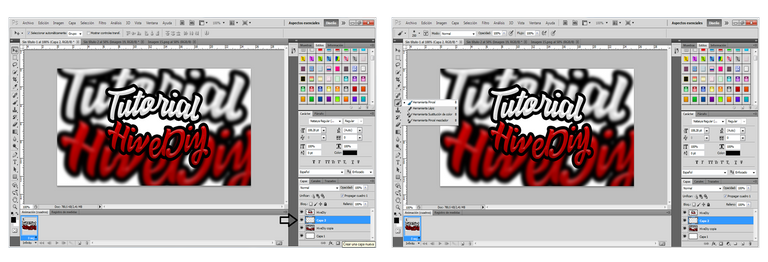
Now then! At this point is where the good stuff starts =) I have placed myself in the "Tutorial" text layer and I have resterized the text to convert it into an image, then I have created an adjustment layer where I select "Hue and Saturation", in this section I have set the brightness to "+100", then I have placed myself in "Blending Options", here I have used the "Bevel and Bump" option, in the same way I have also used the "Stroke" option, in this way I achieved the result that you can see in the final image of the text "Tutorial".
Ahora bien! En este punto es donde empieza lo bueno =) Me he ubicado en la capa del texto "Tutorial" y he resterizado el texto para convertirlo en una imagen, luego he creado una capa de ajustes donde seleccione "Tono y Saturación", en este apartado he puesto la luminosidad en "+100", para luego ubicarme en "Opciones de Fusión", aquí he usado la opción de "Bisel y Relieve", de la misma forma he usado también la opción de "Trazo", de esta forma logré el resultado que podrán ver en la imagen final del texto "Tutorial".
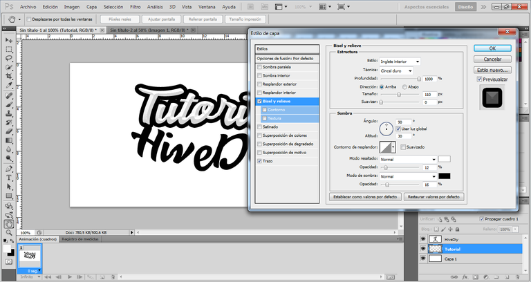
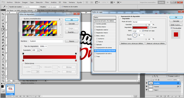
As you can see, the effect I gave to the text "Tutorial" is quite practical and very easy to do, everything is in playing with the options that gives us the "Bevel and Emboss" section. Now for the text of the community "Hive DIY" I have done exactly the same but also adding a red color to the letters. For this step I have used again the "Blending Options" and I have placed myself in the "Gradient Overlay" section to get the desired color.
Como han podido ver, el efecto que le di al texto "Tutorial" es bastante practico y muy fácil de realizar, todo esta en ir jugando con las opciones que nos da el apartado de "Bisel y Relieve". Ahora para el texto de la comunidad "Hive DIY" he hecho exactamente lo mismo pero agregándole también un color rojo a las letras. Para este paso he usado nuevamente las "Opciones de Fusión" y me he ubicado en el apartado de "Superposición de Degradado" para lograr obtener el color deseado.
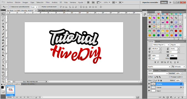
As I told you before I did exactly the same, I used the same effect for the "Bevel and Bump" section and I also applied a "Stroke" with the same size. That way I could get the result below.
Como ya se lo había comentado anteriormente hice exactamente lo mismo, use el mismo efecto para el apartado de "Bisel y Relieve" y he aplicado también un "Trazo" con el mismo tamaño. De esa forma pude obtener el resultado a continuación.
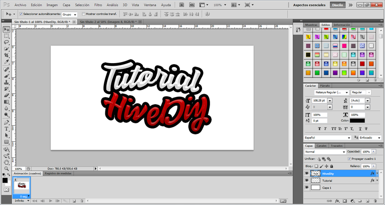
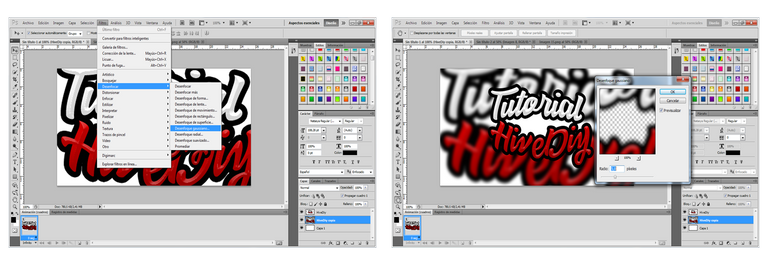
As you can see at this point the 3D Text style has already taken a quite striking shape. The texts as such are completely ready, so I set out to give some simple effects for the background, this with the intention of making the texts stand out even more.
For this I have combined both layers and converted them into one.
Como pueden apreciar en este punto ya el estilo de Texto en 3D ha tomado una forma bastane llamativa. Los textos como tal estan completamente listo, así que me dispuse a darle unos efectos bastante sencillos para el fondo, esto con la intención de que los textos resalten aun más.
Para esto he combinado ambas capas y la he convertido en una sola.
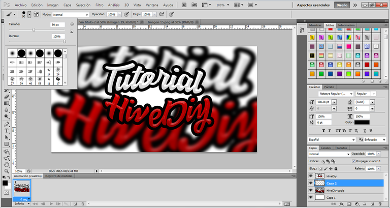
Then I duplicated the layer, the layer that I duplicated I put it below the main one and then I proceeded to make it bigger and then I applied a "Gaussian Blur" effect on it, in this way I achieved the following result
Luego he duplicado la capa, la capa que he duplicado la he puesto por debajo de la principal y seguidamente procedí a hacerla más grande para luego aplicar en ella un efecto de "Desenfoque Gaussiano", de esa forma logre conseguir el siguiente resultado
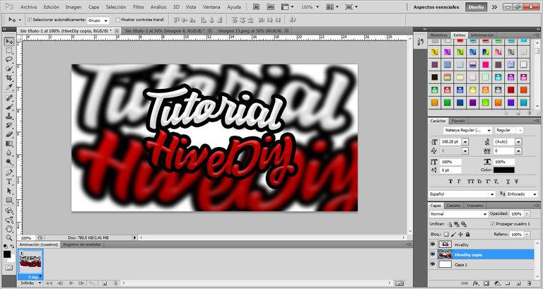
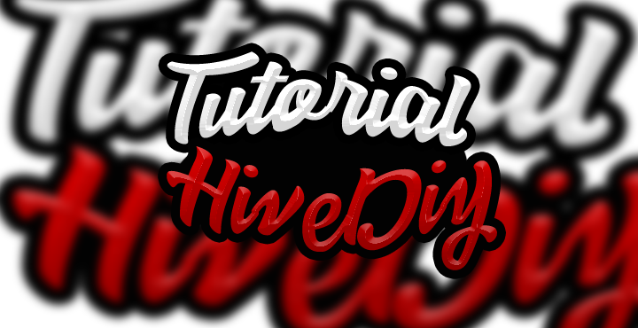
Up to this point it looks pretty good and striking, but personally I didn't like the white space that was left between the two text, so I proceeded to give it a black color to make more contrast and look even better.
For this I created a new layer and placed it between the 3D text layer and the gaussian effect layer
Hasta este punto se ve bastante bien y llamativo, pero en lo personal ese espacio en blanco que quedo entre ambos texto no me gusto mucho, así que procedí a darle un color negro para que hiciera más contraste y se viera aun mejor.
Para esto he creado una nueva capa y la he ubicado entre la capa de texto en 3D y la capa del efecto gaussiano
once this step was done I selected the brush tool and adjusted the parameters to a point that allowed me to fill the space to my liking.
una vez listo este paso seleccione la herramienta pincel y he ajustado los parámetros a un punto que me permitiera rellenar el espacio a mi gusto.
Once I finished this fill, I managed to finish my "3D Text" obtaining this Final result.
Una vez termine este relleno, conseguí terminar mi "Texto en 3D" obteniendo este resultado Final.
This is the end of this basic tutorial =) Quite simple and practical... I hope you liked it!
De esta manera doy por concluido este tutorial básico =) Bastante sencillo y practico... Espero que el mismo haya sido de su agrado!
The Spartan Gamer says goodbye!
El Espartano Gamer se despide!
 |  |  |
0
0
0.000
Genial aporte querido Leo, bienvenido a estar gran comunidad artesa, creativa y artística, están super padres esas letras y los efectos, sabes que son buenas portadas e instrumentos para miniaturas no solo en Hive sino que funcionan perfectamente para youtube.
Gracias por ese paso a paso bien explicado, excelente tutorial.
Muchas gracias por su comentario... Me alegra que le haya gustado mi diseño =) La verdad no lo veía de esa forma, pero es bueno saberlo de alguien que sabe de diseño y lo hace muy bien como usted. Espero que de alguna manera mis tutoriales puedan ayudar a muchos miembros de este gran ecosistema.
Your content has been voted as a part of Encouragement program. Keep up the good work!
Use Ecency daily to boost your growth on platform!
Support Ecency
Vote for new Proposal
Delegate HP and earn more