Creating a new Graphic Design and registering as NFT - Fuori di Seno
All Rights Reserved.
All the images contained in this post are taken and post processed by me. All the contents in this post are copyright-protected. All the uses of the contents - and their derivatives - are strictly prohibited without the explicit consent of the author.
All the contents you find here are only for informational purpose. Before being performed, all the actions described below must be preceded by a minimum knowledge of the topics covered. Any loss resulting from the actions described below will be borne by the person who performed them.
Furthermore, any references made are valid only at the PRESENT TIME: specifications, methods and resources may change over time. Always consult the official sites of the projects to stay updated on any changes.
A few weeks ago I discovered a community dedicated to DIY, the DIYHub community, on a similar thread to the one I already knew treated by Build-it. So I decided to take this opportunity to describe the steps in the creation of a recently completed graphic design.
Let's begin
To create my graphic design I started with 3 fundamental ideas:
1. an imaginative play on words that finds a semblance of meaning in the Italian language;
2. the creation of a NFT;
3. a contribution in the month of the fight against breast cancer.
By mixing these 3 elements, I created a very simple graphic, of which you saw the anticipation on the cover. To translate graphic design into an NFT, I decided to take advantage of a recently launched platform that I learned about, a new project that I would like to suggest you consult with due caution: NFTify.
But let's move on to graphic design: let's see it point by point.
Let's play
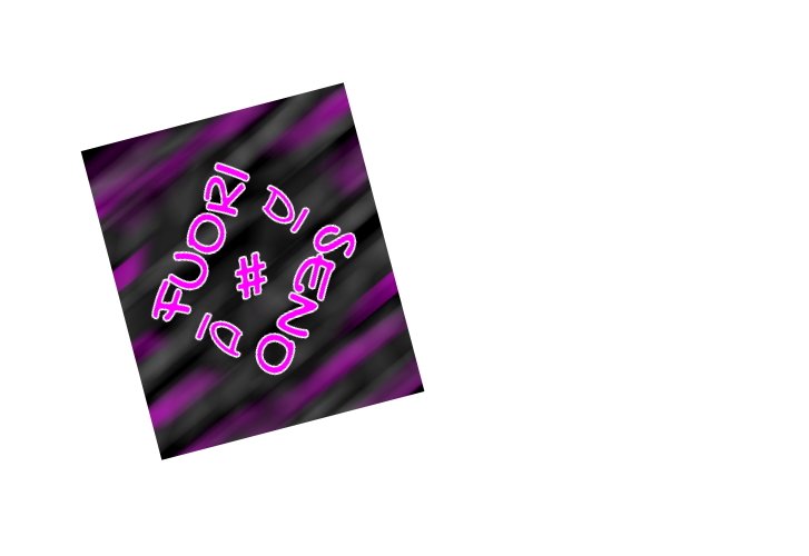
The basic idea came like this, thinking as usual during the day. It was the phrase "Fuori di Senno", a popular expression used to indicate in my native language, Italian, a person who is a little crazy, who is saying or doing absurd and unthinkable things. I simply subtracted a letter, an "n", making the phrase "Fuori di Seno". "Seno" is a word popularly used in Italy to indicate the area of the glands that peek out on the woman's chest.
This was the idea, a sentence. A sentence that I had to recreate in the digital world. To do this, I opened the Inkscape suite, an open-source licensed mainly vector graphics application. But how to write this sentence? To do this you need a font, the file that allows you to install the typefaces on the PC we are using.
Yes, but which font?
For my idea, I needed a font that gave an idea of play, a little cartoonish, with accentuated curves, certainly not squared. I went to some sites where you can download these fonts and started a short search. My choice fell on the GOCHI HAND font
a font designed by Huerta Tipografica and released under an open-source license. If you want more info on these authors, you can consult their website. Below you will find the link to the few lines with which they describe themselves: Huerta Tipografica Website
Once the font was downloaded and installed, I re-opened Inkscape and typed the phrase I had in mind in uppercase mode.
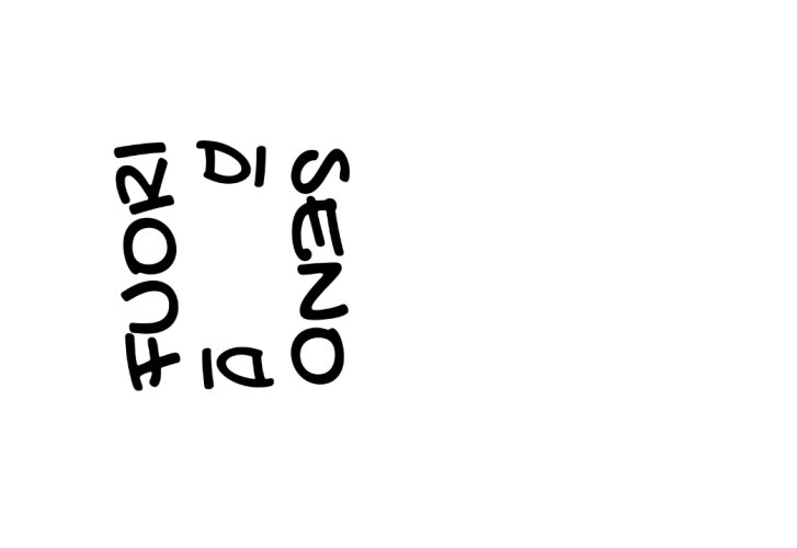
I tried to find an arrangement in the space that I could like. The classic horizontal arrangement did not suit me very well, but the same was true for the vertical one: then how?
First, I have broken down the sentence, with each of the 3 elements on a different line. So I changed the orientation of the 3 elements and I realized that it could be a first step.
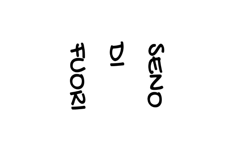
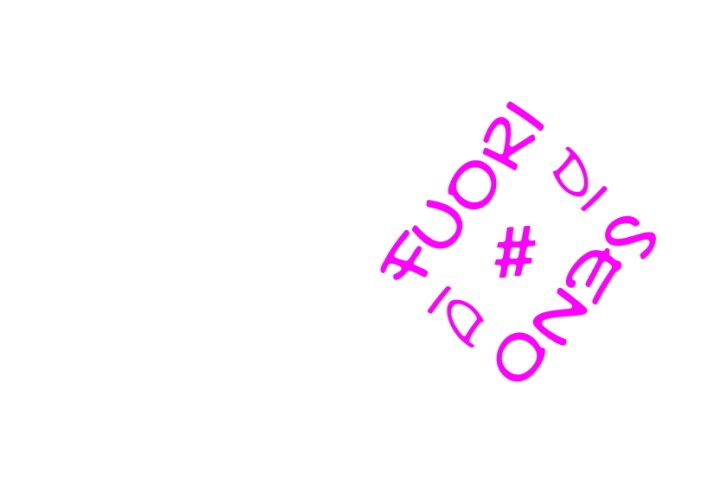
But it wasn't enough: I wanted to create something more geometric, exploiting the elements I had; together, I wanted to create the idea of a progression of words that made sense read in more than one direction. So I added a copy of the "di" element and arranged it so that the union of the 4 elements could resemble the shape of a quadrilateral. I also changed the orientation of the other elements so as to make them legible as the eye moves clockwise.
Lastly, I added what is perhaps the most characterizing symbol of social media communication, the Hashtag; changing again the orientation of the whole, I reached what seemed to me more impactful and that gave the impression of something beyond trivial writing.
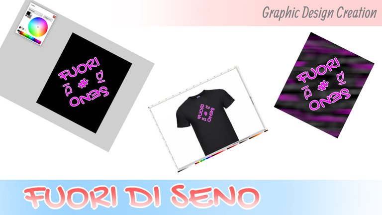
Well, phrase completed. At this point we need the color, which I decided could be a medium fuchsia, thus indicated by the application I was working on. But single color no, I wanted to create a dual-color design to fit against a black background. I then added a white outline.
But on a white background you can't see it, right? Here is the glimpse by adding a black rectangle under the graphic design.
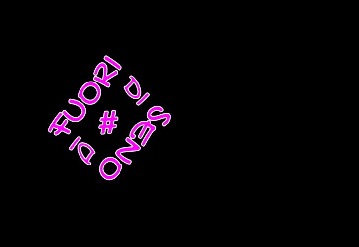
It's a better one, don't you think? Here we can better understand how much the light border increases the contrast.
But what are we doing with this graphic design?
Well, the very first thing that comes to my mind is a t-shirt. A black t-shirt, like the background I had chosen, or at least a dark enough color to contrast with the elements of graphic design.
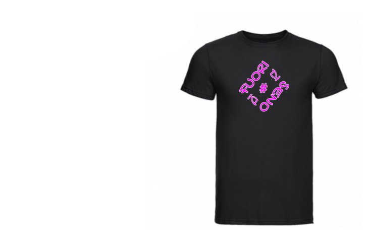
Do you like it? I hope so.
Then?
And then the second idea: to create an NFT.
As mentioned earlier, I had created a page on NFTify, a newly discovered project that allows you to create NFTs on Binance Smart Chain, the chain launched by Binance. Graphic design as it was, no, I didn't like it. I decided to create a background through several layers, starting with a black base and working with brushes, erasers, blurs, and overlay methods.
Let's see a preview in low resolution.
Do you like it?
ATTENTION!!! From here on, potentially promotional content
But that wasn't enough: after saving the NFT on the platform, I had to put it on sale.
I decided to create an NFT according to ERC-1155 token contracts, with 100 editions available. I put on sale only the first 25 editions. If they will be sold, I will move on to a price increase and a phased release of future editions.
I set the price at 205.20 USDT (Tether USD), of which approximately 5.20 USDT will be the Fee for the cost of the service offered by the platform.
And here is the last piece of the puzzle, the contribution to the fight against breast cancer.
Thanks to the journalistic sources, I knew that October will be the month chosen by the international authorities to make propaganda about the dangers and the whole "world" of breast cancer. I certainly cannot guarantee that the NFTs will be sold, but I can guarantee that I will undertake to send - in various times and places - 50% of the amount collected (for completeness, the sum net of any expenses/taxes to be paid) from the sale of these NFTs to associations connected or included in the context of this struggle.
I invite you to take a look at the personal page on that portal and share the links if anyone might be interested. Find the specific NFT on the page that you can reach by CLICKING HERE.
I hope I have left you with a little curiosity or have involved you in a pleasant read.
I greet you and make an appointment for the next one.
Yay! 🤗
Your content has been boosted with Ecency Points, by @davidesimoncini.
Use Ecency daily to boost your growth on platform!
Support Ecency
Vote for Proposal
Delegate HP and earn more
https://twitter.com/EveryWork1/status/1444656979918606338
The rewards earned on this comment will go directly to the person sharing the post on Twitter as long as they are registered with @poshtoken. Sign up at https://hiveposh.com.