What I learn about when I do a Website Redesign (A case study)

I'm in the middle of an interesting project: redesign a co-working space website.
So, a couple of months ago my friend Anna (not her real name) asked me to redesign her website. It’s a website for her co-working space. If you've been (or you're) in Jakarta, you could find her co-working space in one of the most vibrant arts & culture area: Cikini area. Her co-working space is nice, the architecture is classic, with all the artsy environment. Anna is not satisfied with her current website, as it doesn’t show the coolness of the place.
I take a quick look and immediately found the core problem. Her website was not designed well. It was also badly structured. I knew that she use WordPress for building it. Don’t get me wrong, WordPress is a great platform. But it has limitations. It is a blogging platform at the core.
The Meetings
Note: I always start a project by talking to the client and their team. No need to involve all stakeholders, but to have a team leader to talk with would be very helpful.
Before start redesign and do some mock-up, I did a lot of meetings with Anna and her team to know more about what is this co-working space all about. What is their unique selling point? What is their brand statement? Who is their target market? And other marketing-related questions.
Those meetings were long and complicated as we all have tight schedules and absorbed in many other projects.
Note: I usually would need to ensemble a team of two or three-person to help me with a design project. But that time all of my contacts were super busy, so I take this project alone (with a little help from a friend).
Long story short, it was clear to me that this particular co-working space has a unique offer. They're not just renting some desks or meeting rooms, but more to the nurturing communities, developing projects together, try to make an impact on the creative society.
It's not really surprising to me, knowing Anna, she has this long history with creative communities. She's great at networking and has done a lot of massive contribution to Indonesia's arts & culture scenes.
So here are what we got by far:
- This website should show activities from the communities.
- There should be a call for action (especially for community leader) to contact for a possibility of collaboration.
- Call to action for booking the space is also needed.
- Meeting rooms, working space, and other facilities need to be showcased too.
For the sake of rapid development, I offered her to use Laravel framework, with a custom admin dashboard (using AdminLTE). She agreed albeit not knowing what is Laravel.
The Design Phase
So this website should be about the community and its programs. Although I couldn't ignore the fact that as a co-working space, their profit will come from renting the space too.
Based on that premise, I start to create a mock-up.
Here is the first mock-up:
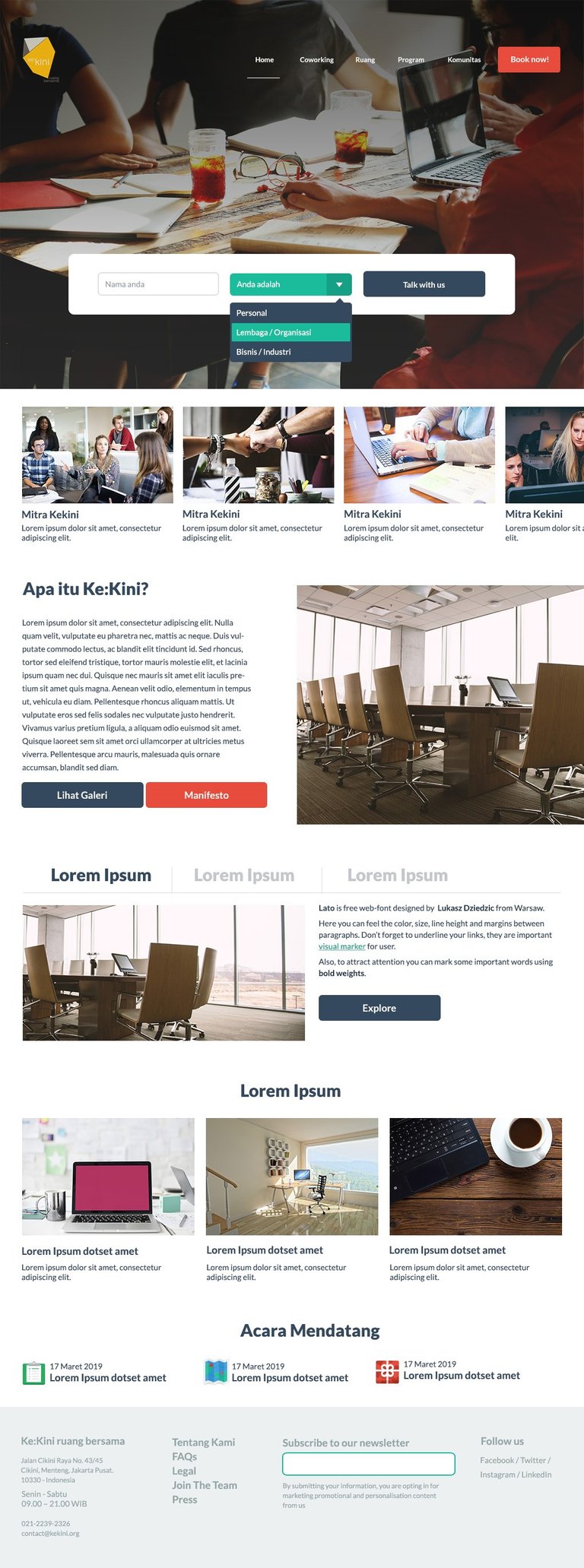
The basic idea would be to have a call for actions on the homepage. I gave two call buttons on it. The 1st one is for booking the space, and the 2nd one is for people (personal, business, or community) to contact this co-working space.
And as you see there are many blocks below the folds, the plan is to showcase the activities and the community profiles (if any). I give some space to showcase the rooms and the facilities too.
Just above the footer, there would be an 'upcoming programs' section. And in the footer, pretty standard, its the place to show the address, mailing list subscription, social media links, and reiterate the header menu.
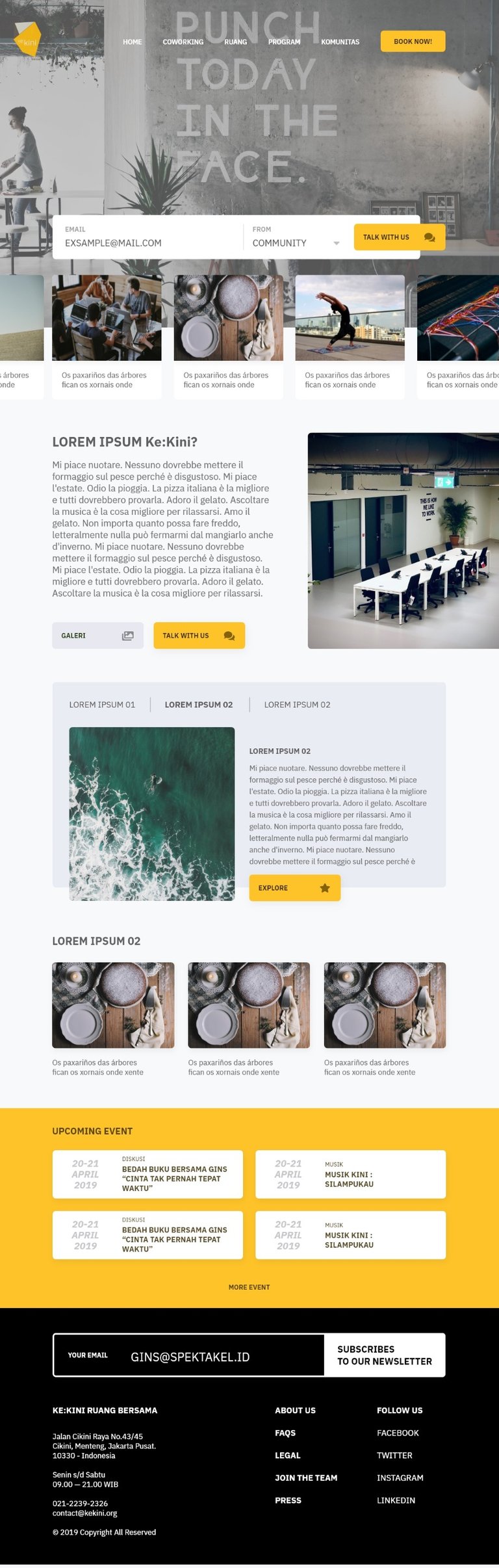
Anna agreed on the structure. She asked me if I could touch up this mock-up further. I contacted my friend, an experienced UI designer, to ask if he has free time to help me with developing this mockup further.
Here is what we came up with:
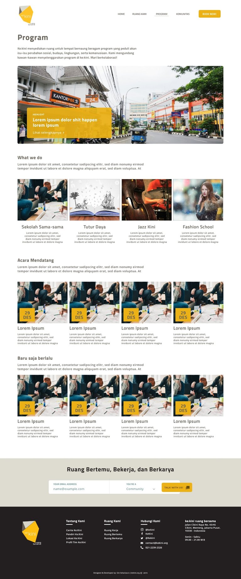
And here is the programs page:
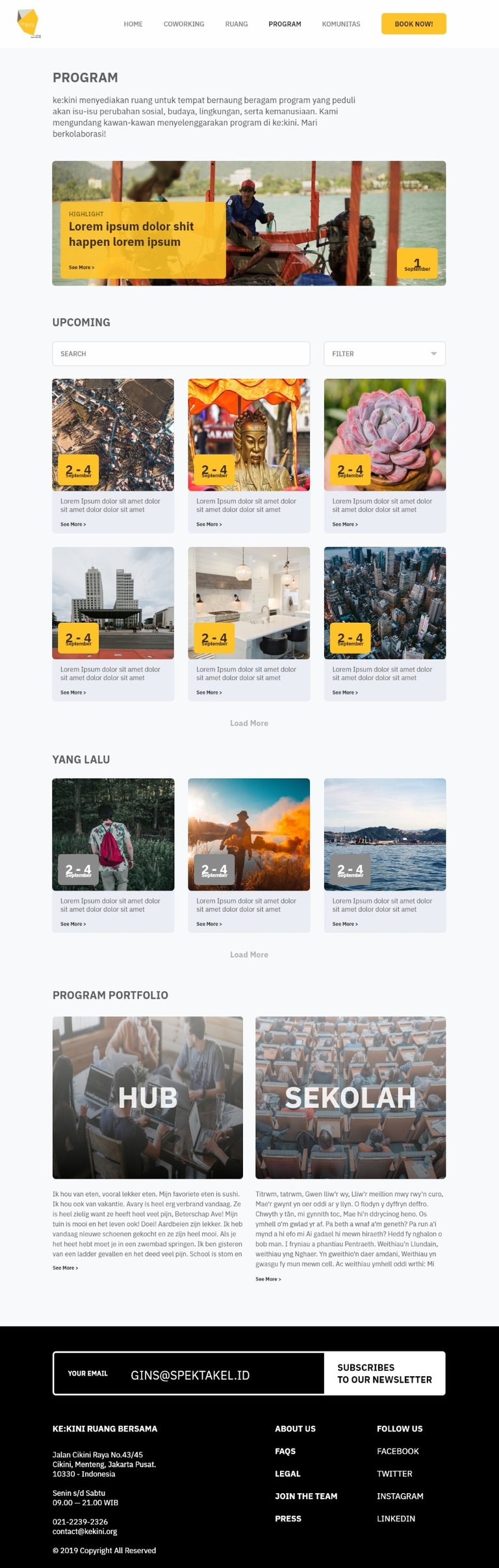
Please ignore that "Lorem ipsum dolor shit happen lorem ipsum" text. We're just that kind of team, we love to goofing around.
Lesson Learned
We showed this works to Anna. I love this design, but to my surprise, she rejected it. She said the design is too bold. Too dark. And many things are not in line with their brand guidelines.
Ok. Lesson learned. I admit, we completely forget to look at their brand identity guidelines. That was a rookie mistake and should be avoidable. The consequences of designing while having too many beers.
Since the structure is locked, it won't take many hours to give another shot to do the redesign. Only this time, I will limit myself to the guidelines. The fonts, the colors, all will follow that guideline.
In one sitting I manage to redesign it while doing some other projects. Multitasking FTW.
Here is what the current design looks like:
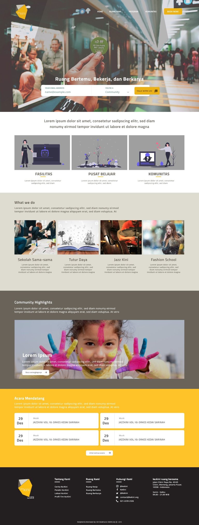
Honestly, I preferred the previous design. But Anna has decided that she'll use this latest design. Well, it suited their brand guidelines anyway.
For the next step, I'll just need to do a little bit of polishing on this one. Smoothing the edge, give it a nice border rounded corner on images, remove the border, find a proper color overlay, etc. Nothing too complicated.
To conclude, this redesign project could go far easier (and faster) if we stick to a proper style guideline from the start. Jump to the designing phase just right after a big meeting is not a wise decision.
Also, try to not focus on a unique design per se. We as a designer or design consultant is the facilitator. We listen to what client needs, we dig to their assets, we always try to figure out what are they are trying to say, what is the core message? Let these questions grow and wait until we could grasp the clear concept of it.
P.S
I did a lot of shortcuts in this project. Usually, I go with many more steps: research, gathering data, gathering moodboard, analyzing competitors, A/B tests, etc.
This is an act of helping a friend :)
Cover Image by Werner Moser from Pixabay
Wow what great information. I'm working on our site and find your tips and insights very helpful. Thanks for sharing knowledge
Hi! Thank you, glad you found this article helpful. I'm planing to create more series on UI/UX/Web Design, maybe more practical how-to in the next post. :D
Thank you for using the #build-it tag. This post has been manually rewarded with BUILD tokens in the form of an upvote. You can buy, stake, and exchange our "BUILD" tokens for steem on steem engine or SteemLeo
Build-it is a central hub for DIY and How-To projects. It's an opportunity to find and share the latest in DIY, and How-To tutorials. The recommended tags required when creating a DIY article are #diy, #build-it. #how-to, or #doityourself. Please read our guide
Chat with us on our discord and telegram channels Discord, Telegram. Are we adding value ? your witness vote will be appreciated! Click here to vote
Shared on my twitter: https://twitter.com/ginseladipura/status/1206971174015516672