It was a fun experience, relearning some HTML and learning some other new things. I am mostly happy with my product. Speaking of which, here it is:
Two weeks ago was when I started. Here is the first post Growing Fast A lot of changes since the early concept as I learned different things and techniques.
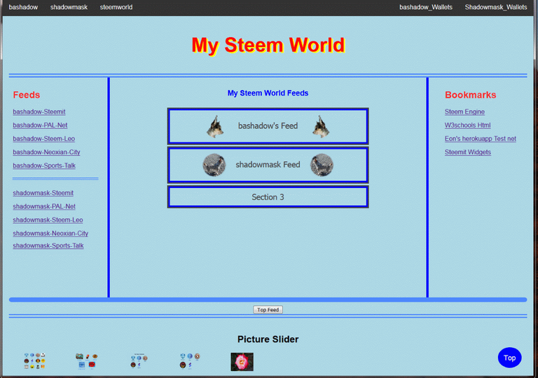
The Navigation Bar
It now has a more balanced look to it. My right hand links are spaced just about the same distance from the edge as the beginning left hand links.
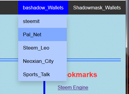
One of the things I need to think about changing is the direct to wallet links. Do I really need them or not there? Initially I thought they would be handy, a direct link to the wallet page, however if you look below there is the link to
Steem Engine. The first
Bookmark. I have grown pretty use to using that, after all it has all the tokens/coins and stake functions in one place. So I can take care of all my banking needs in one place except for the Steemit banking needs. So that gives an idea of the navigation bar.
The Need to Feed
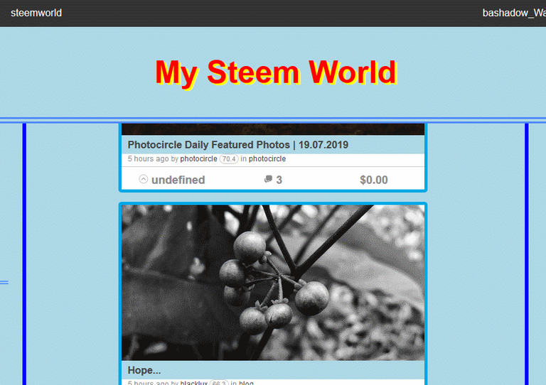
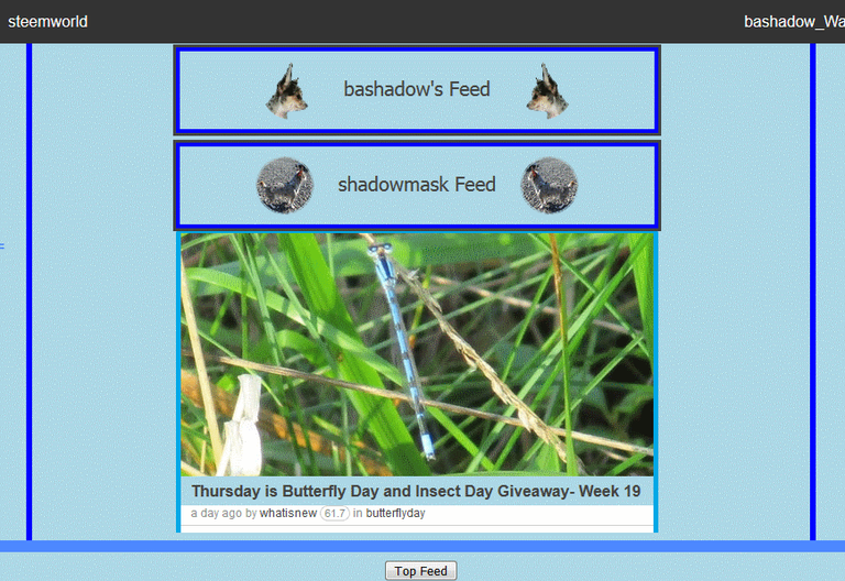
The center column of the page contains my live feeds. There was a problem though as you can see. Using the
Top button, it completely bi-passed my feed column.
This was solved by the inclusion of a Top Feed button which results in a much cleaner return to where I need to be. By using this button, it returns me to the top of the feed. From there I can close out the feed I was surfing through and open another or I can leave it open and still open the second feed. Both can be running at the same time.
So as not to have an excessively long feed I have it currently set on 8 post. That seems to be enough for me for now. The feed is live so if there is an update when I go to close I will see there was a new post. I like this set-up for feeds, it makes it pretty easy to cross vote my feeds. If I am logged in on bashadow account on Chrome, I can click, read, comment, and vote on any post in the two feeds. When I click a post it opens in a new window, so when I am done, I can continue down the feed and decide which one I want to comment and vote on next. I use Fire Fox for my other account shadowmask, so same thing there.
The Aesthetics
Note there are no scroll bars. It took a lot of work and digging to accomplish that. It was not hard to make them go away on Chrome, Fire Fox however was a different story. I like not having to look at the plain old ordinary grey scroll bars. It is my page so I know that I need to use the mouse wheel to scroll. While the full page may not be that long yet, there is always future addition and the possibility of the page length growing. The Top button shows up as soon as I have scrolled 20 pixels down.
The vertical separators, they are going to be a pain to keep looking nice, but as you can see on my computer they look just fine. I wanted a way to separate out, and define the columns, I think they do a nice job of it. For a long time when I would scroll the page they would feed over top of the Navigation menu:

Now they stay in place neatly between the upper twin lines and the bottom fat horizontal, (<hr>), rule. The top twin lines are part of the header bottom boundary setting. I have been having fun picking and playing with some of the small things.
Now for the part I am not so sure about having or the why of it. I liked how the Light Box, (my
Picture Slider), was presented on W3Schools, but I do not think I got it looking or working like they had, it took a couple of days of futzing about to get it to look halfway okay. For now it is a use of the footer.
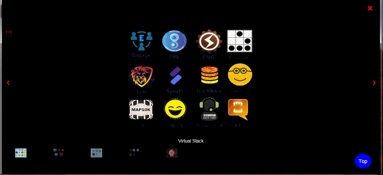
I know with the small image it is hard to see what is going on so here is the
Larger View. Basically I have currently 5 images that will show in a slide show type setup. The small thumbnails at the very bottom of the image can be clicked on to show that one slightly larger. There is a problem however. The
Top button shows through. Not a real big issue as my page is pretty short, and there is nothing below the
Picture Slider/Footer yet. So when you click it then the red "
X"you are taken back to the top of the page. If you just click the red "
X", it close the modal box and leaves you were you were on the page.
Still not sure why I have this, I guess if I ever have my own
"on-line" page I can share a few pictures with people. I do not see having my own On-Line Page, but it is there if I need it or find a use for it.
Conclusion
Well it has been a fun, time consuming and enjoyable experience learning and creating my start page. It makes the start of the day browser set up easy and leaves room on my browser bar for non-steem related links.
Hi @bashadow!
Your post was upvoted by @steem-ua, new Steem dApp, using UserAuthority for algorithmic post curation!
Your UA account score is currently 4.321 which ranks you at #2713 across all Steem accounts.
Your rank has not changed in the last three days.
In our last Algorithmic Curation Round, consisting of 130 contributions, your post is ranked at #109.
Evaluation of your UA score:
Feel free to join our @steem-ua Discord server
Glad to see that you're still active and it appears you've taken on a few new things to learn about. I can't seem to keep up.
Oh, yeah, still floating around, doing this and that and what not. I am temporarily distracted by HTML, and CSS, and all the new Tribes. My browser bookmarks are a mess, always have been, so trying to do my own at home all in one steem page. It is keeping me pretty busy.