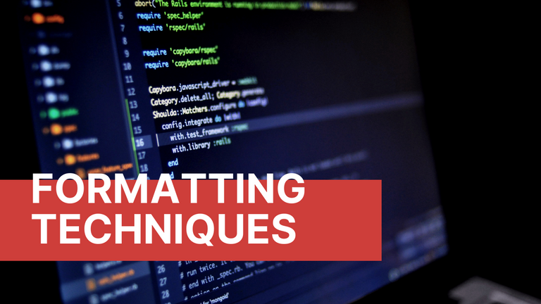
My Personal Choice of Formatting Techniques
(Edited)
Hello Hiveians!
Okay, no one's really asking, but I guess it's time to share my choice of formatting techniques that has been a product of years of trial and error. That might sound exaggerated, but I think it's necessary to provide context as to how I arrived at my current blog format. This might change in the future depending on what I perceive to be good for my posts.
Before I go to my choice of formatting techniques, let me just share some posts that are very helpful in providing the basic codes of formatting. Everything else are just combinations of those codes. It's best to learn the basic first before the complex ones, but hey, you can just copy and then paste the code and you're good to go. You just have to be very meticulous in choosing the code that would be great for your blog. Of course, you can stick to no formatting, but that would be bland and boring for me. Why not experiment on something that could potentially make your post more attractive? Anyway, here are some posts that I'm talking about:
- Markdown Cheatsheet
- Steemit Markdown Basics for Beginners
- Tub Cat's Advice - Formatting Tips and Tricks
I am sorry if it links you back to the old chain. That's still some valuable information right there.
Why would you go through a lot of hassle to format your post? Well, the answer to that is on the readability of your post and the extraction of information by your readers. If you want to be basic, you can stick with the default format, but if you want to improve the readability of your post, you should learn these stuff. At the end of the day, it's your choice.
The reason why these formatting techniques exist is for emphasis, and ease of finding and extracting information. Bad formatting can sometimes lead your audience to lose their interest in your post.
Alright, let's start with my choices of formatting techniques. Take note that I frequently use them and these are combinations to form one structure. Let's start with typographic alignments or text alignments.
Typographic Alignments
Text alignments can be flush left, flush right, justified, or centered depending on different uses and choices. Flush left is the normal text for languages that are read from left to right and a default format of web pages. Flush right is usually used for languages that are read from right to left. Text justification is to align texts both left and right and are usually used in formal documents. Centered is used for headlines, songs, and poems.
Justification
I now personally choose justified texts as they look neat for me. It's just a personal choice as it looks like a magazine-type format. You can still choose to have the default flush left format as there's nothing wrong with that. There's actually an advantage when you use the default format especially when the columns are too narrow and you use long words too often. Using text justification in those situations will lead to too much white spaces because of loose spaces between words, causing a disruption in the flow of reading. Since I still choose justified texts, there are cases when I paraphrase or choose a shorter word in order to eliminate too much white spaces.
Here's the text justification in code:
<div class="text-justify">
It's just a matter of preference. There's no standard rule that you should follow. It's just a matter of choosing the code that suits your idea of what's appealing.
</div>
Here's what it would look like:
It's just a matter of preference. There's no standard rule that you should follow. It's just a matter of choosing the code that suits your idea of what's appealing.
Centering
Centered texts are aligned at the center and I find it annoying when used in normal texts. It has certain uses so I don't use it in texts unless necessary. However, I use the center code in photos especially for portrait type, stand alone photos. So, I'll set that as an example here.
Here's what centering looks like in code:
<center>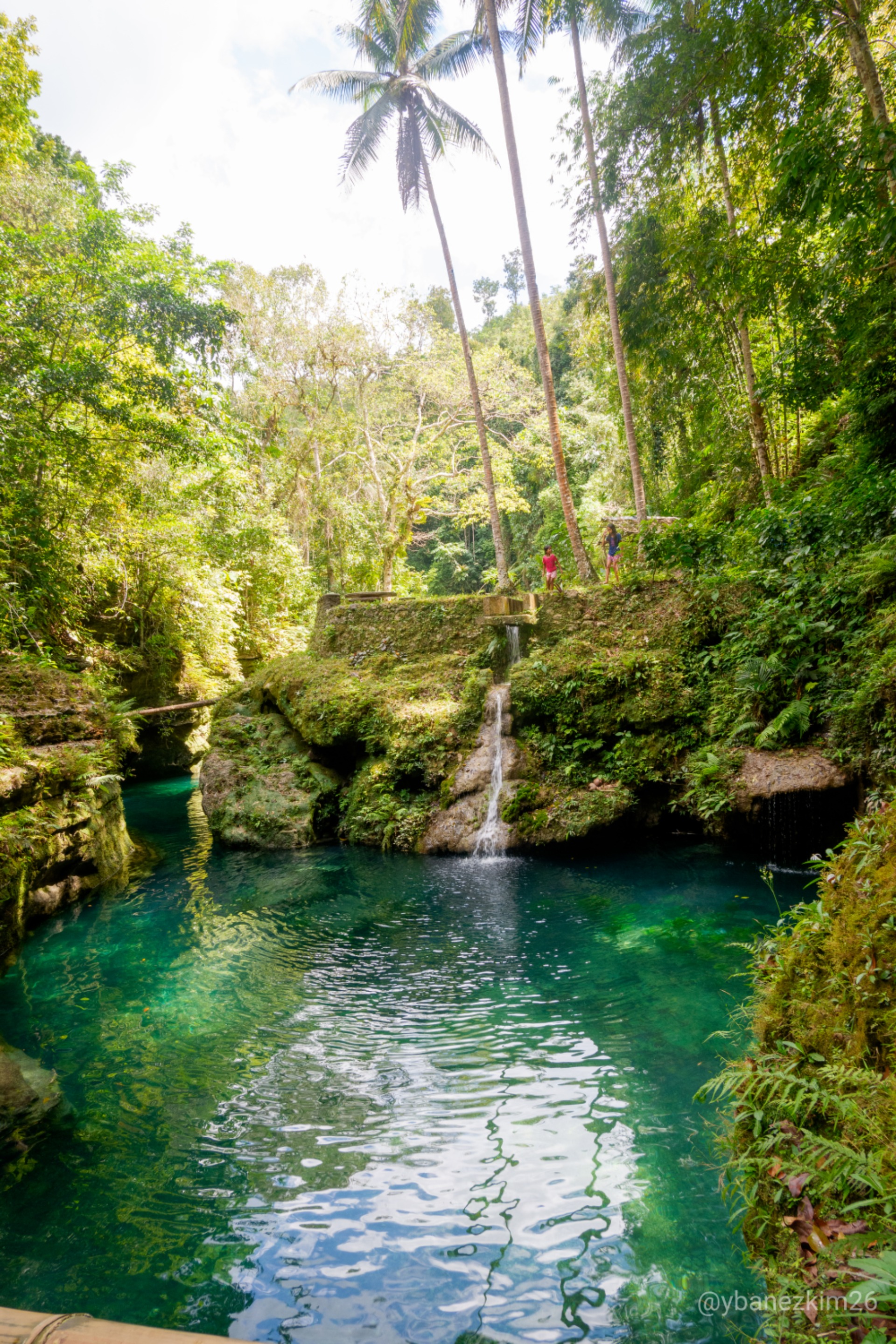</center>
That would normally look fine, but I tend to remove everything except the link to the photo once uploaded. All that exclamation mark, name of the photo, and parentheses would not show up in the preview, but I find it unnecessary and would cause a problem later on. Erase one part of those and everything will be messed up. To be safe, I remove them entirely.
Here's the final centering code:
<center>https://files.peakd.com/file/peakd-hive/ybanezkim26/JtKvRYOi-_DSF0985.jpg</center>
Here's what it would look like:
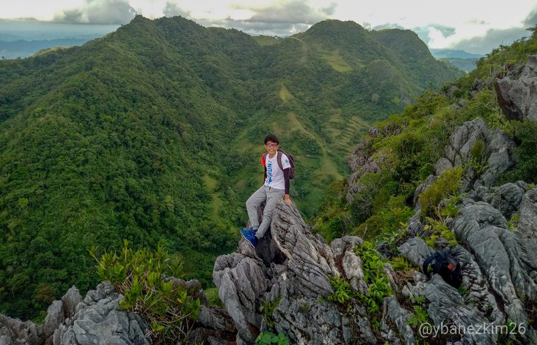
Note: Photo is just for illustration.

That would look okay because the photo fits well with the entirety of the screen, but for photos that are narrow and long, automatic left alignment would trigger my OCD self so centering them would calm me down. Yeah, I know I'm weird.
Now that we're done with the overall look of my blog, let's go to the details.
Headlines
If you have followed my travel blogs, you might have noticed that after my introduction and some other stuff I talk about, just before the main topic, I put a headline to signify the start of the topic. I just find it fancy and it's just for aesthetics. It's usually the name of the place and some catchy monikers and stuff.
Here's what it would look like in code:
-----
<center><b>CANCALANOG FALLS IN ALEGRIA, CEBU</b></center><center><sub><b>That Magical Blue Water Hole in Middle of the Jungle</b></sub></center>

-----
Final look:
Actually, it was @legendarryll who used this first. I just adopted it because it looked awesome in a travel blog. Oh! Before I forget, please don't forget to add a space before the last divider or else, the spaces between the divider and the words would not be equal. Or just copy-paste that code as is. Trust me, I experimented on that because my OCD self was triggered before.
Let's have some photo attachment formats next.
Pull Left and Pull Right
Pull left and pull right are not just exclusive for photos. They can also be used for texts to separate the reading screen into two columns. They work well with multilingual posts and translations.
You can use pull left or pull right alone or you can use them together. I usually use them together.
Adding Two Photos Side by Side
This works well if you want to compare two photos. Here's the code:
<div class="pull-left">

https://files.peakd.com/file/peakd-hive/ybanezkim26/80KXLbt7-2019_0224_14004300.jpg
</div>
<div class="pull-right">

https://files.peakd.com/file/peakd-hive/ybanezkim26/07ZtekDn-2019_0224_14004000.jpg
</div>

-----
Here's the final look:

There are a lot of things to remember here to achieve that photo attachment. First, you must remove the photo details and the only the link must remain. If not, that will show up in the preview. You can try doing it to see for yourself. Second, there must be a space between the pull left or right code and the link of your photo. It's not detectable in PeakD, but it's observable in hive.blog. Without that space, there will be an imbalance in spaces before and after the photo. I'm a fan of using spaces to let the elements of my blog breathe. You can try to compare with and without space and tell me what you observe. Third and last, I added a divider after the codes for spacing. Without the divider, there will be no space between your photos and its consequent text.
Adding Links
Adding links to your blog has its own benefits. You can actually advertise your other posts by linking them to your current post. If you're writing a synthesis of something or making a STEM blog, adding links to your sources means that you have done your research on the topic that you're writing. It increases your credibility as a writer as it shows you're not making things up. In my case, I'm usually doing a travel series so adding the previous parts of the series would provide my readers some context of what I'm talking about.
There are two ways of adding links to your post. One is specific only for default format, while the other is a more general code.
Here's the code for adding links under the default format:
<b>[Markdown Cheatsheet](https://github.com/adam-p/markdown-here/wiki/Markdown-Cheatsheet)</b>
That is not applicable when you're using text justification or within any div class code.
I have a way of adding links to my previous blog. I just find it fancy so I used it. This is still using the pull-left and pull-right code.
Here's the code for the links to my posts:
-----

<div class="pull-left">

https://files.peakd.com/file/peakd-hive/ybanezkim26/uJLzC782-2019_0224_14261900.jpg
</div>
<div class="pull-right">
<center><sub><b><a href="https://peakd.com/hive-174578/@ybanezkim26/definitely-cebu-9-lambug-beach-badian-cebu">Definitely Cebu #9: Lambug Beach, Badian, Cebu</a></b></sub></center>
</div>

-----
Here's what it looks like:
Take note that you have to use "a href" instead of braces and parentheses in order for this to work. I personally choose this code for links to my posts because it gives the reader an idea of what's in store in that link. Adding a photo, specially the thumbnail photo, would entice the reader to check out that post. I'm not sure if it works. 😂
If you have read my posts, please comment below if that works. I need some affirmation.
Headings and Sub-Headings
Adding headings and sub-headings in your post provides structure and emphasis to your topic. It is also said that it improves the SEO ranking of your post.
Here's the code:
<h1>Headings</h1>
<h2>Headings</h2>
<h3>Headings</h3>
<h4>Headings</h4>
<h5>Headings</h5>
<h6>Headings</h5>
Here's what it looks like:
Headings
Headings
Headings
Headings
Headings
Headings
The number ranges from 1 to 6 which signifies how big your heading can be. I personally choose h4 to h6 because I found h1 to h3 to be too large.
This is to give you an idea that there's a lot of things going on before I can upload a post. There are actually other formatting techniques out there, but I rarely use them. Tables, columns, and blockqoutes are some of them, but I won't include them here. Again, you can stick to the basic format or you can follow my format. Just remember to be very keen in your post since one wrong code could mess up your whole post. Whatever your choice of formatting techniques is, always remember that the quality of your content still precedes all of these.
I hope that this will help especially to the newbies who don't have prior blogging experience.
Lastly.
About the Author
This is found at the bottom of my blog. In almost all of the travel blogs I've read, there's an "about the author" thing that is sort of a signature and it tells something, well obviously, about the author of the post.
Here's the code of my signature:
-----

<div class="pull-left">
https://files.peakd.com/file/peakd-hive/ybanezkim26/itN9pdpY-IMG20171007155623.jpg
</div>

<div class="text-justify">
<b>Kim Ybañez</b>

<sub>Welcome to Kim's small corner in Hive. He is a chemical engineer by profession, but a blogger by passion. He is a wanderlust and an adventure seeker. Join his quests as he visits secluded destinations, climbs mountains, tries new and exotic dishes, and explores his country (The Philippines) and the rest of the world even if he's still a poor corporate slave with tons of bills to pay and two siblings to support in college.</sub>

<sub>If you like his content, don't forget to upvote and leave a comment to show some love. You can also reblog if you want to. Also, don't forget to follow him to be updated with his latest posts.
</sub>
</div>
Here's what it looks like:
Kim Ybañez
Welcome to Kim's small corner in Hive. He is a chemical engineer by profession, but a blogger by passion. He is a wanderlust and an adventure seeker. Join his quests as he visits secluded destinations, climbs mountains, tries new and exotic dishes, and explores his country (The Philippines) and the rest of the world even if he's still a poor corporate slave with tons of bills to pay and two siblings to support in college.
If you like his content, don't forget to upvote and leave a comment to show some love. You can also reblog if you want to. Also, don't forget to follow him to be updated with his latest posts.
0
0
0.000
Shared to Twitter: #poshed
https://twitter.com/ybanezkim26/status/1272881857495851009?s=19
These are very useful techniques! Thank you so much for sharing this with us .
I clicked your linked and it brought me to your article and read it. I wish I could visit Cebu sometime.
Thanks again! Stay safe and Have a great day!
Wow! So it really worked! Haha
If you can visit Cebu some time, don't hesitate to ping me. Maybe I can show you around.
You too! Always stay safe and be great even with all that's happening in the world.
Wow! That's so kind of you! Hope this pandemic ends soon. I heard that Cebu is in ECQ.
I hope that the virus will stop spreading there so the adventures can begin again.
Cebu City is in ECQ. Talisay City (adjacent to Cebu City) is in MECQ. The rest of the province, including Mandaue City (where I live) and Lapu-Lapu City (where I work), are in GCQ. I really hope this will be over soon!
Gusto ko na mamundok or magbeach. 😂
Thanks for the info. That's great that you guys are in GCQ. Yes I agree with you
Hahaha, Same feels!
Ingat po palagi sir
You too! Ingat din kayo jan sa Baguio. Wait. Nasa Baguio ka diba? Baka nag assume lang ako. 😂
Yes sir, taga Baguio po ako hehe.
Sana makapunta ako jan soon! Plano namin talaga ng kaibigan ko na pumunta jan pag naresign na kami sa work namin. Pero di pa natuloy. Covid talaga may kasalanan.
Wow! These are very helpful not only for a newbie like me but for everybody.
Thank you so much for this.😊
You're very welcome! Rock that code! Haha
Thank you for this tutorial, @ybanezkim26. It's exactly what I was looking for!
You're welcome, @litguru! Time to test that code in your next post. 😁
It needs some improvement. I wish we could add color fonts. Oh yeah, font type and sizes. This will be a game changer. More functionality for"div" will be greatly appreciated.
I think we can add color fonts. I saw some red colors somewhere. I'll search about it. I'm not sure about the font type though. I haven't seen any blog with a different font. Since this is an iterative process, I'll definitely share when I found something cool.
Thanks for the suggestion, @macchiata. This will keep me busy trying something out.
It has to be embedded in the code. It's about improving HIVE UI and UX experience. My comment is also for a developer just in case if they see your post :)
Thank you -- rebuzzing these excellent tips!
Thank you! Very much appreciated.
Thank you for this... it is a one stop shop which will be useful.
You're welcome! I'm glad you find this useful.
Hi, thanks for sharing, well done. There is always someone new around looking for this kind of posts. Recently I found an interesting use of the code for tables, take a look:
If you're using the light mode you can see the gray background.
The code is:
I can't see a gray background. Haha
I tried to copy the code and it worked the same as the one you commented, but there's no gray background. Although the bold highlight is already a feat considering how short the code is. Thanks for sharing this. I'll keep on experimenting with different formatting techniques, including this one.
It seems like it's not visible on PeakD light mode. Try Hive blog on light mode
Oh! I get it now. Thanks for sharing this. I might try this to emphasize a point.
Very helpful! I always wondered how do people add photos side by side.
Yay! Glad this helps.
Nice article. I was going to write something like this too, but you beat me to the punch. Hmmm, maybe I'll do it with video recordings of my screen as I type formatting examples in eSteem Desktop. I guess some people would prefer to see it in action, than read a lengthy article about it. Anyway, stay safe and God Bless! 🙂 🤘
That would be a great compliment to this post. A lot of people definitely love to learn through a video tutorial as opposed to reading articles. In this article, however, they can just copy and paste the code.
I will be on the look out for your video tutorial. I'm sure it will be synergistic with this post which is great.
Stay safe and have a great day!
Thank you for the valuable information.. It was very helpful. Keep hitting us up with the good work. Cheers man :)
You're welcome! And thank you for stopping by. I really appreciate it. Cheers!
Congratulations @ybanezkim26! You have completed the following achievement on the Hive blockchain and have been rewarded with new badge(s) :
You can view your badges on your board And compare to others on the Ranking
If you no longer want to receive notifications, reply to this comment with the word
STOPSupport the HiveBuzz project. Vote for our proposal!
Huhuhu thank you for this! I've been looking for formatting techniques eh, I like justified too, but I don't know how to. I'll edit my old posts hehe
Thank you!
I'm so happy this helps a lot of people. I guess I posted this just in time.
Applying these techniques to my new blog post!
This is what I've been looking for. Thank you, thank you, thank you, thank you, thank you!
You're welcome! 😁
Thank you soooo much for this informative post, @ybanezkim26 , WHOOOOOO!!!! I AM SOOOO THRILLED TO BE HERE! lovelotssss 💛❤️🤗🥰😍😘✨💖
https://twitter.com/tina_agustiin/status/1435980465068937218
The rewards earned on this comment will go directly to the person sharing the post on Twitter as long as they are registered with @poshtoken. Sign up at https://hiveposh.com.
A very valuable contribution... Thank you very much! 😊
I'm a newbie on Hive and I really don't know a thing about coding, I barely started to learn about cryptocurrency 😰.
I'm a physiotherapist I only know how the human body moves, so this technical information got my brain confused 😵😵. I feel this is pointed out in the simplest way possible so I'm even more worried I don't quite understand it. Did anyone else felt this way? 😅
Lastly I would like to thank you for this usefull information. I'll make sure to go get my pen and papper and write it down for maximum retention!
Best regards,
blackdaisyft
Excelent posh!!! 💙💙💙
I'll point this post to my readers, can I?
Awesome tips! I'll try some of these in my next posts. Especially justifying texts; I'm now a justified-alignment convert. 😂 It does look a lot better than leaving it left-aligned. It's silly that I'm only noticing it now.
Lol, yes, it def works. Your photos are very captivating.
Thank you so much for these helpful formatting techniques. Sa sobrang tagal ko nang di nag cocode, di ko na maremember yung iba kaya this article is really helpful talaga.
Thank you for sharing sir. It is very helpful for a beginner like me.