(Day Highlights) Best Typography Graphic Designs I Saw Today on the Street
I go out often and I take pictures of my highlights of the day. Most of what I see is very bad, but I look a lot, and some are good. There is always a percentage of the designer population that are very good, either small or big.
It also has to do with the ability of business owners to realize that they need a designer. Sometimes business owners think they'll be saving some money and just do it by themselves. Most of the time it ends up being bad, but hey, money saved.
I went out today and decided to highlight some designs for when I'm home. I reviewed the pictures and uploaded them to post them here. I hope you enjoy them.
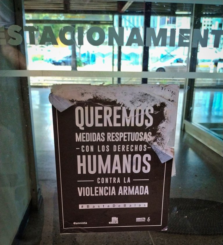
1. Cause Marketing against state-sponsored violence
Translation:
We want measures respectful of human rights against armed violence
#NoMoreBullets
Sponsored by the "Amnistía Internacional" organization (International Amnesty).
This is my favorite design of the day. I loved the way they played with the letter spacing, the font weight, capitalization, letter background and the line particles surrounding the short lines in order to fill the space. It's very balanced and nice to the eye.
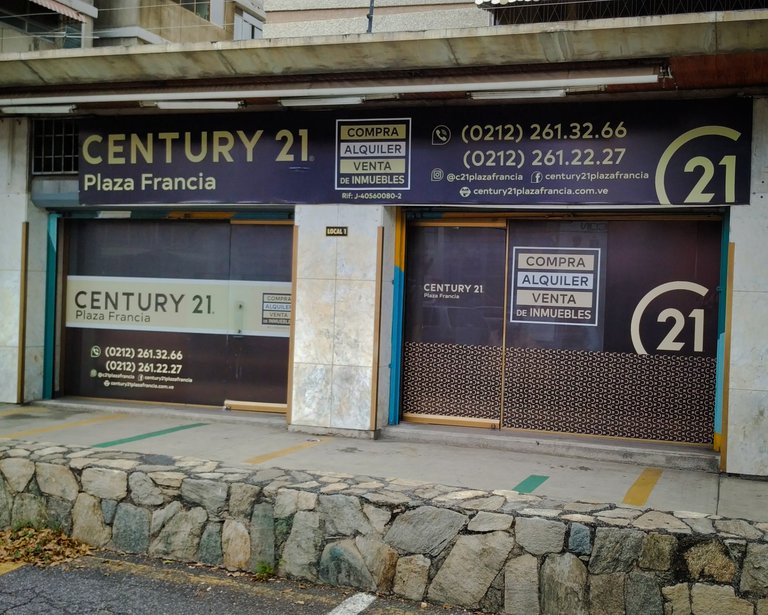
2. Century 21 (Real Estate transnational) store front
I saw them at the Plaza Francia in Altamira, setting up an aniversary event. They had hired a sound engineering company to set up the equipment.
According to this page, the Century 21 font is Typold, but I compared them and they're not the same. They are slightly similar, but their differences are obvious. I tried to find the font but I can't. If you do, tell me.
The design of their shop is really good. The workers also have very nice uniforms. They care a lot a bout their image. The black background and the typographic choice gives the store a strong and solid image.
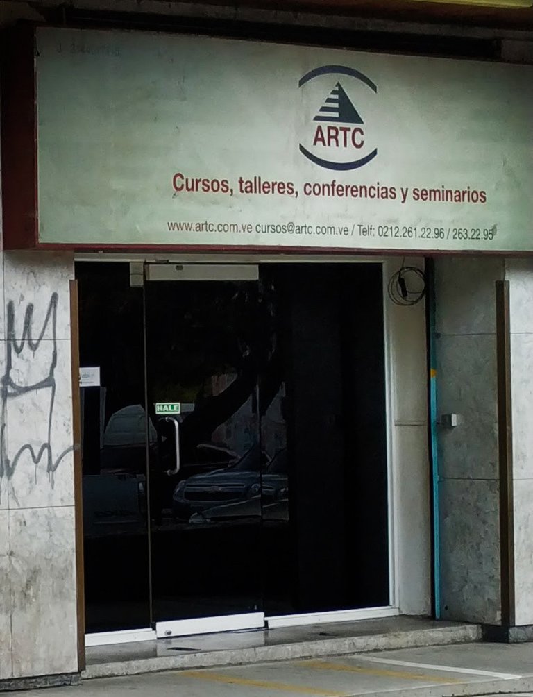
3. Accounting / Tax Law / Managerial Advise
This one is proably empty, it's closed, but the design is pretty good considering that it's just a small firm. The color gives it the appearance of parchment, the serif font looks classic, a bit old. I think that's one of the things you look for when you're trying to have your business finances done: someone with a lot of experience, attentive to detail, with knowledge of the letters.
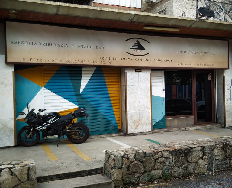
4. The collateral damage design
When I took the picture of the law firm, the phone was too wide, 2/3rds of the picture is the law firm and about 1/4 is this shop. I included it in the picture because it's not too bad. It's clearly done by a decent graphic designer, probably the same as the law firm. The spacing is good, decent hierarchy and colors, and there is a clear play in font weights. The logo is the same as the law firm. It follows the rules, basically, and while it's not amazing, it does its job better than most designs on that street.