Dapplr: First impressions, suggestions, opinions review!
I'm a sucker for shiny new things; especially tech stuff. Within the premise of tech that I roll with, I love to try out any new stuff I can lay my hands on. Ranging from hardware to software.
Today, I'll be talking about a software that most of y'all must have heard about. Some are yet to know about it though. However, don't take my post as a promotional ad. I'm basically doing a review.
Yesterday, I read a post by @bil.prag. In his post he talked about using a new software to publish his post. Without hesitation, I checked out the official blog of the software and registered to have early access. Well, I got access today.
The app is Dapplr; you already saw that in the post title. And in this post, I'll be sharing with you my experience with the app so far. I'll talk about the stuff I like, and the ones I don't like. Although I'll advice that you take the stuff I don't like unserious. That's because the app is still in its early stages and it's very okay for it to be imperfect.
Without further ado, let's delve into my first impressions review of Dapplr.
For every new app I try my hands on, I love to first be mesmerized by its UI. For some software such as music players, I rate UI over the other functions that it might offer. That's to show how deeply concerned about I'm about user interface.
Dapplr has an amazing interface. Looks flat and materialistic with amazing colors.
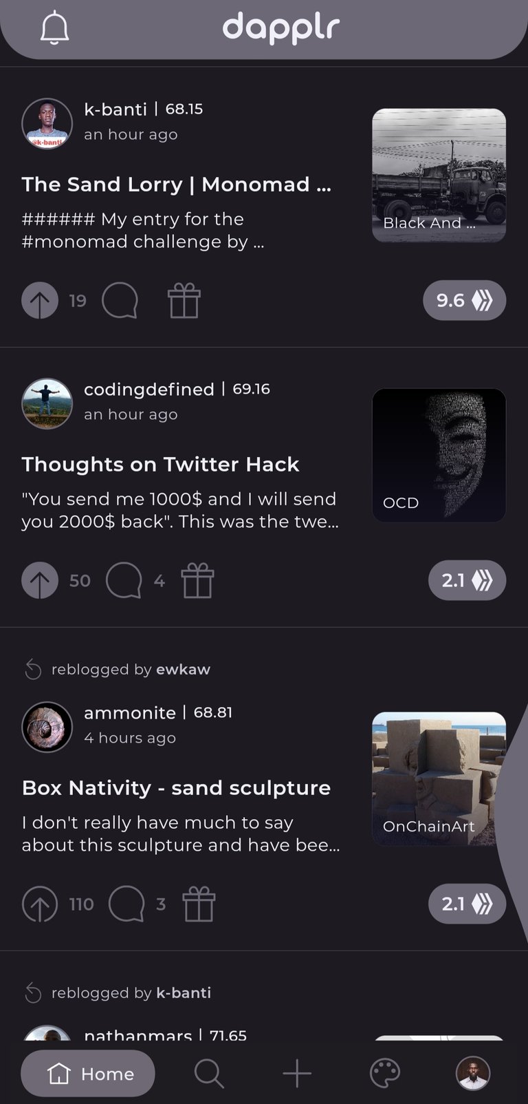
I loved the transitions and how fluid the app just works. The presence of color schemes beyond light and dark modes is amazing. And there are plenty color options to choose from. I already got my favorite themes[after trying all them out]. They are; Toasted Almond, volcanic ash, Dragon fly. I love those themes because of how they make my profile pop. Especially the photos in my posts. I think the ladies are gonna love the berry blush.
Aside from themes though, there are 3 different view modes. Normal view, compact view and grid view. I don't know if those are the right names, but I'm sure you'll understand me. With these 3 different view mode options, the app is literally looking like a colorful PeakD mobile app. I absolutely love it.
The next cool thing I was impressed by was the option to straight up share media files; photos precisely.
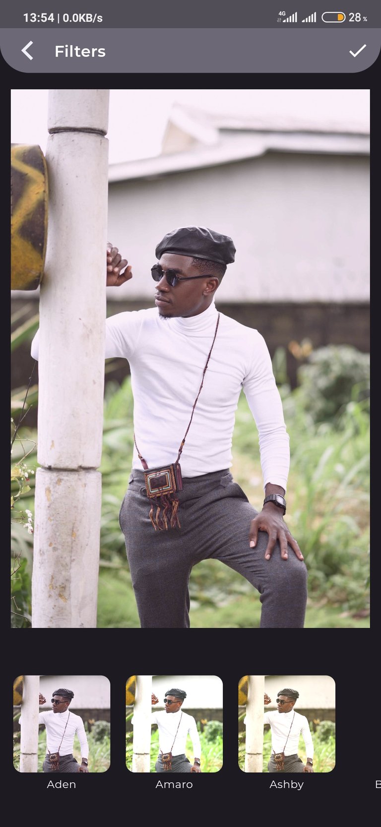
Well you might consider it trivial, but I like the idea. But beyond sharing photos, there's a mini photo editor in the app which offers the options to crop your photo, or add a filter. It's also a nice idea. I think a lot of people are going to like it. I don't think I'll be using it though. Except in cases where I'm not sharing a professional photograph.
The ability to subscribe to specific users is an option I really like. I don't know exactly how it works, but I'm thinking subscribing to a user helps me to stay notified whenever he/she publishes a post. This is an amazing feature to be honest. And it's a huge one for me. With this feature, I'll never miss new post by my favorite authors and content creators on Hive. I'm currently subscribed to one of my favorite authors on Hive; @sidwrites. He hasn't published a new post since I did that, but I'll confirm how the feature works when he does.
Dapplr really be dishing out some Instagram vibes with this feature "double tap to upvote". I love this one. It makes upvoting pretty easy. So I set a desired voting percentage , and that's all. Double tap fest all the way!
Dapplr will have its own token too. I'll love to see how this goes.
Well, there you have it! That's everything I've been able to pick up after using Dapplr for less than 5 hours. I know there are more things/features to find, and I'll share them as soon as they are discovered.
Things that are seemingly missing/not working properly/can be improved.
Having shared my first impressions of the app, I'll love to talk about the things that are missing, not working and can be improved. But recall that in my opening statement, I said that since this is a new app under active development, these shortcomings are permissible.
First, I'll start with features that are missing in the app. These features are likely to be implemented whether or not I point them out. They are;
- A functional wallet. What's currently available is only details of your account. Transactions can't be performed.
- No profile cover art/location/Website on profile panel.
- Word count in text editor.
- Double tap to upvote option unavailable for comments/replies.
- Schedule post option.
Those are the features I discovered that were missing. It should be more though.
Here are the features/things not working properly. You can call them "bugs".
- Dapplr doesn't see PNG files.
- View mode changes with each swipe.
- Using space in text editor doesn't really show space.
- Centered texts don't show.
- Stationary "next" button in text editor.
You can see that I experienced more anomalies in the app's text editor. If I probed it more, I'd have found more. However, not to take anything away from it, I like how the text editor looks. It feels like I'm typing on a notepad, which I've become accustomed to.
Here are areas the app can improve on;
- Theme feature should be in a settings menu. I love the theme feature, but I don't fancy its position on the app. Having it on the major navigation menu doesn't feel so right. Maybe the developers design it with the mind for users to access it and switch themes faster. But I don't think people will do that often. So having a settings menu where that feature would be placed is great.
- Stationary "next" button in text editor. I listed this as a bug, and it could be considered that, and also as a design flaw. The stationary next button on the text editor made typing difficult for me, as it was blocking some areas on the editor.
- "Double tap to upvote" option for comments/replies. I already mentioned this before. Mentioning it again shows how important it is to me.
- Pull to refresh doesn't work on profile page. Only on home page.
There you have it! My first impressions review of Dapplr. As the app develops, I might do a side-by-side comparison with Esteem, which is another great app. But until then, kudos to the founders, developers, and all team members of this project.
Posted using Dapplr
Can't wait till a better app for IOS comes out!
I don't know why, but this has been so exciting for me since the first official announcement.
Now that I have got it, I'm glad I was one of the early testers.
while trying to reply to you, i reallized i can't find a way to upload photos to comments. so back to pc :D
if you swipe that "bubble" you get pretty decent wallet. you can send hive, power up, power down, see transactions...
Oh Okay! I knew that wasn't a design. I knew it was for something, and prolly just redundant for now. My phone works with gesture modes on the edges, so its impossible for me to swipe that.
my does to. you just need to be careful how you do it. if is a bit of a problem, but you don't go to wallet that often so i think i will survive :D
Very decent review, thanks for putting it together :)
@tipu curate
Upvoted 👌 (Mana: 0/21)
Thank you very much @phortun
Loved the review! Very well written, in fact. How did you manage to write it all on your smartphone?
Thank you very much. Well, I learnt how to adjust to using my Smartphone. I don't fancy using my laptop except there's light. It's a psychological thingy sha.
Thanks for putting such details for a review mate.
Thank you very much for your compliment.
Seems like the link has been removed from Play Store.
I don't it has. You have to registered for early access with your email address. Then you should be able to see it. I can't place hands on the link where you can do that.
The link you have provided at the end of your post took me to their homepage that said you can get it on Play Store, but the link is not valid anymore.
That's weird. But for me, I read their official blog on Hive that said I had to register on a Google doc with my email address before I can get access. So apparently without that access, you won't see the app on playstore. It happened that way for me too.
It's because you are not registered for early access. When I tried to get to the page with my secondary Google account, it says page not found too. But with my main account it took me to the Google play page.
Posted using Dapplr