6 Tips to draw and vectorize in Illustrator without having a professional drawing tablet
Hello to all lovers of digital art ^ _ ^ this without a doubt, is a different publication than what I usually publish with you, but I am sure it will be one of the useful ones.

This is a very simple drawing for what I usually do, that is why I decided to use it as a tutorial that summarizes in 6 steps, my entire digital drawing process, which is ideal for those who do not have a drawing tablet, Since each drawing that I make I do it only with the mouse, this originally was because I did not have a digitizing tablet, but now it is because drawing with the mouse gives you more control and precision in the line of the stroke, and the lineart is much cleaner, not to mention that drawing in this way is very useful to have resources, and prepares you to perform motion interpolation animation, that is the main advantage of choosing to draw with vectors over pixels, since with each drawing made They are more resources that can be reused to draw others, (I have reused many elements of previous drawings to make new ones, such as hands, eyes, effects and gradients)

No. 1: make a pencil sketch
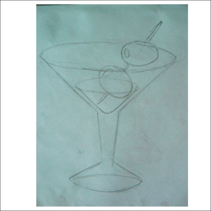
Drawing on paper is the most fundamental thing in drawing, especially in art, because unlike digital media you can do it anywhere and at any time (especially if your Smartphone's battery runs out) the idea of make the sketch, it is to serve as a reference, and to be the orientation base of all the drawing that you are going to make, and something very important is that the final art should not be 100% faithful to the sketch, the idea is that this Just serve as a guide, since proportion errors are always made, and we must be to notice and correct them as we work, the advantage of starting with a traditional sketch is that by taking a photo and fixing it on a layer, it allows us to make a second perception of the to review it before starting. Another advantage is that no matter the quality of the paper or its size, we could make several sketches on the same sheet, and work each drawing inside it independently.
No. 2: Start creating Shapes
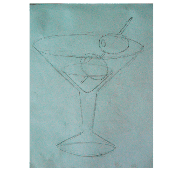
In every drawing, you start by tracing until you complete the entire lineart, this is more than intuitive because that is how you start any pencil drawing, but in Illustrator, I recommend doing the filling shapes first, and these can be done With the pen tool or with the same ellipse or rectangle tools, which are modified until they fit with the base sketch, or how we want our drawing to look, all these shapes must be made with a low opacity, in order to continue visualizing the sketch (the one I use and recommend is 30%) these can be made in any comfortable color to work either white or black, (I prefer to use white but to better explain this tutorial use black)
No. 3: Duplicate the shapes to create the Lineart
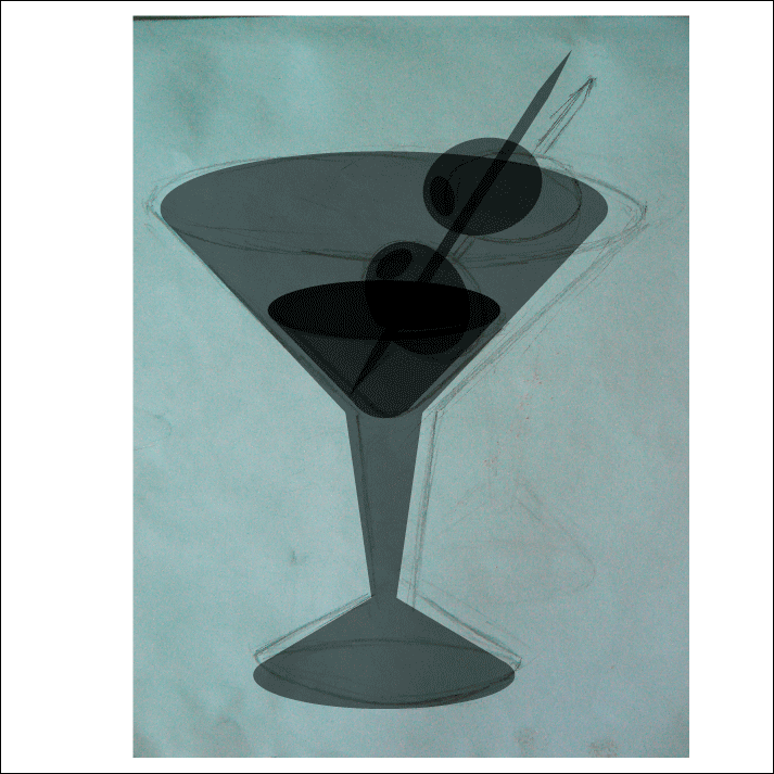
When all the shapes that make up the image were created, now it begins with the development of the lineart, and for this, copy and paste will be used a lot; In Illustrator as in any other program there are the commands: Ctrl + C to copy and Ctrl + V to paste, but when pasting, the piece that is pasted is positioned in any other random place in a disorderly way, so that this element is located in the same place from where it was copied, you must use the command: Ctrl + F and this place the object on top of where the original was copied, we will exchange its fill for this new piece for a path, to do this it is very It is important to have the COLOR window open within your workspace, it is there where we can do this more comfortably and quickly, or you could use the Shift + X command, when you already have this path you can edit it with the tool direct selection, when adding and removing nodes (if you want to cut the stroke, the node must be removed with the Delete button on the keyboard, so that the stroke looks more expressive in the PATH window (which should be activated in its space of work) will you need to assign a width profile, or they could use the WIDTH tool Ctrl + W and do it manually. (in this image use several of the default width profiles with different thicknesses)
No. 4: apply colors

At this point is where we apply the colors to our image and it is demonstrated because I recommend having the path as an element apart from the fill, when selecting each part of the fill we can change its color with in the COLOR window and with the help of the Drop counter tool we can apply this color to the other parts that have this same tone, or gradient, so that an image looks more interesting, I recommend using gradients instead of solid colors, or insert solid colors in some parts and gradients in others, and even playing with opacities as I did in the glass, but for the contours I recommend working with flat colors, (only use gradients if it is really necessary) and be very careful with using the drop counter tool, if you have strokes of different thicknesses, since this value also copies it.
No. 5: make the background in a separate layer

This point, more than a tip, is a standard or rather something of common sense, but to avoid inconveniences, I recommend blocking the layer where you have the character or drawing object, for all freedom when working with the background, and the main thing is that the background should help highlight our drawing, and not that it gets lost within it.
No. 6: make the highlights

This element is what gives life to a drawing, and helps it stand out more, I recommend setting a point of light and that all the lighting has the same direction according to the light source, there are 2 ways to apply, one is using lighter tones, from the area where it is illuminated, and the other way which is applied in this drawing, is to use strong light applying totally white solid shapes, these can be made with shapes or paths of different thicknesses, and if the work allows it, they can add tiny sparkle effects, which are made by fusing very small triangles with a very stretched tip, these can be done with a solid white fill or with white gradients between 100% in the center to 10% on the sides .
These 6 steps summarize my entire work process in each of my drawings, at first it may take a while, but once and with enough practice and perseverance, you will be very fast, your computer mouse will feel like a pencil very versatile, and with each new trick you learn it will become much easier, and remember that each previous drawing will become a new group of resources to use when creating new drawings, it will already be a matter of your artistic evolution, if you decide buy a professional drawing tablet, (if that's why play it safe and buy a Wacom Cintiq ^ _ ^)
Thank you very much for reading my post
And I hope that all the information in this tutorial will be very helpful and will help you improve your art.
See you in a next post
Inu-Jim

Copyright @inu-jim – All rights reserve
And I hope that all the information in this tutorial will be very helpful and will help you improve your art.
See you in a next post
Inu-Jim
Copyright @inu-jim – All rights reserve
https://twitter.com/InuJim1/status/1328776739472945154
I just found your post while browsing my newsfeed and I'm glad I learned more about your process. I think the most difficult part to understand is step 3. I don't use Adobe Illustrator so I can't see it fully from your point of view with the short cut keys mentioned.
But I get the idea behind the steps method. It sounds like a lot of work to render even the simple images but I get the value behind. You only used a mouse for this work am I right?
I will be revisiting your old posts and study them again. I really like your style and I'm hoping I could pick up some of your techniques while I journey on to find my own style.
Take care and hope to see more of your works. I dropped some messages on discord and was wondering if you do receive the weekly updates.