Playing Around with Volume Charting Indicators
Most that read my chart analysis posts know that I live by the KISS method - keep it simple stupid.
When it comes down to it everything is driven by price and volume so I mainly focus on the price action of the candlesticks, the associated volume and some moving averages to assist on overbought/oversold readings.
However, I'm open to adding things that make it simpler to make reads if possible, which is why I am playing around with this indicator....
Volume Range
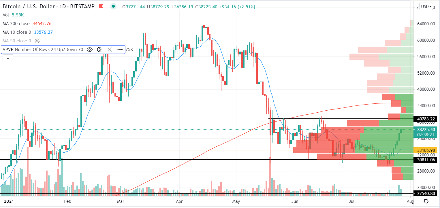
If you look at the Bitcoin chart you will see volume like bars on the right side of the chart, they are colored green and red.
The basics of it is green shows buy volume, while red show sell volume.
You can set the parameters however you like, but I went with the default setting in regard to the number of rows it shows and range.
You will also see a yellow line, this represents the price area with the most volume in the specific range you have showing at the time.
I set the chart to just show 2021 for the most part so I could see what price the most volume has occurred. To no surprise its in the mid 30K which is where about 4 months worth of action happened between the last few months and the first month of the year.
I'm still learning the details or this, but this is the basic understanding I have thus far.
Should be interesting as I get into it more as seeing the buy/sell at certain price levels can further help me identify support and resistance levels.
Posted Using LeoFinance Beta
Coming from a forex trading background, volume has never really been on my radar.
As crypto is also a massively decentralised market, do you find these volume indicators to be useful?
Are they per exchange or what?
Posted Using LeoFinance Beta
Thanks for the signal
Posted Using LeoFinance Beta