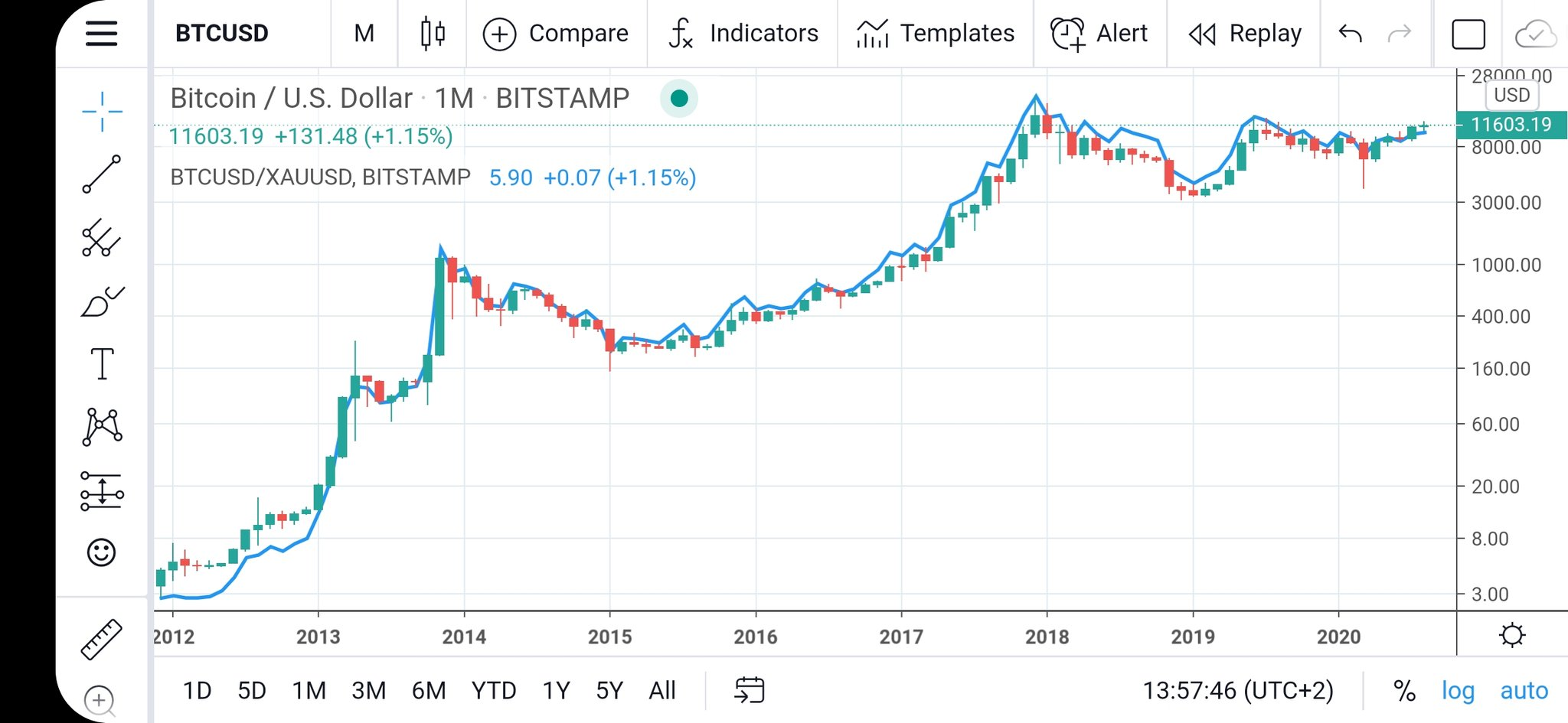
The graph of BTC in Gold looks the same as BTC in terms of USD
How's this for crazy!
The chart of bitcoin in USD is almost the exact same as the chart of bitcoin in gold.
Not only that but the moves pretty much have happened at the same times as well.
Sees:
(Source: https://twitter.com/100trillionUSD/status/1300041490970836992/photo/1)
The really interesting thing is that the price of bitcoin in USD just jumped over the price of bitcoin in gold after lagging it for months and months.
What does this mean?
Possibly that gold is overvalued?
Or possibly that bitcoin is undervalued compared to gold?
I'm not sure exactly what it means but it's the first time it's been over that line in years actually.
It looks similar to the setup we saw back in 2012.
Look what happened from there.
Posted Using LeoFinance
0
0
0.000
Congratulations @jondoe! You have completed the following achievement on the Hive blockchain and have been rewarded with new badge(s) :
You can view your badges on your board And compare to others on the Ranking
If you no longer want to receive notifications, reply to this comment with the word
STOPTo support your work, I also upvoted your post!
Do not miss the last post from @hivebuzz: