Layout & Ad Placement Suggestions To Improve Results

In my previous article I talked about LeoFinance site metrics such as bounce rate and time spent on time, but I also talked about CPM & Ad Revenue and I explain thoughts and ideas on how to raise CPM and increase your overall Ad revenue. Within the comments, I was asked a question:
What changes do you think is most crucial to improve the metrics even more @hitmeasap?
I obviously replied to the comment with some of my ideas, but to bring more awareness and to highlight some of these things even further, I decided to do a post about it. So, this time I'll talk about some suggestions I have to improve the overall results for LeoFinance.io, but this doesn't only suit LeoFinance, this is actually more or less what I would recommend to any other Hive community or tribe out there, if they were interested in Ad revenue and improved site metrics.
Ad Placements And Site Layouts
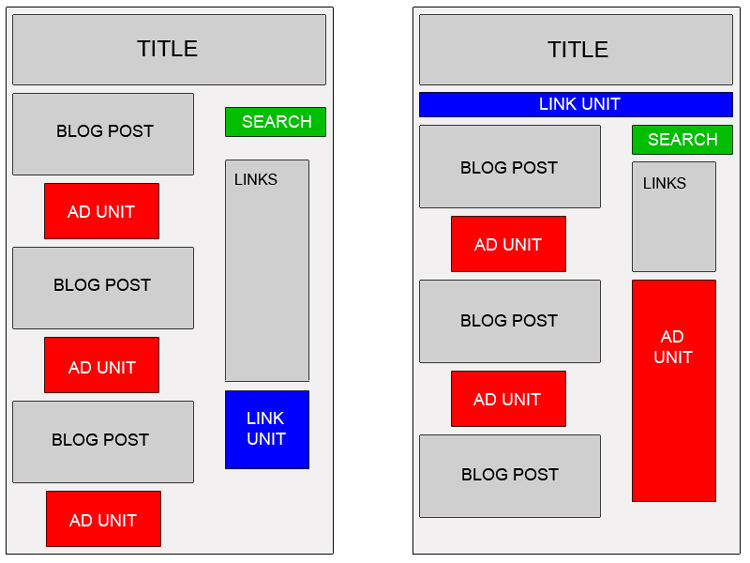
This design or layout is pretty much what you usually strive for when it comes to simple, effective and user-friendly websites or blogs, if you are looking to earn Ad revenue from your site. It's some sort of 'standard' for sites these days.
If you compare that to how LeoFinance looks today, you can see several similarities:

However, one of the biggest mistakes according to me, is to not have visible ads immediately on the front page. As things are today, you have to scroll down 15-16 posts before you see the first ad:
After that, you'll have to scroll down another 15-16 posts before you will see the next ad, and that is a big mistake according to me, because you miss out on impressions from people who are not scrolling down a bunch of posts. We all know that most people are not searching on page 2, 3 or 4 on google whenever they search for something. They look at the search results on the top of the first page.
The same thing goes for LeoFinance, Hive or other communities as well. The posts that are showcased on the front page are the popular ones. As curation is as simple as just "liking" (upvoting) content, and we know that the "common saying" is that you can vote 10 times per day if you want to use all your vp, it is not likely to see the majority of the people scrolling down 15-16 posts on the front page.
I would recommend something like this instead:
You would obviously have to make room for a decent-sized ad, but by having ads in a position like this you would most likely yield more impressions in total, as the ad would be visible from the moment someone visits LeoFinance.io. That leads to more impressions, hence more Ad revenue.
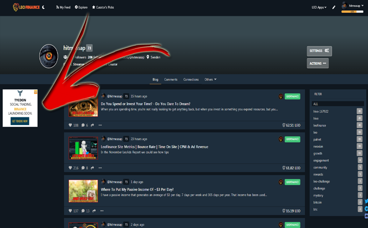
The screenshot above shows you how it looks today if you look at a profile.
While this is a good position for the ad, as it is placed at the top and being visible the second someone looks at a profile, I would change the position for the ad, as this looks a bit out of place according to me.
I would go for something like this instead:
Even though this might not affect the amount of impressions, this looks more clean and polished according to me and it keeps the professional and smooth look of the site without the ad to the left.
I would probably think about deleting the filter to the right as well, as I have never used it personally, but there might be others out there using them.
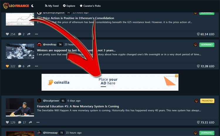
This is how it looks when you're about to read an article on LeoFinance after the most recent update. A good change according to me, and a change that is likely to reduce the bounce rate.
However, there are no ads within articles, which is a good thing as you don't want to overuse ads, but the ads are placed at the bottom of the article, between the article and the comment section:
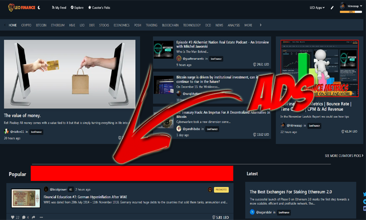
After that, you have ads within the comment sections as well, depending on the amount of comments I pressume(?), and that is not something I would change, but I would try to make changes at the top of the articles, and utilize some of that space for ads instead, like this:
This would definitely affect the amount of impressions you get on your ads, as everyone who reads an article starts at the top before scrolling down. However, there are no guarantees for content consumers to read entire articles from top to bottom, so you might miss out on impressions if the ads are at the bottom of the articles like they are today.
The last thing I would do, which has nothing to do with ads, is to add a floating menu, which basically is a menu that follows you while you scroll down the article. Something like this:
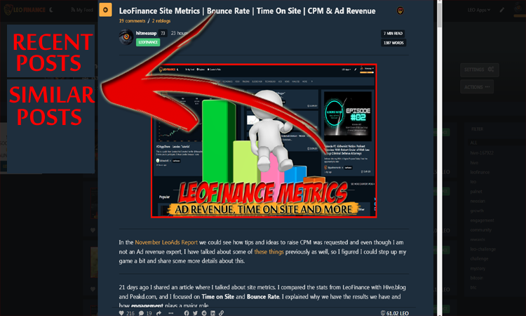
As you can see in the screenshot, I would add both recent posts and similar posts from other authors, based on the first 2-3 tags or perhaps even better, based upon certain keywords you could use to display content like that. This would not only potentially reduce the bounce rate, which this new update already does, but it would also help users to navigate easier and it would help to increase the overall time spent on site, as content consumers wouldn't have to search- or browse for others articles to read due to the recommendations they already got.
Hence, the chance for a reader to stay would increase.
Posted Using LeoFinance Beta
Haha, nice that you actually made a post about the things we talked about :)
Hope they will take some of your advice here in future updates of Leofinance
Posted Using LeoFinance Beta
Of course! I told you I had plans on doing that.. :D
Posted Using LeoFinance Beta
You'd recommend ads on popular pages right? Since there's more likeliness that people would actually prefer staying on the trending pages. And also placing the ads on tops of the post?
Well I don't know I think it's a great idea but then maybe the ad placements are put where they previously are for a reason. But then we can always tilt it to cover more better ad revenue.
Posted Using LeoFinance Beta
You mean for specific posts?
I don't think that is necessary if you place the ads on top of the posts instead of the bottom. That way you cover all posts, popular, hot or not.
Posted Using LeoFinance Beta
Congratulations @hitmeasap! You have completed the following achievement on the Hive blockchain and have been rewarded with new badge(s) :
You can view your badges on your board and compare yourself to others in the Ranking
If you no longer want to receive notifications, reply to this comment with the word
STOPDo not miss the last post from @hivebuzz:
What's your opinion on adblock detectors? Eg show a banner explaining why people should disable adblock if it's enabled As a placeholder for the actual ad banner
I don't know.. I mean, it makes sense to have adblock detectors, but everyone knows that people aren't likely to disable adblockers just because someone asks you to do it. They are more likely to disable adblock if and when they have established some sort of relation with you, or when they trust you..
So I don't think it would benefit LeoFinance much for instance.
Posted Using LeoFinance Beta
Mh, I think many leo holders or bloggers are not aware that the ads actually help their investment (either time or money or both). So it could help in a sense. Maybe a link to leowiki with an explainer
That is actually a very good point, I thought of it differently. I thought more like people would know how it benefits us, so they would disable their adblockers without having adblock detectors, but you have a really good point, most people, especially newcomers wouldn't know at all..
I like the idea!
Posted Using LeoFinance Beta