A PolyCUB UI adjustment suggestion (token claim buttons)
UI is not a really critical thing for a defi platform, but sometimes it matters much more than we thought since average Joes use UI for daily operations and a good UI design not only can save time for users, most important of all, it can avoid tragedies ... >_<~~~~
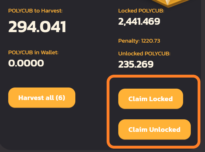
So there is a small adjustment suggestion for PolyCUB UI home page that I think of a while ago. There were a few times when I was not really focused, I almost made the mistakes of claiming the LOCKED POLYCUBs!
Fortunately, almost. :)
Now it looks like this:
And if we rearrange it like the following (hypothetical view edited by me). Might save a lot of careless users.
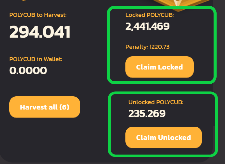
If the colors can be made different, even better! :D
Posted Using LeoFinance Beta
I would love too if it happens per your suggestion
Posted Using LeoFinance Beta
Great suggestion there!!
Congratulations @d-company! You have completed the following achievement on the Hive blockchain and have been rewarded with new badge(s):
Your next target is to reach 4750 upvotes.
You can view your badges on your board and compare yourself to others in the Ranking
If you no longer want to receive notifications, reply to this comment with the word
STOPCheck out the last post from @hivebuzz:
I have no idea how it happened, but one day I have discovered all my ~9000 locked Polycub's been claimed.
Murphy never sleeps
Posted Using LeoFinance Beta
that's really ouch! I forgot where would those 4500 PCs go? to the xPC holders? Anyway, the community would love you to make more mistakes... lol
Posted Using LeoFinance Beta
Fair point, I would love to see it changed. Your suggestion makes a lot more sense!
Posted Using LeoFinance Beta