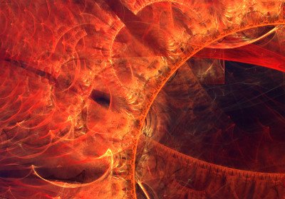
A Fractal to the Left, and a fractal to the right.
This fractal was designed rather quickly, while I was at work and without anything better to do. Do not tell anyone!
What took a lot of time though, was the rendering. I usually render my fractals in high resolution (4000x2500 px, ~10MP), with high quality settings and, well, this takes a lot of processing power. This one was left rendering for 18 hours until it reached a quality value of 100,000 (as measured in JWildFire, the fractal app). To be honest, after a quality of 10,000 there seems to be no difference, but I said "wtf, lets leave it on until tomorrow morning!"
In my last post I mentioned the "Brightness" setting, so today I will show how Brightness & Quality relate (screenshots are below the fractal picture). As always the fractal is made exclusively in JWildFIre with no post-processing, except the addition of the frame.
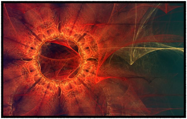
Fractal to the Left
by @nyarlathotepA fractal made in JWildFire
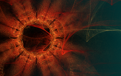
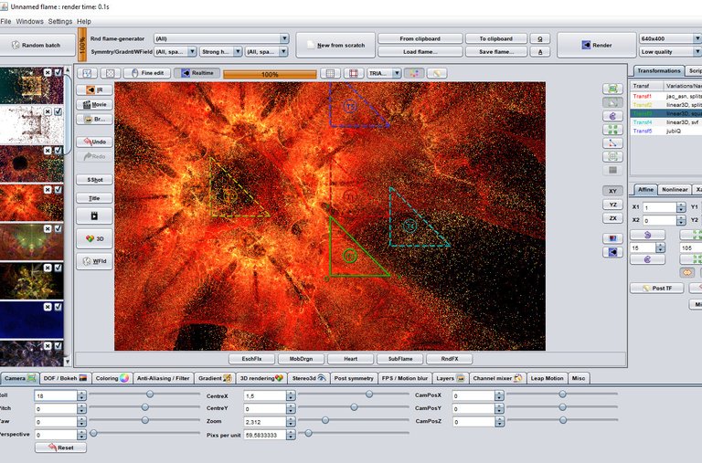
Here is a quick render with "Brightness:1" "LowBrightness:0" and "Quality:100." This is an extremely low quality, useful for previews & some cases where you want to give a dirty, rustic look to the fractal:
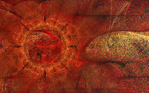
Changing to "LowBrightness:8" gives a result that is cringy for the eyes! Every pixel is too bright and because the quality is so low (10) there are not enough iterations over each pixel to get a better color result.
Now, if the quality is increased from 100 to 1000, we get the following result.
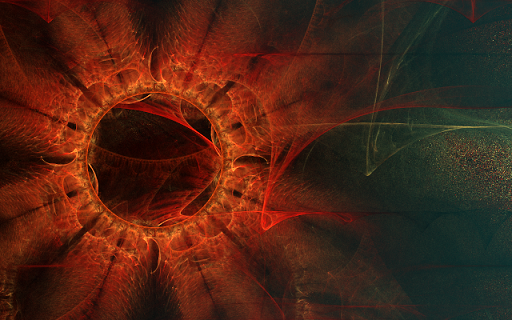
You can see how most of the pixels are properly colored now; also, some pixels that were dark in the first sample above are now more bright, but not overburnt. With more iterations, the colors find the proper values -- but, to the right side of the picture, you can see a bunch of pixels are inproperly bright, still. This can be corrected with an even higher quality setting. Knowing how these settings affect the final image, you can adjust Brightness & Quality to get the exact results you want for the "feel" of the fractal.
Lastly, a screenshot of the process within JWildFire as proof of originality in these suspicious times, and a detail of the high-resolution render. I hope you liked the fractal and enjoyed the comparisons!
The Stars are -almost- Right!
@tipu curate
Upvoted 👌 (Mana: 14/28)
This post was shared in the Curation Collective Discord community for curators, and upvoted and reblogged by the @c-squared community account after manual review.
@c-squared runs a community witness. Please consider using one of your witness votes on us here
more effort and more impressive...😀