Hide and Seek | Drawing with the Note 10+
I intend for this particular post to be a long one, so if you're ready and are a willing reader, then please join me as I talk about my latest digital painting. Because it was a long ride creating this, I wanted to be more detailed about how I managed it.
Let's start with the concept.
Hide and Seek
The words "I'm ready!" were left hanging in the air. She waited and waited some more, with irrevocable faith that someone would come find her. But she was hidden in a place that was difficult to come by.
She called out again, "I'm ready!" and it rang everywhere.
She waited, and wondered when the game would end.

hide and seek on KnownOrigin
The idea comes from another Japanese song called Kakurenbo (かくれんぼ) by Yuuri (優里). The song talks about someone's loneliness after heartbreak and describes it as though it's a game of hide and seek. He's looking for someone, but he can't find that person. He's waiting for the words, "I'm ready!" but they never come. He wonders when the game will end.
And I thought... what if it's the other way around? What if you're the one hidden, yelling out "I'm ready!" But nobody comes? And you're running out of time, else you'll drown just by being rooted to the very same spot in forever.
I wanted to touch on that in this piece.
Drawing Hide and Seek
The artwork cumulatively took more than 30 hours of work in a span of 4 days. It was honestly a challenge I was very willing to take. It has been, after all, a while since I drew anything like this.
Part of me wanted to do some detailed painting,and I tried my best to indulge that want in here.
Concept
I normally sketch while thinking up of what to draw, and Yuuri's song Kakurenbo happened to play on Spotify. As earlier mentioned, I wondered what if the opposite of Yuuri's song happened? With that question I wanted answered, I started thinking up how to play around with it.
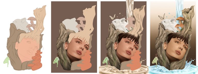
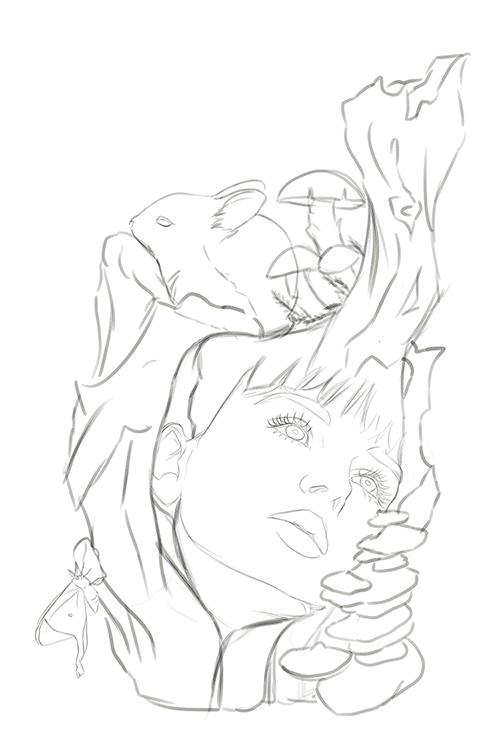
There are, overall around 10 layers for the sketches alone. There are so many things I wanted to include but had to think twice about in the end.
Painting
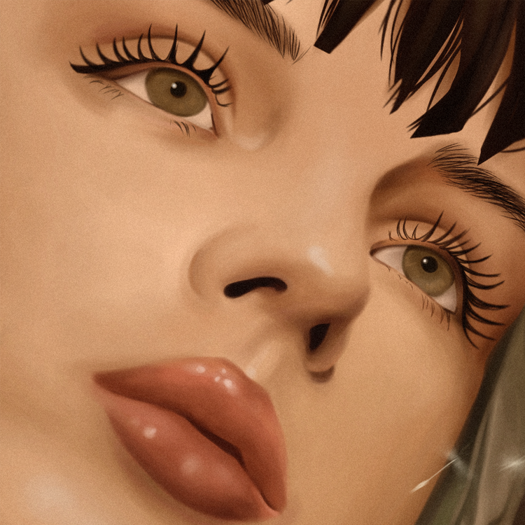
I started with the face. If it didn't turn out right, I might have to scrap the whole thing. I have that kind of tendency where I beat myself up over minor mistakes, and I end up losing motivation. Boy, was I glad I liked how the face turned out. So I went on.
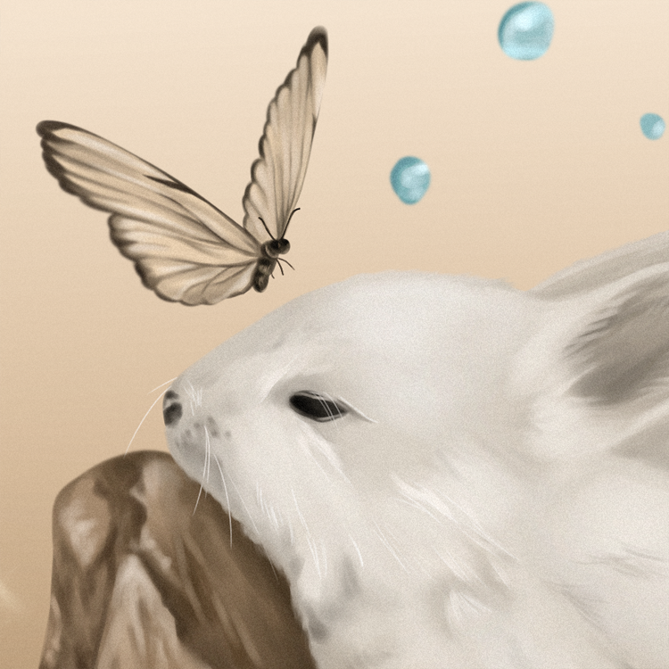
The next thing I worried about was if I would be able to pull off the details on wood. I had little confidence I could make it work, but I tried anyway. And... it surprisingly worked. The ridges, nooks and crevices turned out all right, so I went on ahead with the luna moth.
Did you know? A luna moth represents spiritual transformation and striving for truth. It felt fitting to include that, so I tried to find a way to incorporate it in the overall picture.
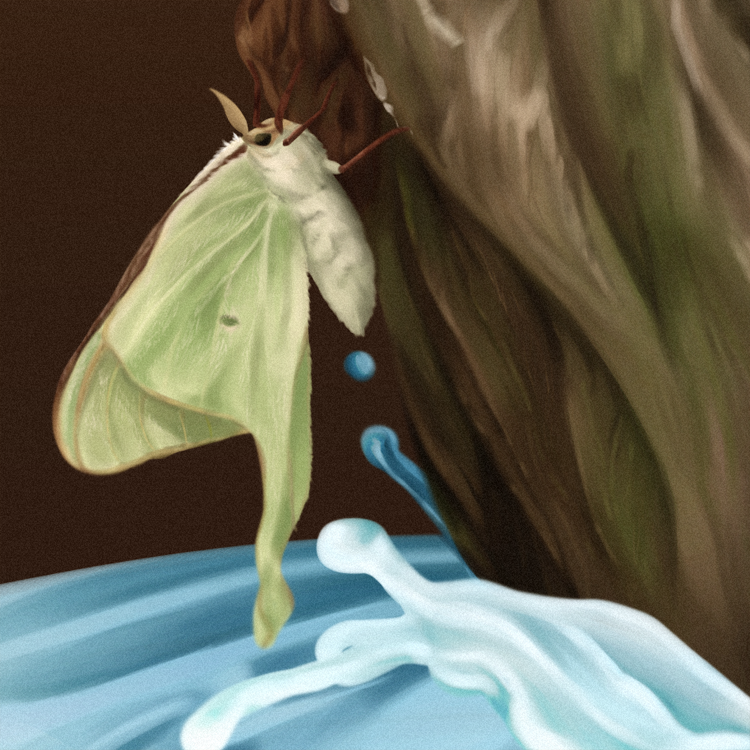
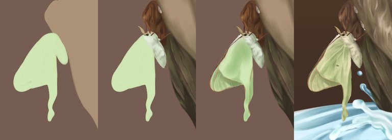
Even a luna moth's wings are hairy, so I couldn't just leave out that kind of detail. Thankfully, MediBang's watercolor brush worked perfectly for that kind of job.
After painting the whole left block, I started getting a more vivid picture of how I wanted it to really look like. There were elements I felt were missing, so I added them in belatedly.
I painted water falling from above, and splashes of water flooding at the bottom. I wasn't exactly happy about how it looked, but I thought it was acceptable. But something still felt off.
The water didn't fit. I changed it in sepia tone, and for a while, it worked. With the water in brown tone, I went on with the rest of the painting, this time, moving forward to the bunny and an additional brown butterfly.
Again, I think the watercolor brush turned out to be a pretty powerful tool. I managed to include the "hairy" details without adjusting any settings from the watercolor brush.
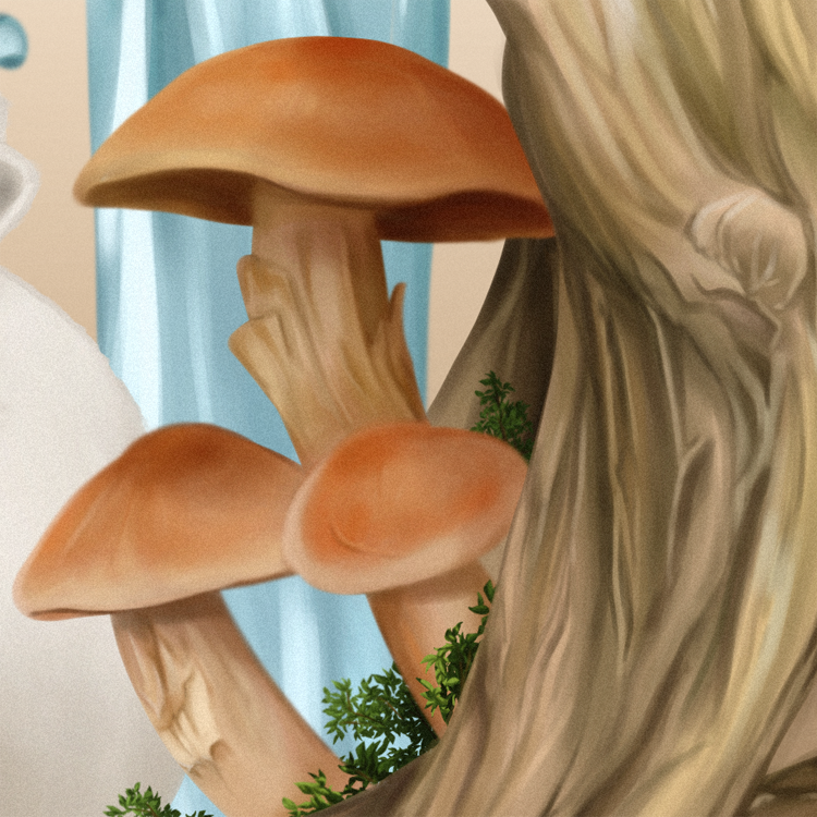
Now that I think about it more, I painted the whole thing in a clockwise manner. After the butterfly and bunny, I move to painting the mushrooms and some leafy stuff. Then moved again to the rest of the tree trunk.
Initially I was about to include some polypores, but I had to scrap them because it didn't look right.

After that, I just generally have the whole picture. I just had to polish and think up of ways to make it look a little more well-put together. I think that was the hardest part.
Looking at the bigger picture, I ended up thinking about how it would look nice if I revert the water back to being crystal blue. So I adjusted back its hue and I thought it looked more all right.
It still felt lacking, so I added in dandelion seeds floating in the air. I believe in dandelion seeds carrying our wishes. If I added it in, it would complete the message. So I did.
Black or white?
I was confused. At first, I wanted it to be transparent. But it looked bland that way, so I let go of the idea. I played around with a lot of colors and realized that it would work better with either white or black backgrounds. Just... which one?
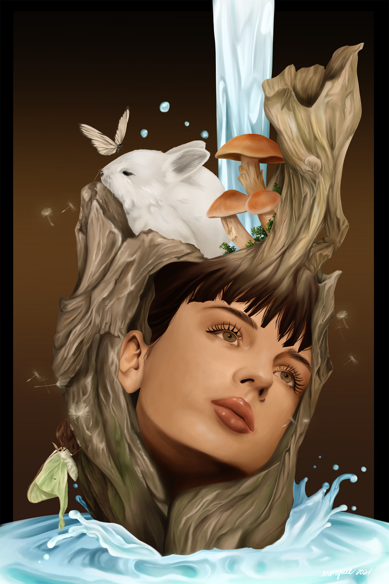
I asked some friends for their opinions, and one of them told me that the black one was dramatic, the white one, refreshing. They came to a unanimous decision: go with the white.
How about you? If you were one of the persons I asked for initial opinion, which one would you choose? And why?
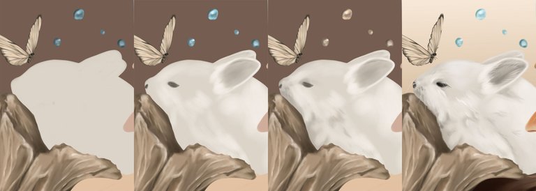
Finally, here's how the whoooole process went, in a GIF. As always, I would start with base colors and paint on them.
Minted in 1 edition
I got this minted in 1 edition over at KnownOrigin.io. This is the second artwork I put up for sale over there. The first one also comes in 1 edition.
Notes
I was pretty happy with this one. It definitely helped me relax... even though at the expense of back logs at work. I don't care. Lmao.

erangvee.carrd.co
ko-fi | twitter | instagram | nft showroom
Your content has been voted as a part of Encouragement program. Keep up the good work!
Use Ecency daily to boost your growth on platform!
Support Ecency
Vote for Proposal
Delegate HP and earn more
Wow! Nice work and beautiful presentation! You've just won a new follower. ♡