Participation in the OCD LOGO contest [ENG-ESP] Participación para el concurso LOGO de OCD
When I saw the contest proposed by @acidyo to design the new logo for OCD and POSH, I got excited even though I've been away from design for a while, beyond the thumbnails for HIVE or the logo for my mom. This contest is the opportunity to reconnect with the creation of logos; an area that I've always been passionate about, although it requires a lot of time and creative energy.
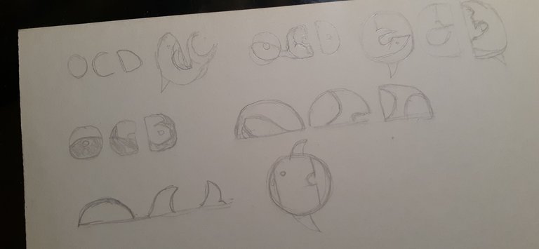
The moment I started the pencil sketches I felt a kind of pressure. I couldn't spend much time with paper; something was pushing me to take the computer. I'm very used to digital and I've lost the practice of manual work. I had the ideas in my head and I felt that they were not transmitted on paper, so I quickly went to the computer.
Cuando vi el concurso propuesto por @acidyo para diseñar el nuevo logo de OCD y POSH, me emocioné aunque tengo tiempo alejado del diseño, más allá de las miniaturas para HIVE o el logo para mi mamá. Este concurso es la oportunidad para reencontrarme con la creación de logotipos; un área que siempre me apasionó, aunque requiere de mucho tiempo y energía creativa.
En el momento que comencé los bocetos a lápiz sentí una especia de presión. No pude estar mucho tiempo con el papel; algo me empujaba a toma la computadora. Estoy muy habituado a lo digital y he perdido la práctica de lo manual. Tenía las ideas en mi cabeza y sentía que no se transmitían en el papel, por eso fui rápidamente a la computadora.
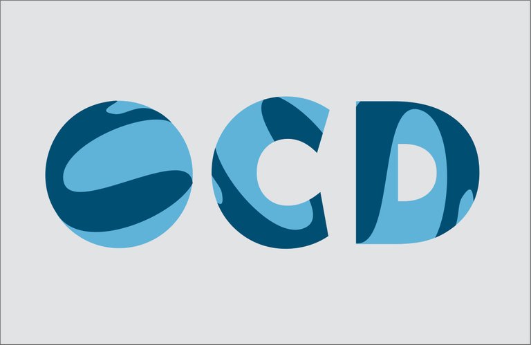
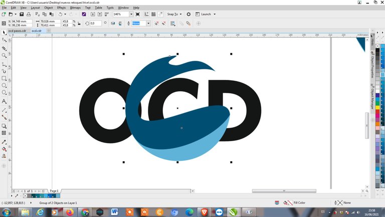
LOGO A
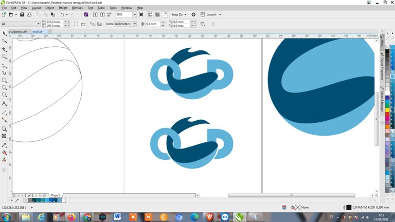
I made two logo proposals. In proposal A I have two options, clearly differentiated by a shadow.
This concept is based on my first idea, since I read the title of the contest and then confirm it by what is asked in the post. An integation of the whale with OCD.
Sketching I observed that with the whale I could form a C. What this logo expresses is the healing process of OCD, where it goes through one publication (The O) and goes to the other publication (The D). It does this in a harmonic way always through different publications, yet following a line in the healing work.
OCD's curation work also works to unite the platform, to establish a better idea of what quality is, it shows how it goes in and out of communities, leaving a strong support to drive great talent.
Two types of blues are used generating high contrast. A corporate blue representing the investors who delegate to the project and a sky blue to give it more freshness and approach to the common user who is curated by the whale. The typography is solid as the project, although quite rounded looking to express that support to the new creators.
Realicé dos propuestas de logotipo. En la propuesta A tengo dos opciones, claramente diferenciadas por una sombra.
Este concepto se basa en mi primera idea, desde que leí el título del concurso y después confirmarla por lo que se pide en el post. Una integación de la ballena con OCD.
Boceteando observé que con la ballena podría formar una C. Lo que expresa este logo es el proceso de curación de OCD, donde pasa por una publicación (La O) y va hacia la otra publicación (La D). Lo hace de forma armónica siempre por publicaciones diferentes, aunque siguiendo una línea en el trabajo de curación.
El trabajo de curación de OCD también funciona para unir a la plataforma, para establecer una mejor idea de lo que es calidad.Se muestra como entra y sale de las comunidades, dejando un fuerte apoyo para impulsar grandes talentos.
Se usan dos tipos de azules generando un alto contraste. Un azul corporativo representando a los inversores que delegan al proyecto y un azul cielo para darle más frescura y acercamiento al usuario común que es curado por la ballena. La tipografía es sólida como el proyecto, aunque bastante redondeada buscando expresar ese apoyo a los nuevos creadores.


This is how the logo would look on the profile. - Así se vería el logotipo en el perfil.
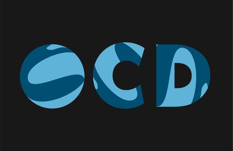
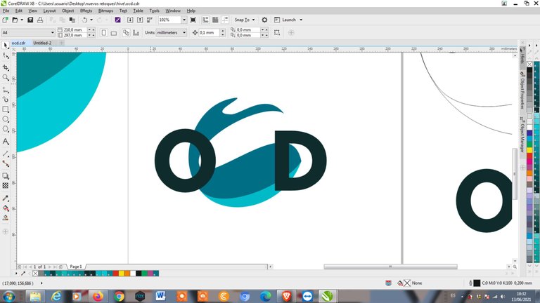
LOGO B
The following proposal is based on the use of the initials without external elements. In the O we find the three letters, created by the whale and the negative spaces of the O.
This whale and spaces are repeated in the following letters with different directions. It expresses the variety in healing, the different communities taken into account. The simple use of the letters gives it strength.
The same colors were used as in the previous proposal, to express the same thing. Two examples are created with gray backgrounds, one light and the other dark. Both work well and are legible.
La siguiente propuesta se basa en la utilización de las iniciales sin elementos externos. En la O se encuentran las tres letras, creadas por la ballena y los espacios negativos de la O.
Esta ballena y espacios se repiten en las letas siguientes con diferentes direcciones. Expresa la variedad en la curación, las distintas comunidades tomadas en cuenta. El uso simple de las letras le da fuerza.
Se usaron los mismos colores que con la propuesta anterior, para expresar lo mismo. Se crean dos ejemplos con fondos grises, uno claro y el otro oscuro. En los dos funciona bien y es legible.
This is how the logo would look on the profile. - Así se vería el logotipo en el perfil.
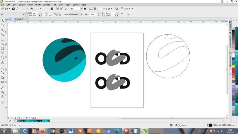
Steps
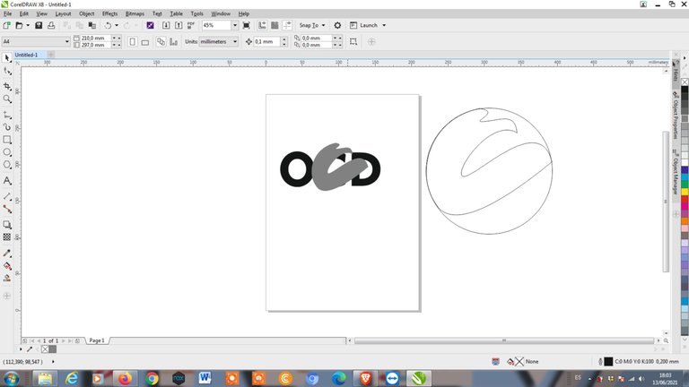
My first idea was to create a circumference where the three letters would meet and a whale would be integrated. While I was drawing the whale I realized I could make a C and I placed what I had done, over the C of OCD. I saw that it could work and that the C could play more with the other letters.
I continued designing the circumference to finish that idea. I would have time to develop the new idea that came up.
After "finishing" the integrations inside the circumference, I started working on the whale that would be the C. I realized that I would have to lengthen the tail, though always keeping it inside a circumference. By making the tail thinner so I could introduce it into the O; I observed that it had a better shape, more elegant, bigger and more powerful; less childish and more corporate.
From that moment on I only used that shape for the two proposals. There was a moment when the file was deleted and I had to start again. I only had the screenshots, that's why you see a difference in the colors.
That's how I developed this design concept, to be harmonious within the circle of the user avatar.
I hope the @ocd team likes it. I hope I have time to design the POSH one.
Pasos
Mi primera idea estaba en crear una circunferencia donde se encontaran las tres letras y que estuviera una ballena integrada. Mientras dibujaba la ballena me di cuenta que podía hacer una C y coloqué lo que llevaba hecho, sobre la C de OCD. Vi que podría funcionar y que la C podría jugar más con las otras letras.
Seguí diseñando la circunferencia para terminar con esa idea. Ya tendría tiempo para desarrollar la nueva idea que surgió.
Después de "terminar" las integraciones dentro de la circunferencia, comencé a trabajar en la ballena que sería la C. Me di cuenta que tendría que alargar la cola, aunque siempre manteniéndola dentro de una circunferencia. Haciendo la cola más delgada para poder introducirla en la O; observé que tenía una forma mejor, más elegante, más grande y poderosa; menos infantil y más corporativa.
Desde ese momento solo usé esa forma para las dos propuestas. Hubo un momento que se me borró el archivo y tuve que comensar de nuevo. Solo tenía las capturas de pantalla, es por eso que ven una diferencia en los colores.
Fue así como desarrollé este concepto de diseño, para que sea armónico dentro del círculo del avatar de usuario.
Esperando les guste al equipo de @ocd. Espero que me de tiempo de diseñar el de POSH.
My preference goes to logo A (just my 2c 😉)
(just my 2c 😉) ummmm I think I understand 🤣🙈
Me encanta.. y definitivamente me quedo con la primera opción pero el logo B con las sombras... es muy lindo y muy completo... éxito en el concurso☺🤗