Logo Design Process: jr.node (minimalist-negative-space)
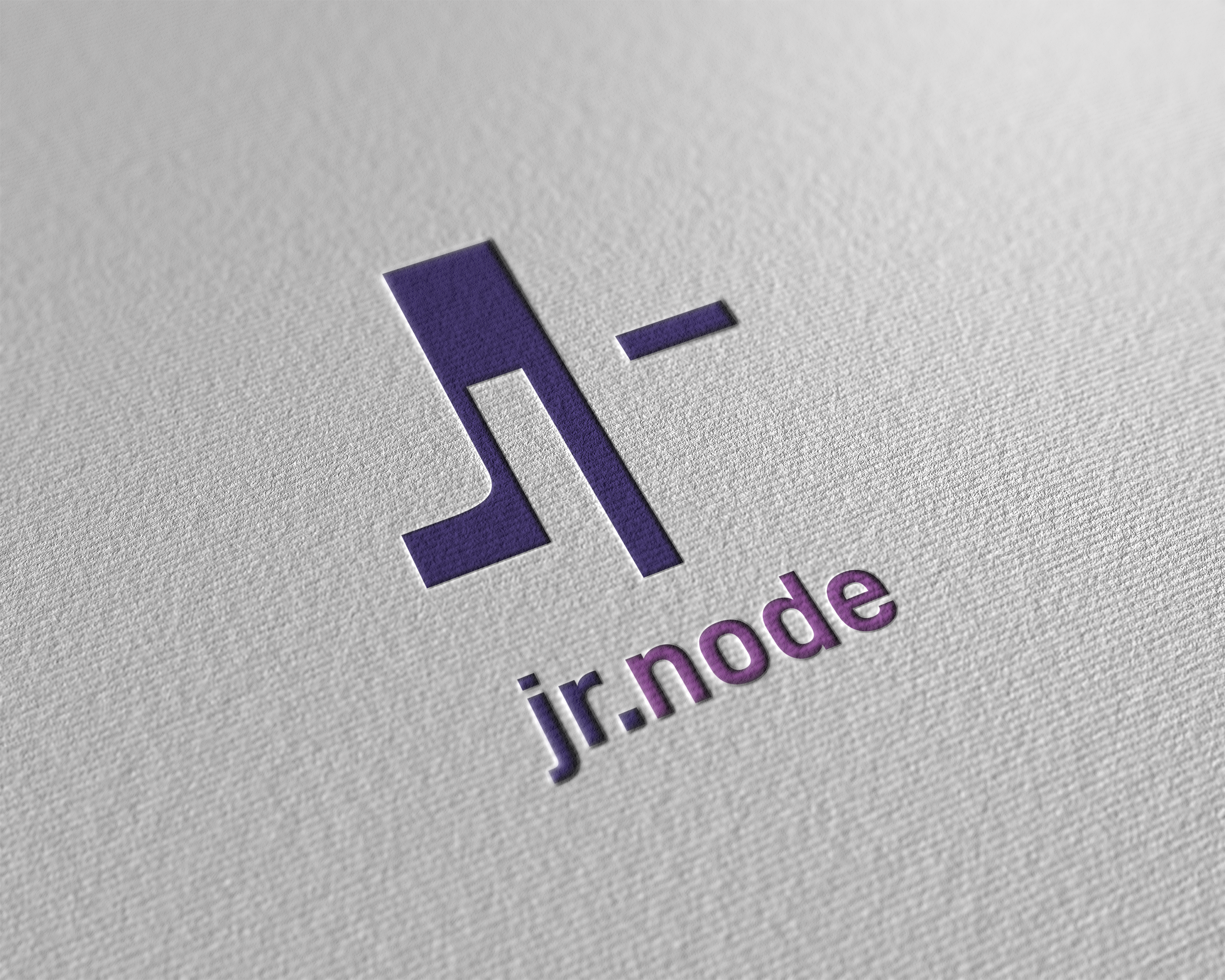
I've never done anything professionally in graphic design or the like, but have been interested in it for a while. I mainly design logos with a focus on negative space. That just appealed to me a lot. In principle, I only design for people I know personally or when I feel like it. Very often I just get an idea that I then put on paper or I start some random design out of nowhere.
That's what I want to show you in this post once very roughly. The interesting thing about the process "Random Design" is that creativity is not limited and you don't have any guidelines. Usually I do such a sprint within an hour, sometimes a little longer, sometimes a little less long.
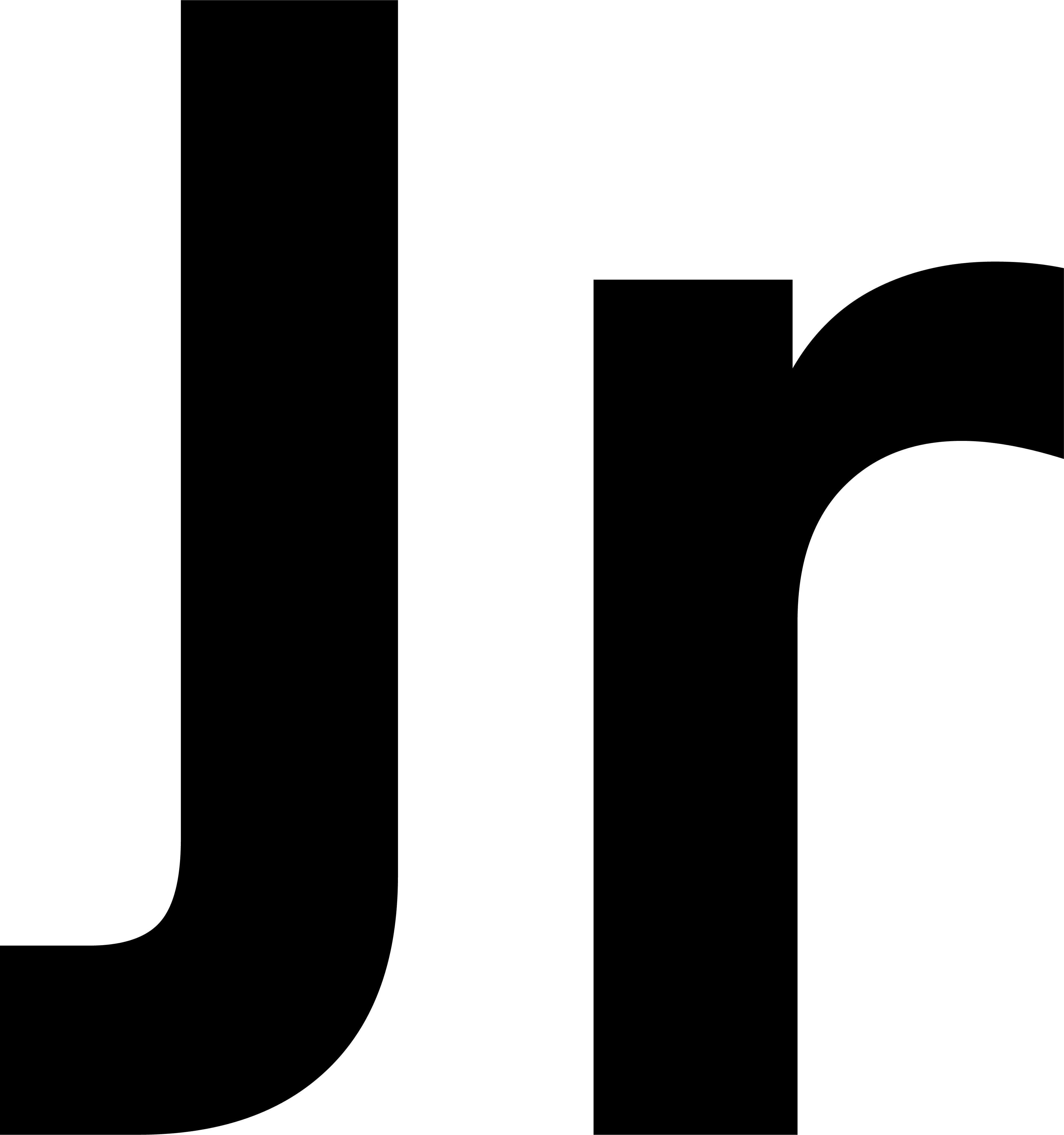
I start with a baseline. In this case I decided to design a logo for "jr.node". My starting point in this case are the two initials J and R:
On this basis I now develop a simple idea, which mostly ends in a minimalistic negative-space design. Finally, I play around with this design until I have a result that I like.
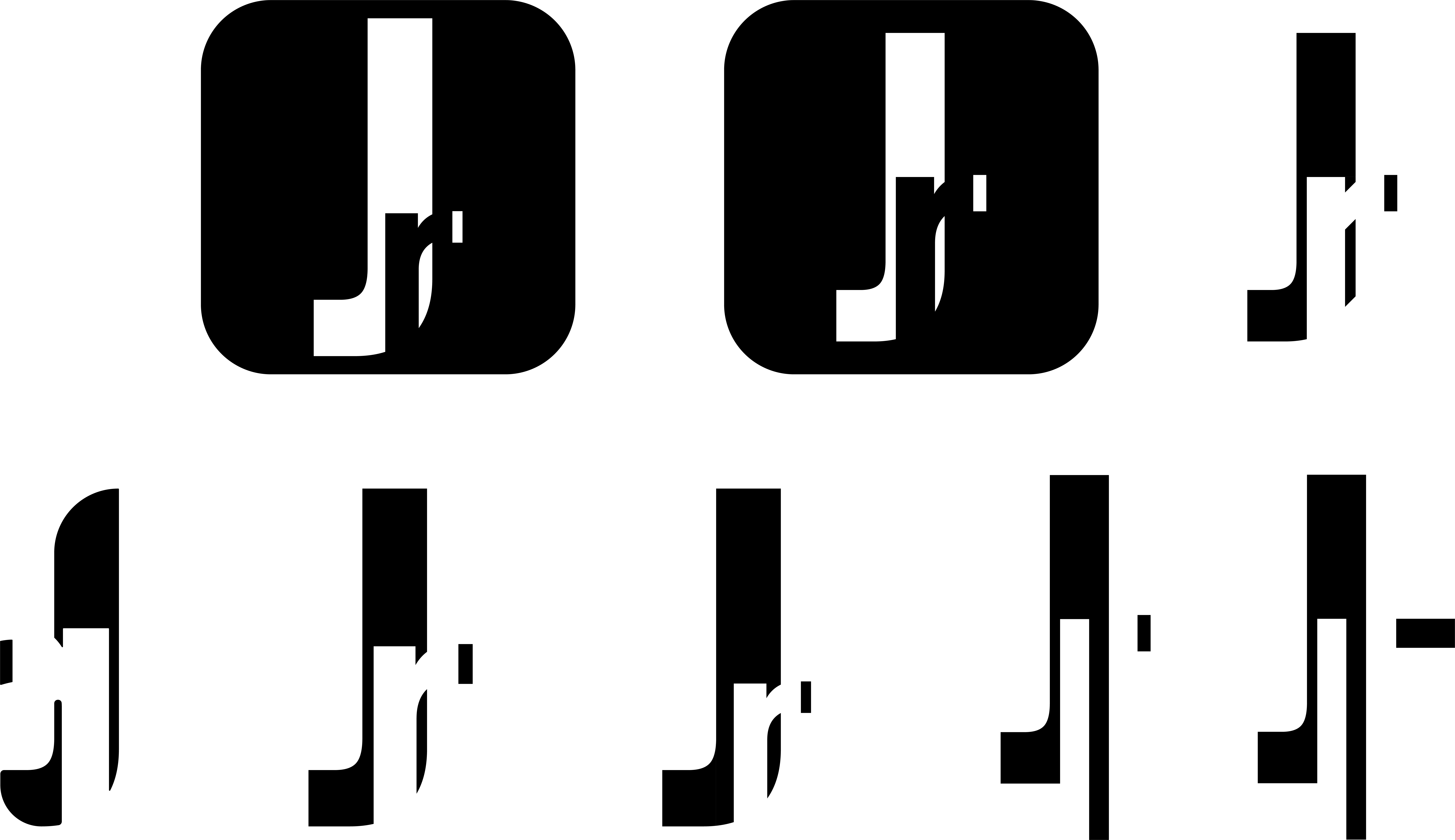
Typically for me, I choose the design in which you can see the least of the original idea, namely the negative-space R in the J. I'm not sure if this is the right one. However, I really liked the bridge between node and note here. And from my perspective, you can definitely see that it could be a note. The JR is more difficult.
A note on this: unfortunately, this doesn't really work in commissioned work, and recognizing the actual symbolism would be fundamental to the effect of the logo. That's why you should always focus on preserving the actual message or adapting it to fit the project/product.
Finally, with the design, I go into the color finding:
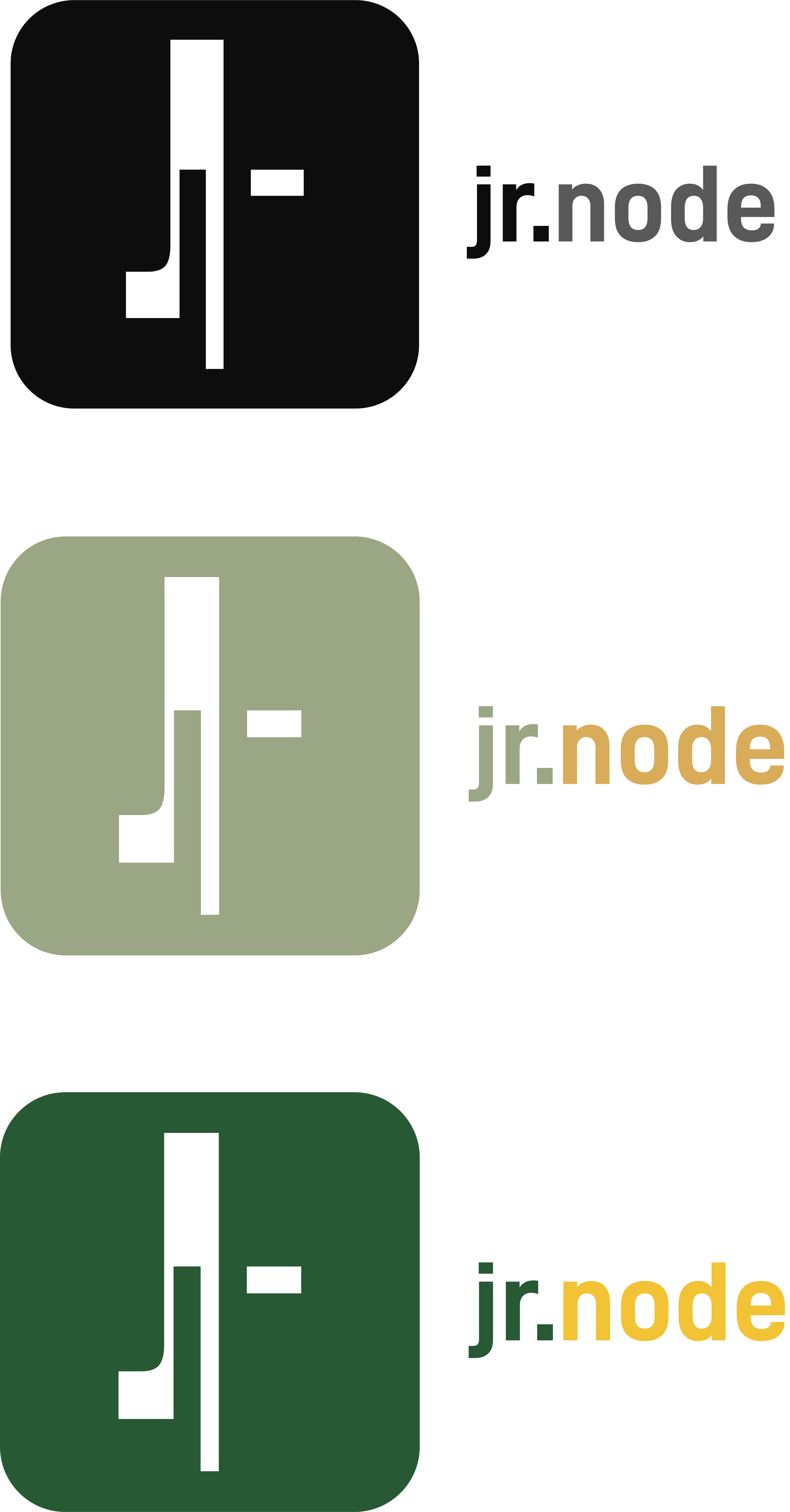
I quite liked these combinations. However, I decided to go with a combination of bright purple/pink tones, as you can see one image below. Actually, the choice of the font would be next, but since I am a convinced supporter of the font DIN, this is left out today. Instead, I look at the placement of the font:
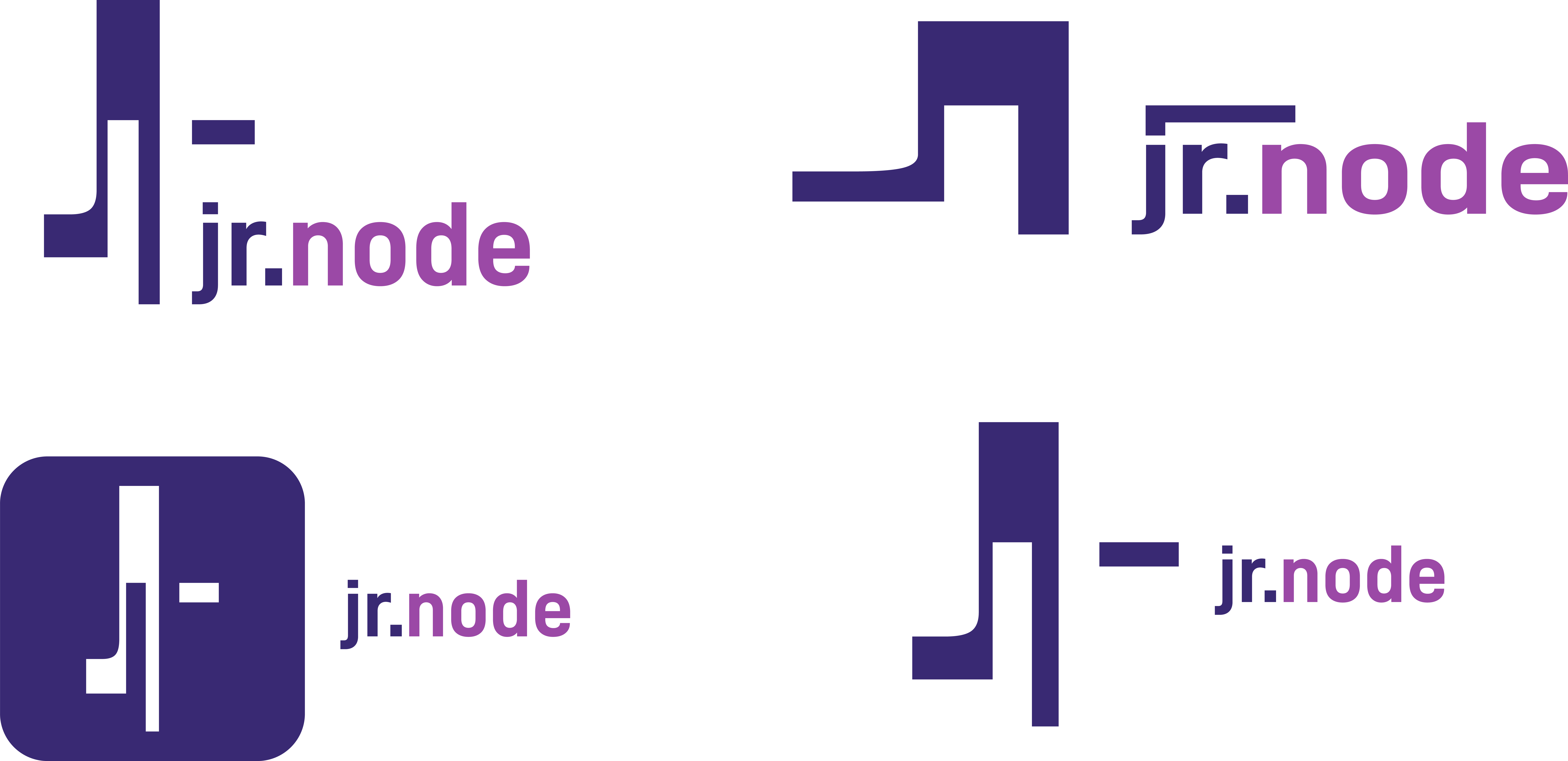
Based on the versions, I decide on the most appealing logo, which, if possible, also has good proportions. My choice here is the placement of the text under the icon.
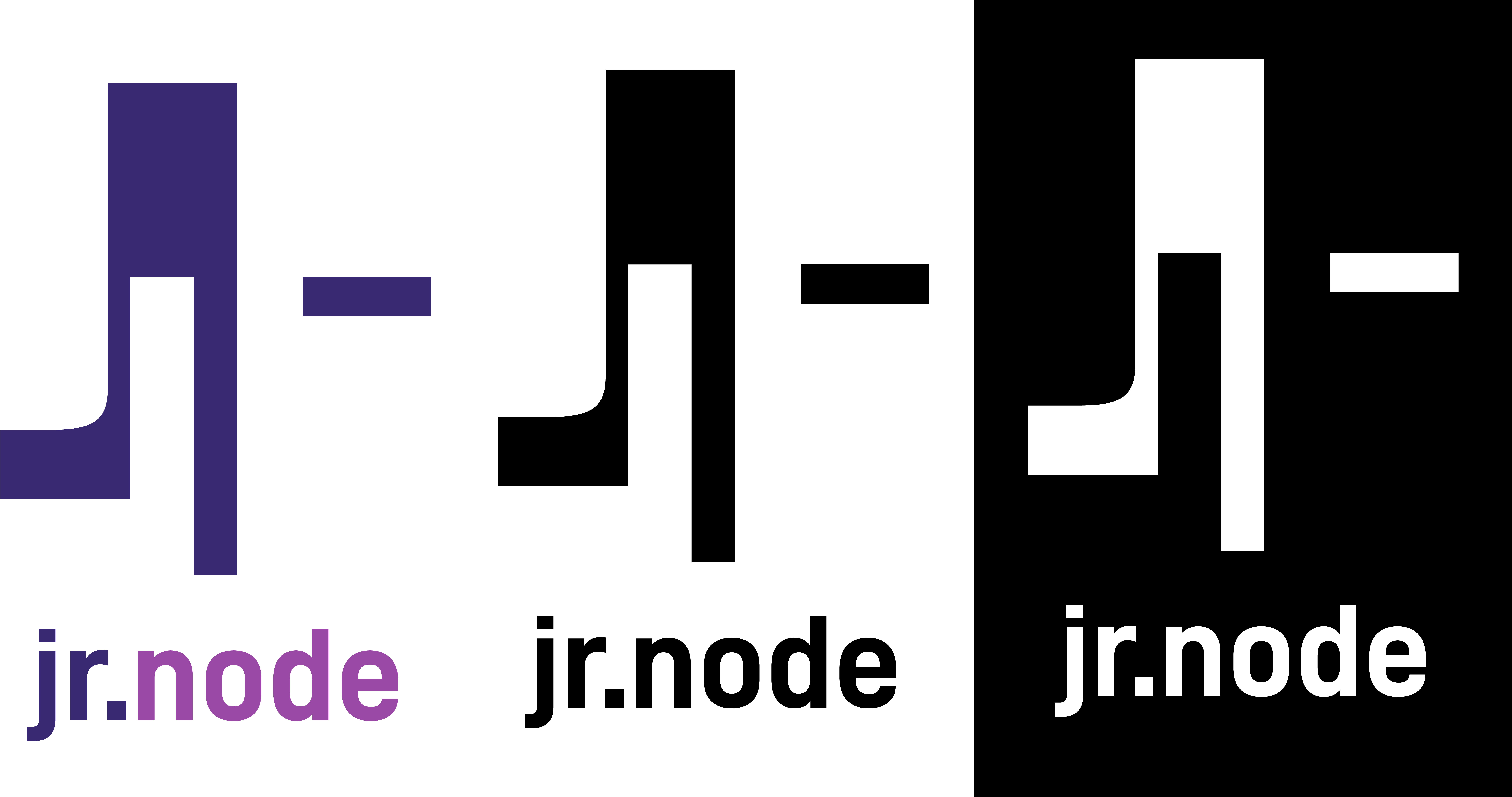
The final version always comes in three versions and usually with a mockup that shows a possible printed state, for example on a map.

Here again an overview of the whole process:

If you like the logo, you can also purchase it. Just write me in the comments.

Congratulations @st8z! You have completed the following achievement on the Hive blockchain and have been rewarded with new badge(s) :
You can view your badges on your board and compare yourself to others in the Ranking
If you no longer want to receive notifications, reply to this comment with the word
STOPDo not miss the last post from @hivebuzz: