Logo Critique: Paris 2024 Olympics
The Paris 2024 Olympics logo has just been unveiled. It's caused something of a stir! Here are my thoughts as a design lecturer:
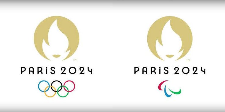
The left and right variants are the logos for the Olympics and the Para-Olympics respectively.
On the left logo, the Olympic rings look too prominent relative to the text. Mind you, that's when viewing on-screen at seated distances. The effect is probably not as noticeable when the viewer is further away because high-frequency changes, like the interconnections on the rings, tend to be dominant up close and recede at distance.
The typeface is deliciously art deco but just a little contemporary too. Paris is the birthplace of Art Deco. Maybe a little less art deco and more contemporary style would make the logo nicer, but at the cost of losing typographic contrast on all the other things that will use this typeface; signs, brochures etc.
As for the icon; any somewhat abstract shape is open to near-endless interpretations depending on what the viewer wants to see. In such cases, the designer & owner should be clear about what the meanings they intend are. Paul Rand says meaning flows from the thing to the logo, not the other way around. Here's what I see:
The Olympic flame in the negative space forming Marianne's face and she sporting a famous french haircut. It also celebrates that Paris was the first Olympics that allowed females to compete. The golden colour represents gold medals.
I looked it up their explanation is a gold medal shape, with an Olympic flame and the lips of Marianne.
Some of the negatives are; that the gold-medal-torch-lips icon, the text and the Olympic rings are in three very different visual styles. The horizontal separations do mitigate that with some risk of making the whole seem disconnected. I imagine that this logo will need quite some white space around it to avoid surrounding elements "pulling" things out of the logo.
The lips and flame combination might be seen as sexual, especially since the hairstyle could be associated with the free-love sixties. I see this interpretation in there, but don't think it's as dominant a meaning as the official one.
Overall: I like the logo! It will grow on people and will make more sense as the full visual system is used.
Posted using Partiko Android
Hi @eturnerx, a small upvote and a tip from the ADDAX trading game! Round 2 has closed - please sell your tokens asap if you still hold some.
$trendotoken
Congratulations @addax, you are successfuly trended the post that shared by @eturnerx!
@eturnerx will receive 0.73179450 TRDO & @addax will get 0.48786300 TRDO curation in 3 Days from Post Created Date!
"Call TRDO, Your Comment Worth Something!"
To view or trade TRDO go to steem-engine.com
Join TRDO Discord Channel or Join TRDO Web Site
A bonus $trendotoken tip from ONECENT!
Also consider MAPR fund and MAXUV vote bonds too.
MAP Steem FinTech: growing your STEEM without SP.
Congratulations @onecent, you are successfuly trended the post that shared by @eturnerx!
@eturnerx will receive 4.49811225 TRDO & @onecent will get 2.99874150 TRDO curation in 3 Days from Post Created Date!
"Call TRDO, Your Comment Worth Something!"
To view or trade TRDO go to steem-engine.com
Join TRDO Discord Channel or Join TRDO Web Site
To listen to the audio version of this article click on the play image.

Brought to you by @tts. If you find it useful please consider upvoting this reply.
Thank you so much for participating in the Partiko Delegation Plan Round 1! We really appreciate your support! As part of the delegation benefits, we just gave you a 3.00% upvote! Together, let’s change the world!
Hi @eturnerx!
Your post was upvoted by @steem-ua, new Steem dApp, using UserAuthority for algorithmic post curation!
Your UA account score is currently 4.981 which ranks you at #1173 across all Steem accounts.
Your rank has not changed in the last three days.
In our last Algorithmic Curation Round, consisting of 75 contributions, your post is ranked at #18.
Evaluation of your UA score:
Feel free to join our @steem-ua Discord server
$trendotoken
The hair also doubles as slightly demonic eyes. ;-)
Congratulations @busbecq, you are successfuly trended the post that shared by @eturnerx!
@eturnerx will receive 5.33725200 TRDO & @busbecq will get 3.55816800 TRDO curation in 3 Days from Post Created Date!
"Call TRDO, Your Comment Worth Something!"
To view or trade TRDO go to steem-engine.com
Join TRDO Discord Channel or Join TRDO Web Site
Congratulations @eturnerx, your post successfully recieved 10.56715875 TRDO from below listed TRENDO callers:
To view or trade TRDO go to steem-engine.com
Join TRDO Discord Channel or Join TRDO Web Site
반가웠습니다