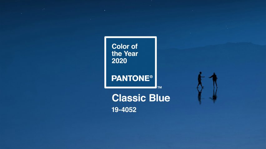
Classic Blue | Pantone Colour of the Year for 2020

Ahead of a challenging new era, Pantone have been mindful in choosing the Colour of the Year for 2020.
'Classic Blue 19-4052' is a reassuring, familiar colour. It is also classic, reliable, calm and relatable.
Colour theory is all about provoking a mood or a response by using colour. The choice of Classic Blue is a move to ease social anxieties of troubling issues that seem to be escalating in the world today.
Interestingly, in 1999 (20 years ago now!) Pantone chose a Cerulean hue in the lead-up to the new millenium, to offer a calming visual to offset the general anxiety of society ahead of the Y2K issue.
In my opinion, the Classic Blue is an apt choice as many turn to mindfulness and begin to prioritise 'me time' instead of glamourising the hustle. Many people are choosing to return to 'JOMO' - the joy of missing out, enjoying Hygge-style activities that are cosy, such as movie nights in with family and friends, simple pleasures of good meals and reading a good book.
Staying in, rather than going out, is the new preference. Time off social media is promoted ahead of constantly updating what you're up to online. Overseas travel is now shared with an odd photo update or two, rather than a whole album.
It will be an interesting trend to the design world, both graphic and interior.
'Constant and classic', is how I would sum up the hue.
Lettering and illustration by me :)
Below, image source here.


@tipu curate
Upvoted 👌 (Mana: 5/20 - need recharge?)
Thank you for supporting @CatsMakeKittens by being a part of our community @leysa.
Each CATS you purchase gets you daily upvotes from me @CatScientist as our community grows so do your rewards for being a member!
You have received a 0.17% upvote based on your stake of 115.76023270 UFM! Votes today: 1
$trdo
Congratulations @contrabourdon, you successfuly trended the post shared by @leysa!
@leysa will receive 0.33910650 TRDO & @contrabourdon will get 0.22607100 TRDO curation in 3 Days from Post Created Date!
"Call TRDO, Your Comment Worth Something!"
To view or trade TRDO go to steem-engine.com
Join TRDO Discord Channel or Join TRDO Web Site
wow !
Congratulations @leysa, your post successfully recieved 0.3391065 TRDO from below listed TRENDO callers:
To view or trade TRDO go to steem-engine.com
Join TRDO Discord Channel or Join TRDO Web Site
This post earned a total payout of 0.500$ and 0.376$ worth of author reward which was liquified using @likwid. To learn more.