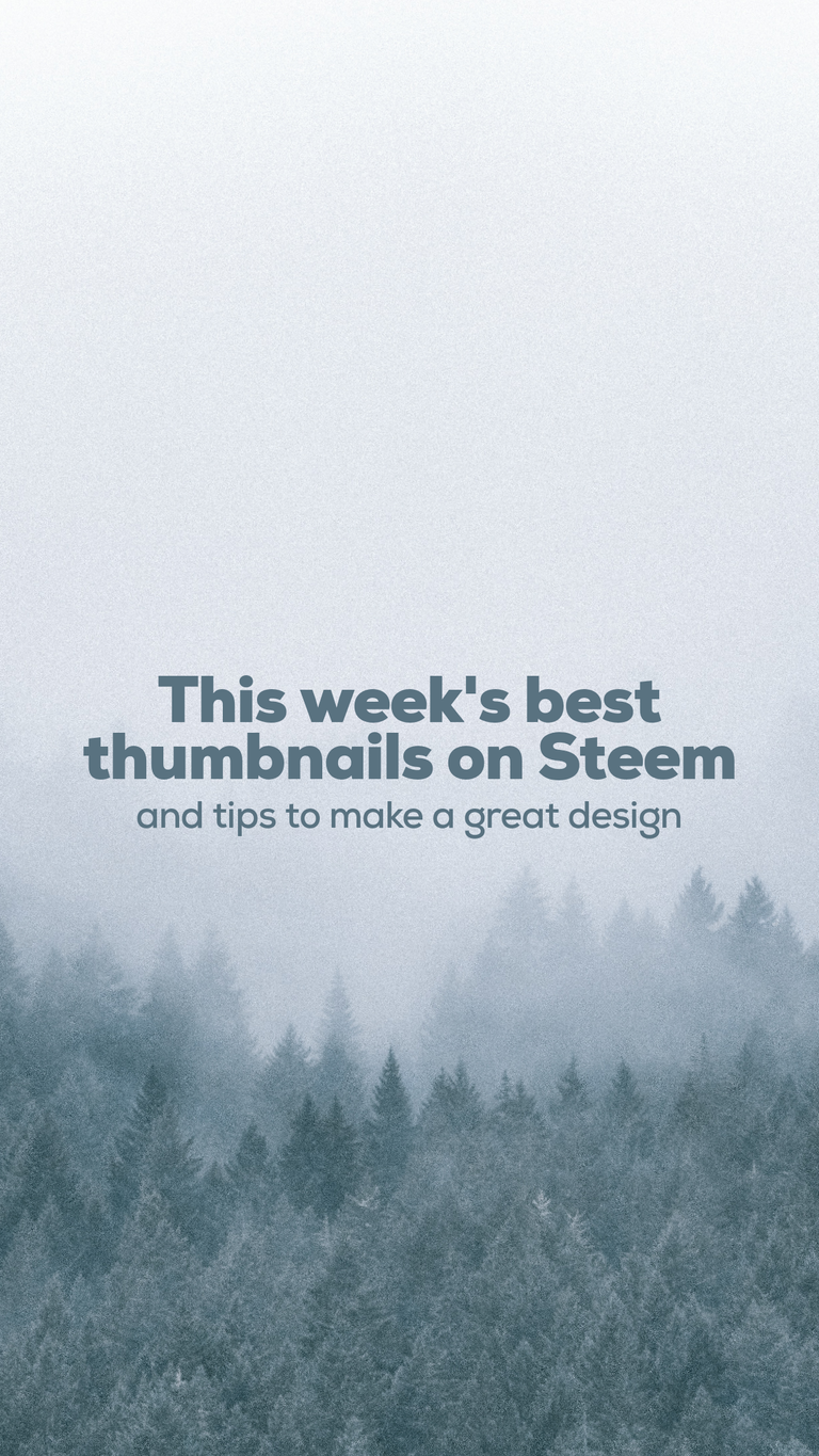
Steem's best thumbnails of the week: a weekly showcase + design tips + prizes on liquid Steem
The thumbnail is an essential element of a great post.
Hey guys, I've been thinking for a long time to do a weekly showcase of the six best Thumbnail designs from posts on Steem.
The time has definitively come now.
I've identified a painful point here on our Steem blockchain: the poor graphic design on most post's thumbnails.
If you go to trending (which is the face of Steem to the outsiders and newcomers), you'll only see a graphic design clusterfuck. This is unacceptable.
So, in order to foster good and simple practices of graphic design, every week from now on
- The best 6 thumbnails of the past 7 days, will be selected every Wednesday.
- Prizes in liquid steem will be given to the first three places (1st place wins 9 STEEM, 2nd place wins 6 STEEM and 3rd place wins 3 STEEM).
- I'll dissect each thumbnail and expose the reasons why I think it's great design. This will serve for you as tips that you can apply on your thumbnails to better your designs and possibly win the next week.
The criteria to be selected:
- Thumbnails must be from individual authors. No thumbnails from projects or companies will be selected.
- Thumbnails must include text.
Bonus points
- Thumbnails must look good across all Steem front ends. Specially @Partiko, because this dapp has a weird way to crop thumbnails. For example, if you place text too close to the borders, it will be cropped out. If your thumbnail's aspect ratio is not 16:9, you need to make sure your text is dead center vertically and inside an imaginary rectangle of 16:9 ratio, and with some bleed from the side borders in order to avoid text cropping (see this post's thumbnail for a good example on how to set text that will display properly on all Steem front ends).
This week's best thumbnails are:
It took me a great amount of scrolling and browsing to come up with these six thumbnails.
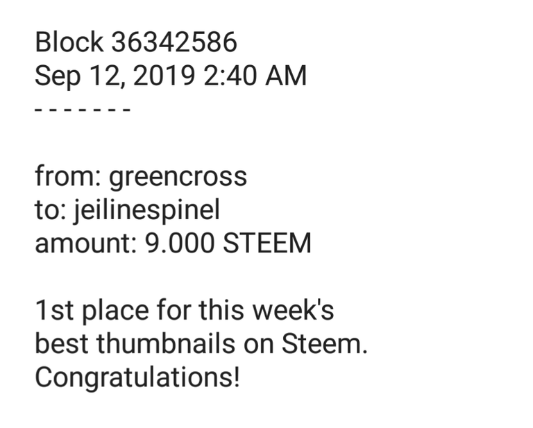
1st place: @jeilinespinel with "PELÍCULAS | Raging Bull"
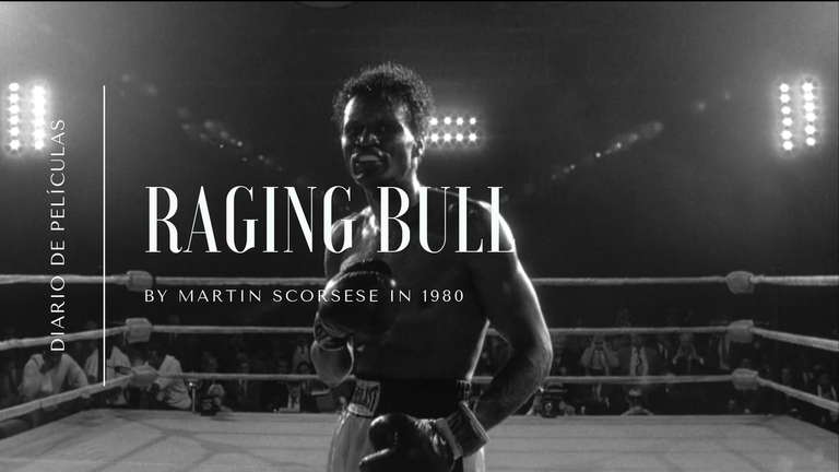
@jeilinespinel's thumbnail is great because:
- it is minimalist: a black and white color scheme coupled with elegant and simplistic serif font that is easy to read over the background photo
- it is part of her branding: she has designed a series of thumbnails with identical "feel" for all her "movie review" posts, and she also has another themes intended for other kinds os posts. This helps us to easily identify it is her and what kind of post are we seeing in a fast way
- it looks perfect across all platforms: she left enough bleed for.the text not to be cropped at the edges.
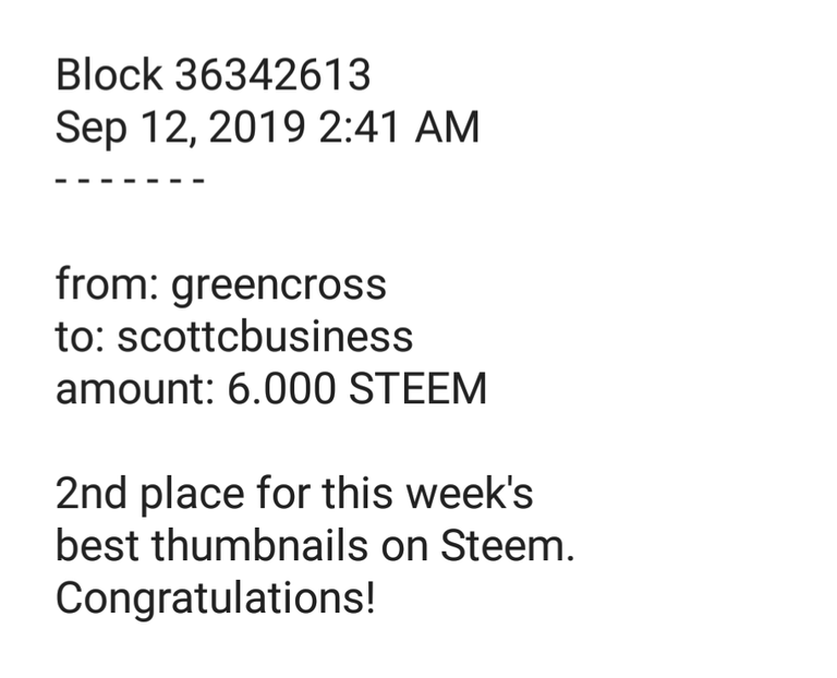
2nd place: @scottcbusiness with "What Is The Best Crypto Bounty Game?"

@scottcbusiness' thumbnail is great because:
- good branding: it shows Scott's face so we can easily identify who the author of the post is, besides the iconic color scheme and font.
- the text is easy to read even on very small applications: the contrast between the text with a drop shadow and the solid coloured background where it's laid upon makes the font appear perfect and sharp, so it's very easy to read.
3rd place: @juliakponsford with "Creative Coin Promo / A crypto tribe for creatives"
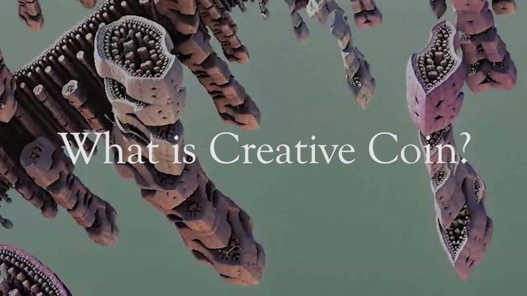
@juliakponsford's thumbnail is great because:
- it's minimalist: there's something about this thumbnail that makes it great, and that is the fact that the "less is more" philosophy is embraced at large.
- great readability: the chosen serif font is perfectly readable, despite the fact that it's laid over a background that is not totally flat.
- the background image is amazing: enough said.

4th place: @jaynie with "HACK the INESSENTIALS - Introspective Weekend..."
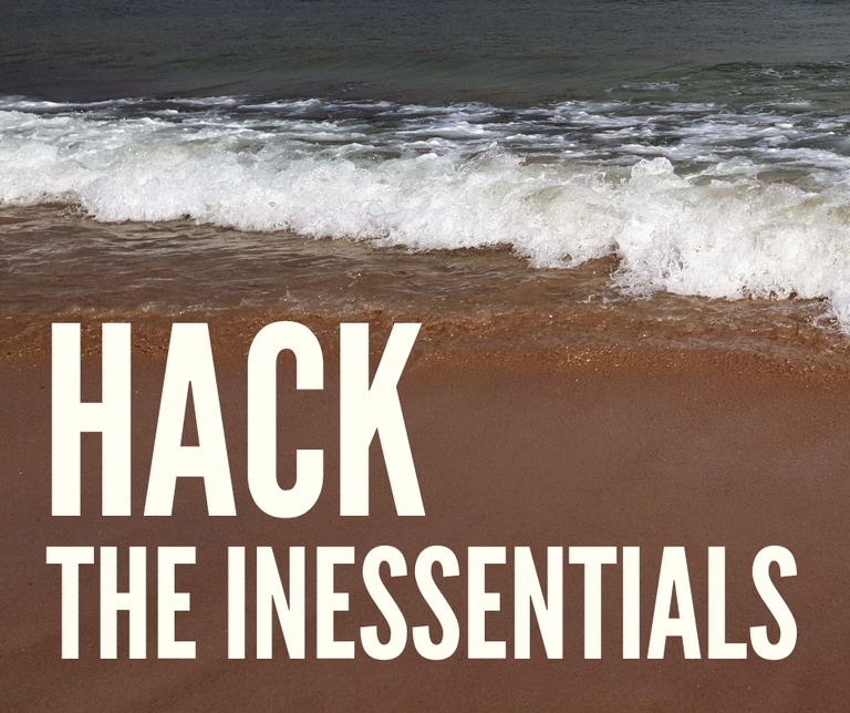
@jaynie's thumbnail is great because:
- it embraces the post's content on the image: the thumbnail includes exactly what is essential, and it is laid over a photo of the beach, which, in my opinion, is pretty essential for a happy life.
- the chosen font is great for thumbnails: the chosen sans serif typeface is perfect for this kind of applications, since it's not wide and this allows for more characters to be fit on the design.
- the letters fall over a flat part of the photo: making it perfectly readable.
5th place: @isaria with "Isaria’s Weekly Music Curation // Minnow Support/Palnet/Creative Coin/Sonic Groove Community Curation!"
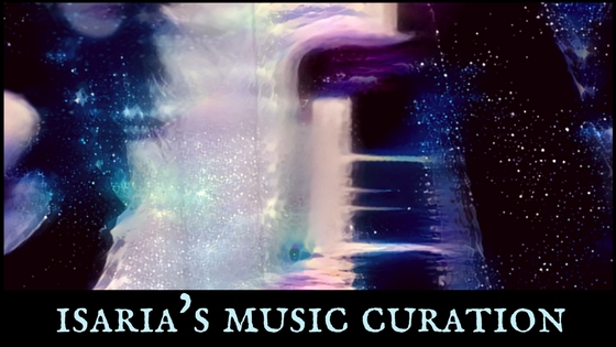
@isaria's thumbnail is great because:
- the background artwork fits perfectly to the theme of the post
- the letters were laid over a black flat background, separating it from the busy photo background. This ensures the text is perfectly readable, while fully respecting the background's artwork.
6th place: @adventuroussoul with "The Incredible Terracotta Warriors - What You Can Expect - China Adventure v14"
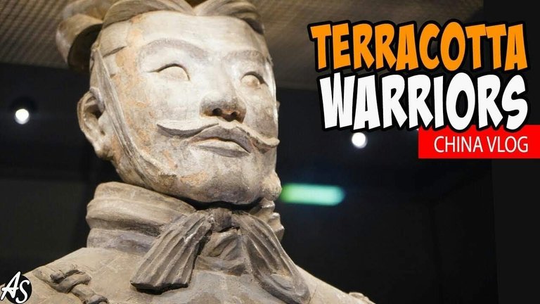
@adventuroussoul's thumbnail is great because:
- the design is clean and consistent
- the font was outlined to ensure readability, although the background is not busy, this technique ensures readability over backgrounds with many details.
I am looking for judges and sponsors!
In order to make this contest more appealing, I am looking for judges and sponsors.
If any of this week's winners would like to judge the following weeks they are more than welcome. However, you can't win on the weeks you are judging, sorry!
If you would like to sponsor some Steem for our weekly prizes, please feel free to contact me on Discord "greencross#2884"
EDIT: we have a first sponsor!. Thanks to @preparedwombat who donated 10 STEEM for next week's prize pool!.
Did I miss any great thumbnail design?
Maybe I overlooked a great thumbnail design. If you think I did, feel free to drop a link on the comments and I'll keep an eye on the author for the next weeks.
Thanks a lot!
@greencross
Posted using Partiko Android
Thank you so much for being an awesome Partiko user! You have received a 14.35% upvote from us for your 1260 Partiko Points! Together, let's change the world!
Thanks for the mention buddy! It’s a fantastic idea by the way, let me know if I can help in any way and I’ll see what I can do
Posted using Partiko iOS
You are welcome @adventuroussoul! and congratulations, it was a simple but effective thumbnail. I just wished the text was not so close to the border so it wouldn't cut out on Partiko :) but it was great enough as is.
We need sponsors and/or judges. Whatever help will be greatly appreciated.
Cheers
Posted using Partiko Android
Thanks I appreciate it :) The thumbnail is what always draws me into the post, I'm afraid to say I often judge a book by it's cover lol!
You are very welcome. I couldn't stop looking at the simplicity of your design. Very lovely!.
Yes I think we do live in a very graphic era, it's essential to have something good looking in order to draw attention in this sea of information.
Posted using Partiko Android
Super helpful @greencross Thanks much
Posted using Partiko iOS
you are very welcome @mammasitta :)
Posted using Partiko Android
What a good idea! I guess I need to up my thumbnail game. My default is just a nice photo.
@wholeself-in yes!, we can find a lot of great "photo only" thumbnails on Steem indeed. Sometimes the photo is so great and says everything that a text overlay would just spoil it.
The reason I want to focus on thumbnails with text is to spread some knowledge and basic graphic design tips so we all can better the visual quality of this blockchain's content :)
Posted using Partiko Android
Thank you so much for being an awesome Partiko user! We have just given you a free upvote!
The more Partiko Points you have, the more likely you will get a free upvote from us! You can earn 30 Partiko Points for each post made using Partiko, and you can make 10 Points per comment.
One easy way to earn Partiko Point fast is to look at posts under the #introduceyourself tag and welcome new Steem users by commenting under their posts using Partiko!
If you have questions, don't feel hesitant to reach out to us by sending us a Partiko Message, or leaving a comment under our post!
Great idea for a contest. I don’t use Discord (long boring story) but check your wallet. I sent some STEEM that can be used for prizes.
Hi @preparedwombat thanks so very much for sponsoring the initiative. I will edit the post to include you as our first sponsor!.
Once again many thanks :)
Posted using Partiko Android
What awesome idea!! I used to make an effort with my thumbnails and you have inspired me to go back to it.
I am proud of the consistency of @naturalmedicine thumbnails and brand, i must say :)
Posted using Partiko Android
indeed very nice designs they have! @riverflows. I'd like to include them but the idea was to focus on individual authors. I might have to make a special run for "collectives and companies" or something like that. The reason why is that there are sometimes professional graphic designers hired to develop their branding, hence the great thumbnails.
Thanks very much!. Happy to have inspired you, since I only aspire to inspire before I expire ;)
Will keep an eye on your next thumbnails!
Posted using Partiko Android
Woahhhh! This gets a heart 💜
Posted using Partiko iOS
thank youuu @mammasitta 🍄😍
Posted using Partiko Android