Greyscale to Color | Study |

Hello Everyone! Welcome to my Art Blog.
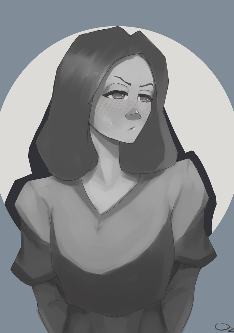
I'll be sharing today the study I did last night. It is to add color to the greyscale, I simply just had an urge to do this after watching Marc Brunet's coloring process on his Instagram reels. I also tried to imitate his coloring process a few months ago except I skipped the value part which is the most crucial to his process, it's because I don't really have that idea of how to properly paint with values but now that I understand a bit of it I ought to try it again. And here's my experimentation...
ART PROCESS
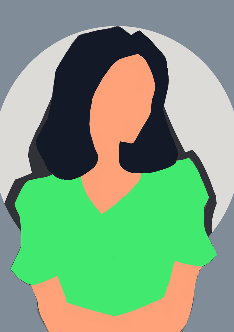
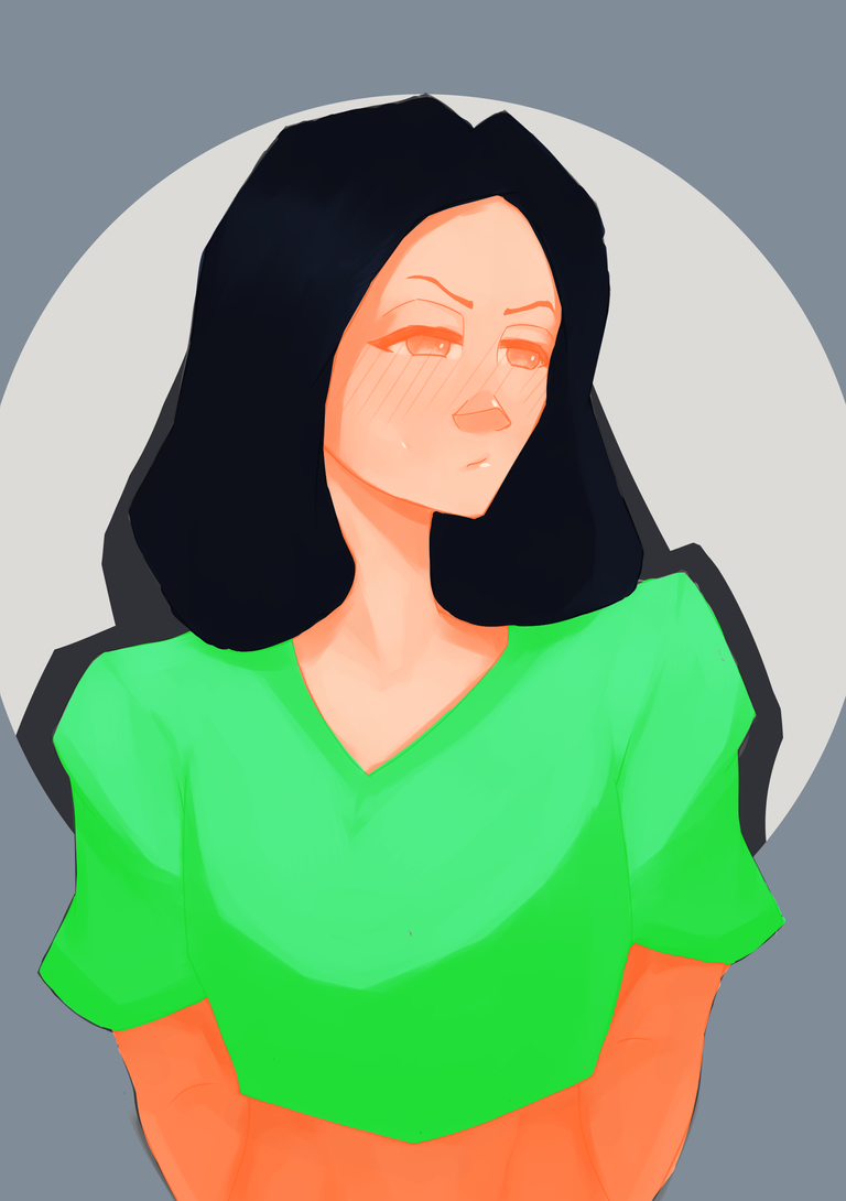
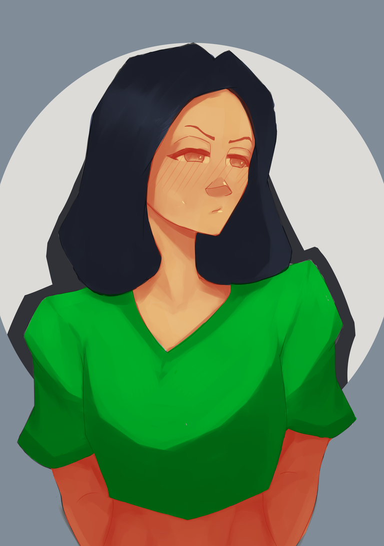
And here is my 2nd try, the flat colors and blending mode were the same, but here, I tweaked the levels of each separate layer. I'm quite satisfied with the color of the clothes but the shadows of the skin were kinda look bland. I tried to use the lasso tool to select only the skin that the light doesn't hit and edited the level but the result was still the same. At this point, I felt lost, I felt there was really something I missed along the process so I looked for my notebook where I'd written the step-by-step process of Marc Brunet's coloring from when I was studying in his YouTube channel months ago. And there, I've written that the light would be Overlay or Hardlight blending mode, but the hardlight is best for darker scenes since it's more opaque. Since my drawing is not that of dark scenes but rather with a strong light source, I changed the blending mode to Overlay. And here is the perfection result.
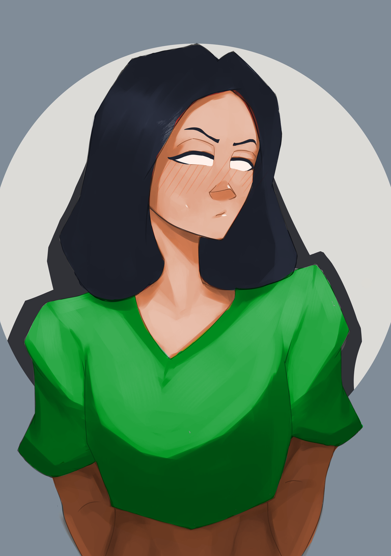

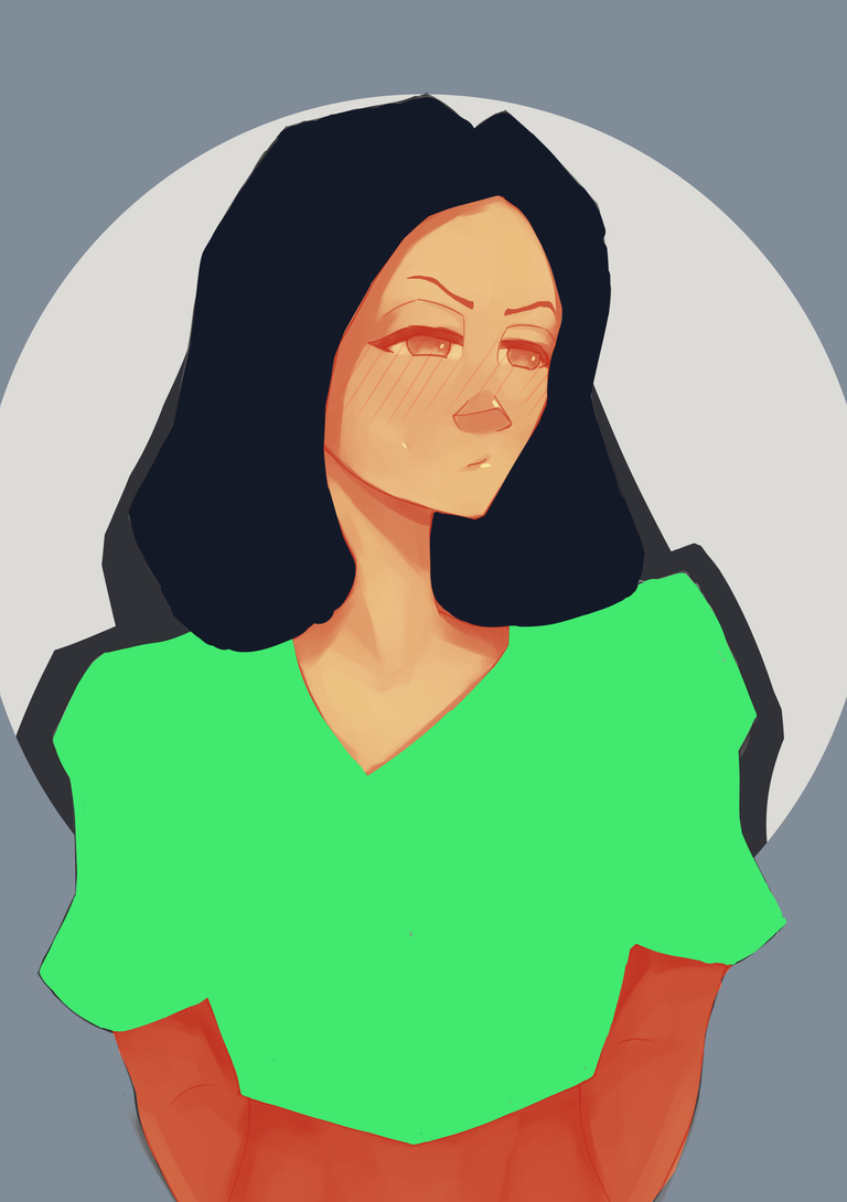
The overlay turned out good!! From here I added a layer on top for some of the linearts and then another layer for correcting the colors. I did my usual way of rendering though I only repainted the skin. Then another layer was set to hardlight blending mode for the materials, to add glossiness, though I don't really know where the best to put those glossy highlights, I just added them wherever I want XD. As you can see in the last photo above, the shadow cast by the hair doesn't look right it should be darker so I repainted it, and while at it I tried to color the terminator orange, and here is the FINAL RESULT....
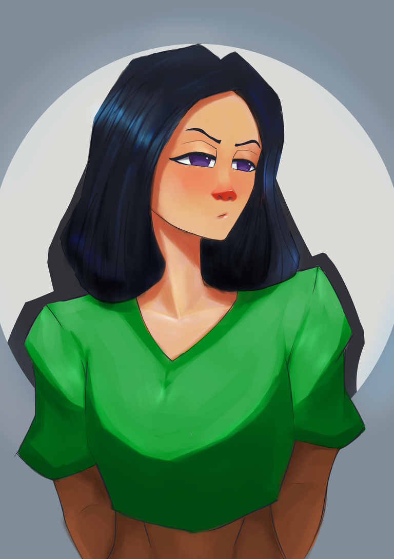
In the afternoon, I happened to watch the Instagram reel of Marc Brunet's again and I realized that it was not the levels of flat color that I should tweak above the greyscale but rather create a gradient map😆🤦♂️ but Mimosa looked so pretty at the result so it still a good one.
Thank you for your time!
I hope you learned something too💖
Tools:
💾 Krita
🖊 XP-Pen Deco Mini 7
Greyscale Art Process
~Ozaki~
Congratulations @weirdghost! You have completed the following achievement on the Hive blockchain And have been rewarded with New badge(s)
Your next target is to reach 3750 upvotes.
You can view your badges on your board and compare yourself to others in the Ranking
If you no longer want to receive notifications, reply to this comment with the word
STOPCheck out our last posts: