Athena- The Angel of hope (Original Character) for Splinterlands Art contest week 215
Splinterlands Art contest week 215
Hello there and welcome to my new blog. For this week I decided to draw my characters for the contest in a new style. If you read my previous blog then you will know what I'm talking about. I have to say, attempting this on phone was very tiring but the results were really good so I have to share it with you guys. So without wasting any time let's begin!
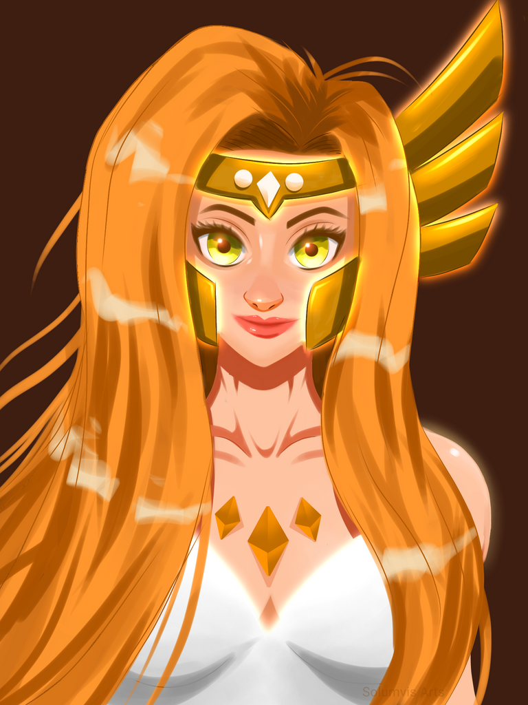
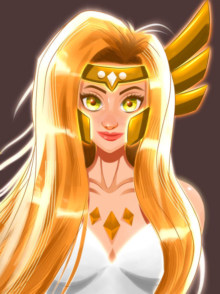
Athena- The Angel Of Hope
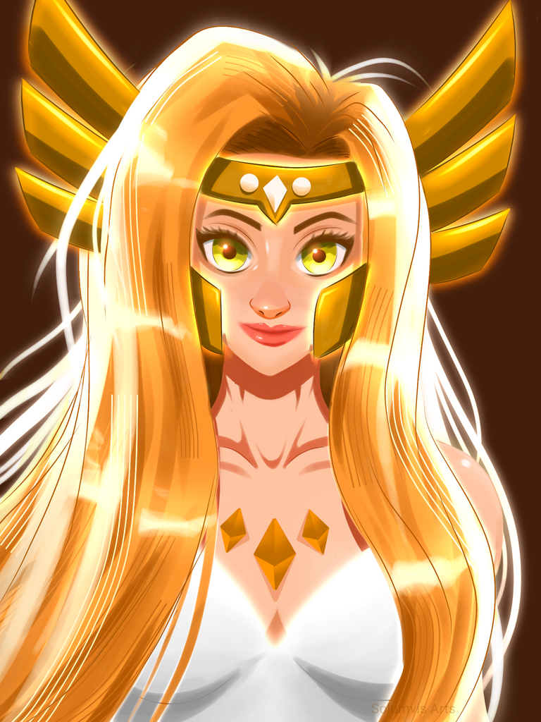
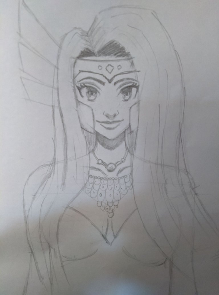
I made a decent sketch of this painting on paper months ago. I even painted it based on the anime style and it was very clear to me that the anime style was not giving justice to the lineart I made so after some time I did a practice study on this lineart with the new style and it worked. I was experimenting with it and found out that this type of style is better suited for Portraits as I can play around by adding highlights on the nose and lips since I never really painted it in my old paintings. Simply put the face is now a bit more defined and detailed. I guess I can call this a success haha.
After the base design was finished I wanted to give her some accessories as well so I gave her that crown and necklace to show that she is from a royal family. If you saw Thor movies then you know that his helmet has these wing-like structures on the sides. I don't know what it's called but yeah I liked the helmet design so I made something similar for this character. She is an angel so I added a glow surrounding her to make it feel that way. It gives off a divine feeling so I created that effect after I completed painting her body.
The process
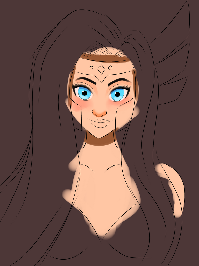
This lineart didn't give me much trouble this time. I didn't need to do any extra work after importing it to the ibis app. Usually, when I flip the canvas there is always something off in the anatomy. Thankfully, That wasn't the case this time.


Dang! I didn't know I save this many work-in-progress pics lmao. It's fine I guess since these shots will show you how I reached the final product.
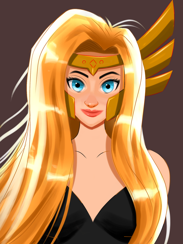
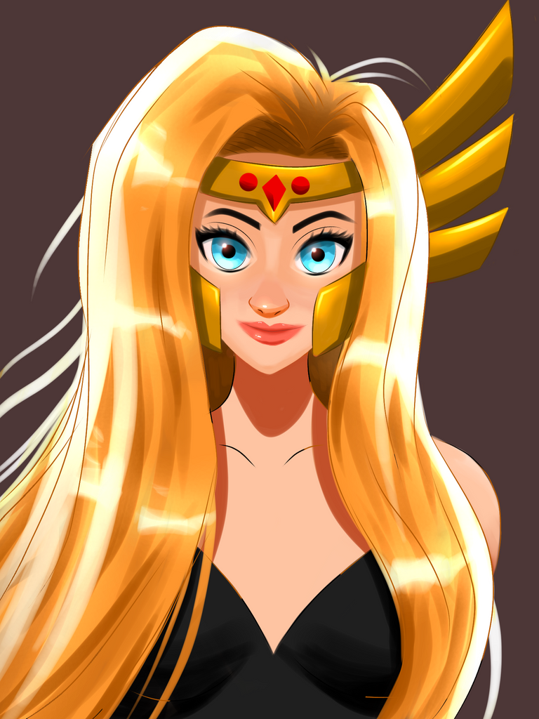
As you can see in the w.i.p shots I made some revisions to the helmet. I believed that the wing-like structures forming on both sides were the better choice so I just simply lassoed the right wing, flipped it, and pasted on the left side. Simple right? It's pointless to do it again when you can just copy it. Although I had to trim some areas to adjust it to her hair flow. The neck was too lean as well so I fixed that too. It's kinda annoying that I always see mistakes after I completely painted something and not before lolz.
That's about it guys and I hope you enjoyed the blog so I'll see you in the next one :)
Tools used
Apps used: Ibis x paint, pencil, and paper
Duration: 9hrs+
Thank you so much for your time :)
The clarity of this character is very beautiful!!!😀
Thanks bro. Appreciate your nice comment :)
It's a nice one.
I liked the color grading part the most.
@tipu curate
Upvoted 👌 (Mana: 23/53) Liquid rewards.
Thanks @ashikstd 😁.
Mention not.
Thank you for sharing this post on HIVE!
Your content got selected by our fellow curator ashikstd & you just received a little thank you upvote from us for your great work! Your post will be featured in one of our recurring compilations which are aiming to offer you a stage to widen your audience within the DIY scene of Hive. Next time make sure to post / cross-post your creation within the DIYHub community on HIVE and you will receive a higher upvote ;) Stay creative & HIVE ON!
She looks so gorgeous 🥰🥰
Thank you Alexa. I'm glad that you liked it :)
This looks so beautiful and it is very nicely done, love the colors, just a really small critique if you are open for it - look at the base of the hair on the front if the crown/head piece is a source of light, like you did it the under side of the hair just over the forehead shouldn't be in shadow it should have that yellow glow reflecting on it a lot. I think you tried to put it in but probably got scared because it's usually in shadow but if you want to you can try making it stronger, it will look just a little bit more cohesive. I hope that you don't take it too harsh the drawing is great as is, just a small thing! Keep sharing your work I really like the style!
Thanks for notifying me about that because I totally forgot to add that under there. I was more concerned about the face that I forgot about the rest XD. The glow you see here was a last minute addition so I didn't think it through.
Positive criticism is always appreciated hehe.
Thanks for commenting:)
You are most welcome keep sharing your art!
Great work! Looks amazing!
Thanks @dynamicgreentk and thanks for helping me all the time XD.
Congratulations @solumviz! You have completed the following achievement on the Hive blockchain and have been rewarded with new badge(s):
Your next target is to reach 4000 upvotes.
Your next target is to reach 400 replies.
You can view your badges on your board and compare yourself to others in the Ranking
If you no longer want to receive notifications, reply to this comment with the word
STOPSupport the HiveBuzz project. Vote for our proposal!
What a beauty.
I love her hair. 😊
!1UP
You have received a 1UP from @thecuriousfool!
@monster-curator, @oneup-curator, @ccc-curator, @neoxag-curator, @pal-curator
And they will bring !PIZZA 🍕.
Learn more about our delegation service to earn daily rewards. Join the Cartel on Discord.
I gifted $PIZZA slices here:
@curation-cartel(12/20) tipped @solumviz (x1)
Please vote for pizza.witness!
Oh I think the technique you are talking about is the copy paste and flip for objects that are in front view to avoid redundancy hehe. If so, I do it sometimes too. I wish we can do it always to save time lol.
Congrats on achieving the look you want. Highlights are always needed. A little gloss will always complete the look of any drawing. The thor style helmet suits her too. It doesn't look girly and it gives a balance in the drawing.
Oh that too but I was talking about the new art style I used here. I made the face a bit more defined by adding 3d nose and lips which usually isn't the case. Overall I used penfade brush to create a nice soft look.
Oh that new style is effective. Putting highlights and soft look makes anything look more defined. Now I notice. You don't do this on your previous works. This new style can be helpful on other works where pure cel shading won't be enough.
Your experimentation and practice had a great outcome. I love it!
Thank you and I hope I can improve it in the future hehe.
How did I miss this one?! You're really pushing yourself into new realms, this is proof. As always, your color choices are so on point. Love it!! 🤩
Thanks hehe. I'm just glad that my practice paid off. The only problem is I only know how to do portraits in this style XD. Anything more than that will wreck me for sure. But I try anyway because I like to get wrecked XD.
Lol. Yes, "wreckage makes perfect" 😆 that's definitely one way to put it. That super annoying frustration feeling is actually a good thing ;)
Thanks for sharing! - castleberry#6859

Thanks for the support :)
Me ha encantado!!!
Thank you 😁.