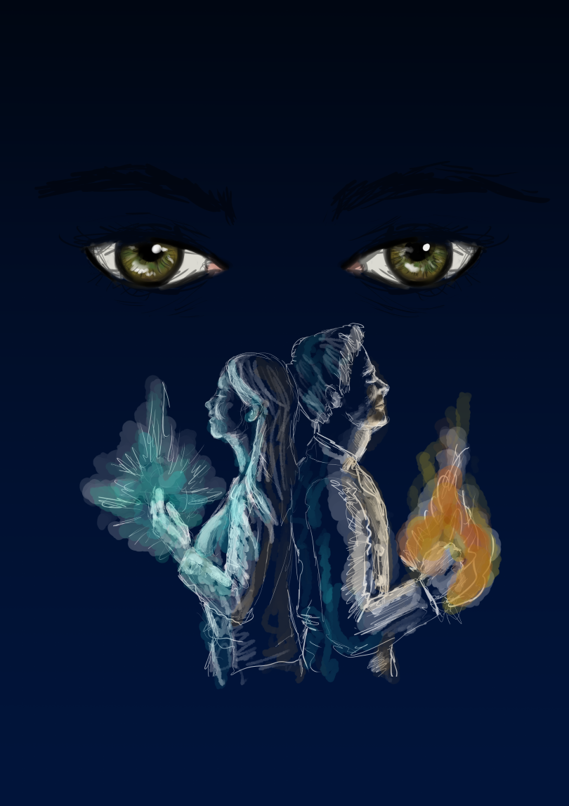
Cover art failure sketch: a rejected proposal 🤷♂

Hey there!
This was a sketch I sent to a publisher, I work for them now and then, for how a cover art might look like...but they had other ideas in mind.
The story is about a young man and woman who discover they have magic abilities and it all somehow ties together with clairvoyance or some other character that can see the future.
But after many changes of colours and position of elements etc, they decided they didn't like it so it ended up just being some eyes with a brighter blue gradient as BG and the title in grading ochre tones 🤷♂.
Technical Info:
Digital Sketch
Created using Clip Studio Paint and Adobe Photoshop
Sketch Art

Click to see in full size


INSTAGRAM | BEHANCE
Join our Discord Channel and network with other artists to help each other grow.
0
0
0.000
This cover looks a lot like the iconic cover of the book "The Great Gatsby". Admittedly at a glance, I thought this was a homage piece to that book until I took the time to read the post.
I like the glow of the elements though.
Thank you for sharing your work.
!PIZZA
@melooo182! I sent you a slice of $PIZZA on behalf of @huzzah.
Learn more about $PIZZA Token at hive.pizza (5/20)
Thank you @huzzah!
Hmmm pizza yummy! xD
Went to google that bookcover of "The Great Gatsby" indeed very similar, Interesting! 🤔🤔🤔
Yeah, your cover is very different- especially with the addition of the two people and the elements. My silly brain was just seeing the connection. It's just mostly the green eyes on the deep blue backdrop.
You're very welcome for the $PIZZA. Hope you're having a fantastic day!
I guess I can kind of see why they didn't like it (the two people and the eyes aren't tying together meaningfully), though I personally think if they were going to drop any elements it should have been the eyes and keeping the two people, they look pretty cool the way you drew them.
I guess they wanted something a bit more abstract/minimalist for the cover? :)
🤔 hmm well 🤷♂
Apparently they heard you lol
last message was that they wanted the characters but younger looking 😩
not too hard to tweak them but why do they have to be like that going back and forth?
Some clients have an idea of what they want and some only know what they don't want? ^_^;