Fan Art Marvel’s Spider-Man Kawaii 🕷 [ENG/ESP]
Greetings artists! Welcome to all of you to my new post. Today I'm very happy to share my first post in this great community, this time it's a fan-art illustration based on my favourite superhero, Spider-Man. With all the hype and popularity that the new Marvel’s Spider-Man 2 videogame is having, I really wanted to draw the character, so I took my digital tablet, my favourite software and started working on this little illustration for all of you. Let`s start!
¡Saludos artistas! Sean todos ustedes bienvenidos a mi nuevo post. El día de hoy estoy muy contento de compartir mi primera publicación en esta gran comunidad, esta vez tratándose de una ilustración fan-art basada en mi superhéroe favorito, Spider-Man. Con todo el auge y popularidad que esta teniendo el nuevo videojuego de Marvel’s Spider-Man 2 me dieron muchas ganas de dibujar al personaje, por lo que tome mi tableta digital, mi programa favorito y comencé a trabajar en esta pequeña ilustración para todos ustedes. ¡Comencemos!

Creative Process | Proceso Creativo✏️
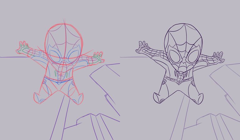
I started making the sketch, my idea was to make a Spider-Man with a kawaii style, so I deformed the character to make him in this style. Being a small character I had to adapt the most important and relevant elements. After making the sketch I worked at once on the main idea of the background, this would be simple, with some buildings around the character. Finally I started to apply a clean line to the whole character trying to play a bit with the thickness of the line.
Comencé realizando el boceto, mi idea era realizar a un Spider-Man con un estilo kawaii por lo que deforme al personaje para poder realizarlo en este estilo. Al ser un personaje pequeño tuve que adaptar los elementos mas importantes y relevantes. Luego de realizar el boceto trabaje de una vez en la idea principal del fondo, este seria sencillo, con algunos edificios alrededor del personaje. Finalmente comencé a aplicar una línea limpia a todo el personaje tratando de jugar un poco con los grosores de la línea.

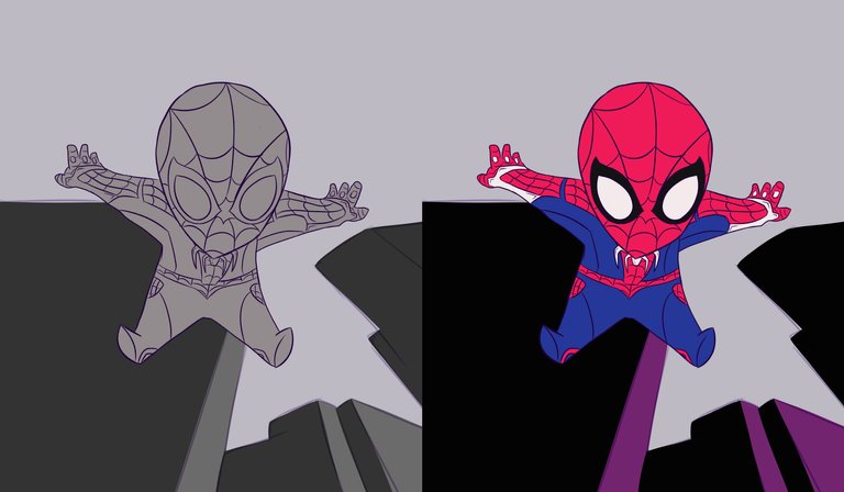
The next thing I did was to place a layer of grey colour to delimit all the elements of the illustration and so I didn't go out of the lines. Then I made a colour palette and started to apply it in different layers until I completed the base colouring of all the elements.
Lo siguiente que hice fue colocar una capa de color gris para delimitar todos los elementos de la ilustración y así no salirme de las líneas. Luego arme una paleta de color y comencé a aplicarla en diferentes capas hasta completar el coloreado base de todos los elementos.
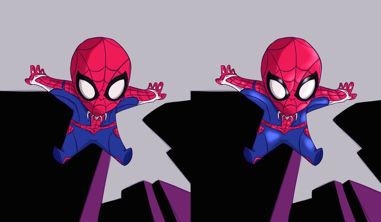
Then I applied the lights and shadows to the character. I started first with the shadows, as it was a simple illustration I placed flat shadows in the places where my spotlight could not reach, then with a soft brush I applied in small quantities the light to the character and these I mixed them a little more with the base colours to create a soft gradient between the tones.
Luego aplique las luces y sombras al personaje. Comencé primero por las sombras, al tratarse de una ilustración sencilla coloque sombras planas en los lugares donde no llegara mi foco de luz, luego con un pincel suave aplique en pequeñas cantidades la luz al personaje y estas las mezcle un poco mas con los colores base para crear un degradado suave entre los tonos.
Once I finished with the character I worked on the background, I placed windows to the buildings and I made gradients with several tones, first with violet and then with blue and magenta colours to create a gradient of several tones between them. Finally I placed white dots to simulate stars and I applied a blur filter to them so that they didn't look so defined.
Una vez termine con el personaje pase a trabajar en el fondo, le coloque ventanas a los edificios y fui realizando degradados con varios tonos, primero con violetas y luego con colores azules y magentas para crear un degradado de varios tonos entre si. Para finalizar coloque puntos de color blanco para simular unas estrellas y a estas les aplique un filtro de borrosidad para que no se vieran tan definidas.
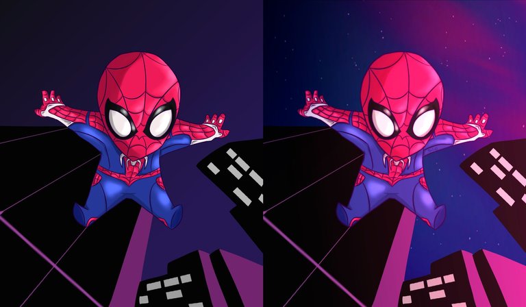
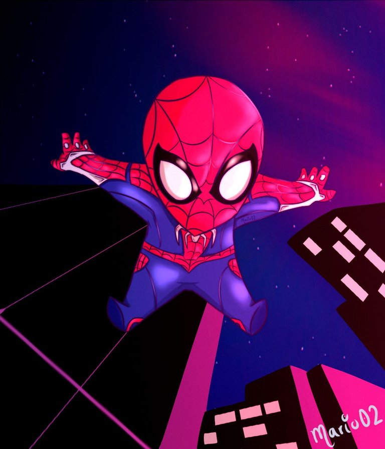
Final result of the Illustration | Resultado final de la ilustración
And this is the end of today's illustration, as a final detail I made a colour and saturation adjustment to improve some colours that I didn't like at all. I hope you all liked it, if you want you can support me and/or leave me a comment with any advice or opinion and I will be glad to thank you. Thank you very much for watching until the end and until next time!
Y así doy por culminada esta ilustración del día de hoy, como detalle final hice un ajuste de color y saturación para mejorar algunos colores que no me gustaban del todo. Espero que haya sido del agrado de todos ustedes, si deseas puedes apoyarme y/o dejarme un comentario con algún consejo u opinión y con gusto te lo agradeceré ¡Muchas gracias por ver hasta el final y hasta la próxima!

The illustration and separators used in the post are my property.
Translated with DeepL (free versión)
Wow bro! You got some talent there. The drawing is really cute and I love it.
This post has been selected to be curated by hive learners community. Kindly click on the banner to visit our community and check out our discord channel here.
Thank you very much my friend!
Me gusta el estilo que le has dado, te quedó muy bonita la combinación de colores del cielo y las ventanas. 🤩
Mil gracias por el comentario! Me alegra que te guste
Contáctenos para saber más del proyecto a nuestro servidor de Discord.
Si deseas delegar HP al proyecto: Delegue 5 HP - Delegue 10 HP - Delegue 20 HP - Delegue 30 HP - Delegue 50 HP - Delegue 100 HP.