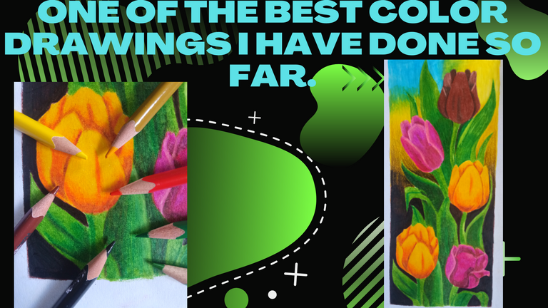
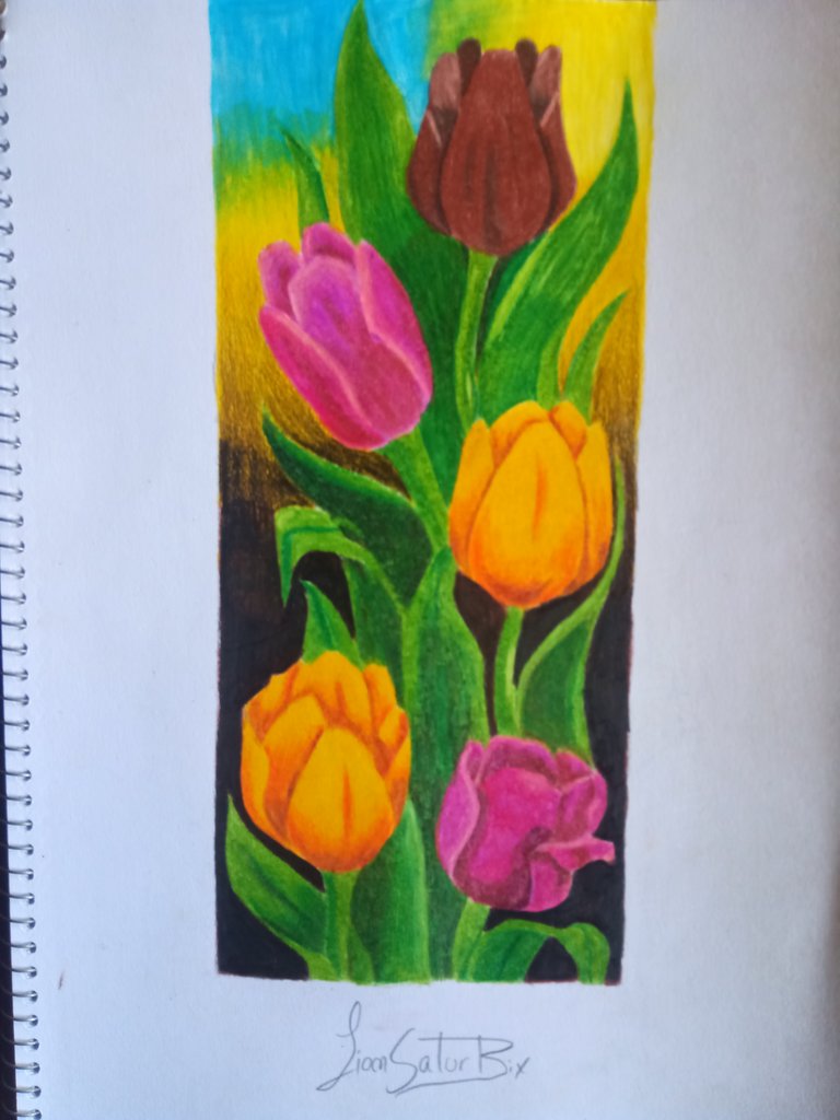
One of the best color drawings I have done so far / Drawing Flowers / (ENG/ESP)

Bienvenidos mis queridos amigos amantes del arte y artistas.
En esta ocasión les vengo a presentar un dibujo que he realizado con colores marca Kores, los cuales son de un material un poco débil, pero que una claridad muy linda a la hora de realizar dibujos con esta marca de colores.
El dibujo que les mostraré a continuación es de unas flores, las cuales llevaran muchos colores de diferentes tipos, también tendremos que mezclar algunos otros colores para crear el efecto que deseamos según nuestra imagen de referencia.
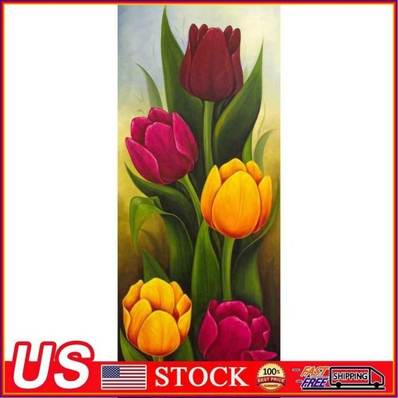
Al igual que en la mayoría de mis dibujos, las imágenes que utilizo en referencia son sacados de una gran página de ideas y diseños llamada Pinterest.
Welcome my dear friends, art lovers and artists.
This time I come to present a drawing that I have made with Kores brand colors, which are a little weak material, but a very nice clarity when making drawings with this brand of colors.
The drawing that I will show you next is of some flowers, which will take many colors of different types, we will also have to mix some other colors to create the effect we want according to our reference image.
As in most of my drawings, the images I use in reference are taken from a great page of ideas and designs called Pinterest.
Este estilo de dibujo son a base de colores escolares marca Kores, los cuales se están usando mucho para los que están iniciando en este mundo, próximamente les estaré mostrando una comparación con este tipo de colores con los Prismacolor, dicha marca de colores los estaré comparando la semana que viene para probar por primera vez que tan buenos son.
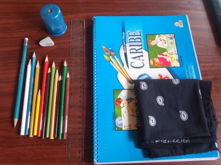
Los materiales que se utilizaran para elaborar nuestro trabajo son las siguientes:
*Bloc de dibujo marca Caribe.
*Borrador.
*Regla.
*Pañuelo.
*Lápiz de grafito 2B.
*Sacapuntas.
*Colores mara Kores.
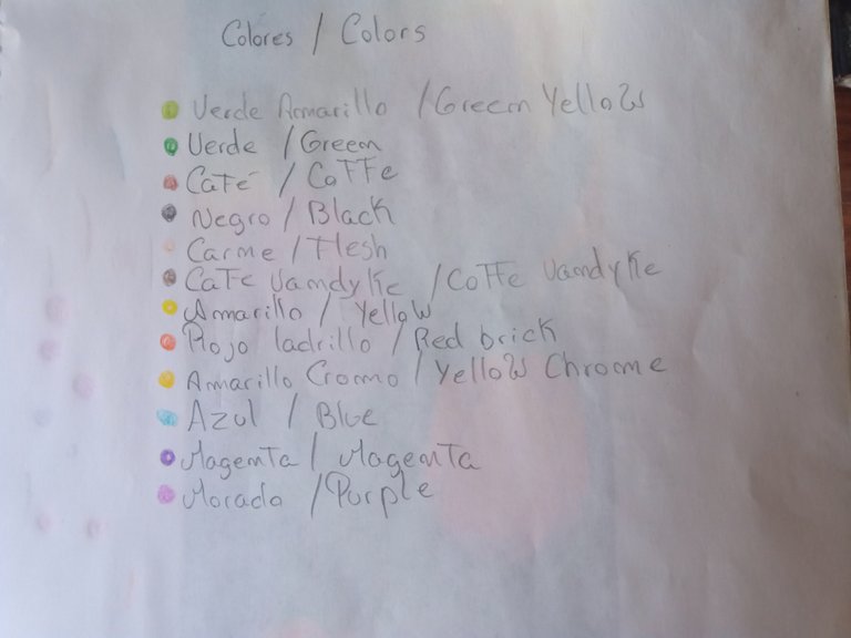
Ahora los colores que vamos a necesitar para hacer nuestro dibujo son los siguientes:
*Verde amarillo.
*Verde.
*Café.
*Negro.
*Carne.
*Café Vandyke.
*Amarillo.
*Rojo ladrillo.
*Azul.
*Magenta.
*Morado.
This style of drawing is based on Kores school colors, which are being used a lot for those who are starting in this world, soon I will be showing a comparison with this type of colors with Prismacolor, this brand of colors I will be comparing them next week to test for the first time how good they are.
The materials that will be used to elaborate our work are the following:
*Caribe drawing pad.
*Ruler.
*Ruler.
*Handkerchief.
*Graphite pencil 2B.
*Pencil sharpener.
*Mara Kores colors.
Now the colors that we are going to need to make our drawing are the following:
*Yellow green.
*Green.
*Coffee.
*Black.
*Meat.
*Vandyke coffee.
*Yellow.
*Brick red.
*Blue.
*Magenta.
*Purple.
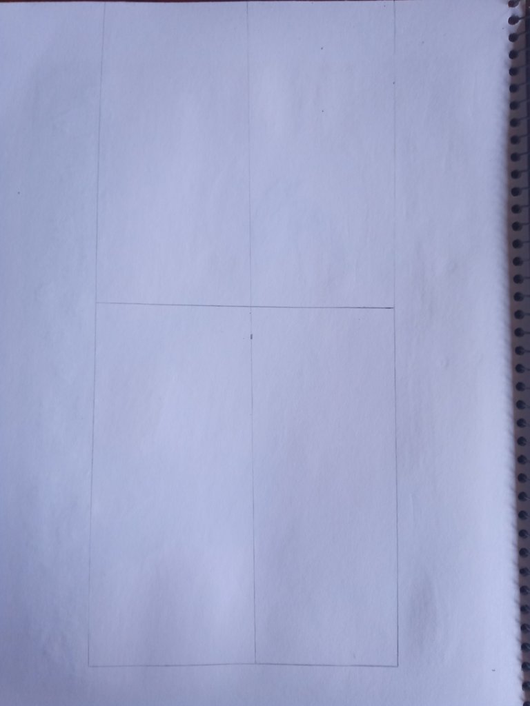
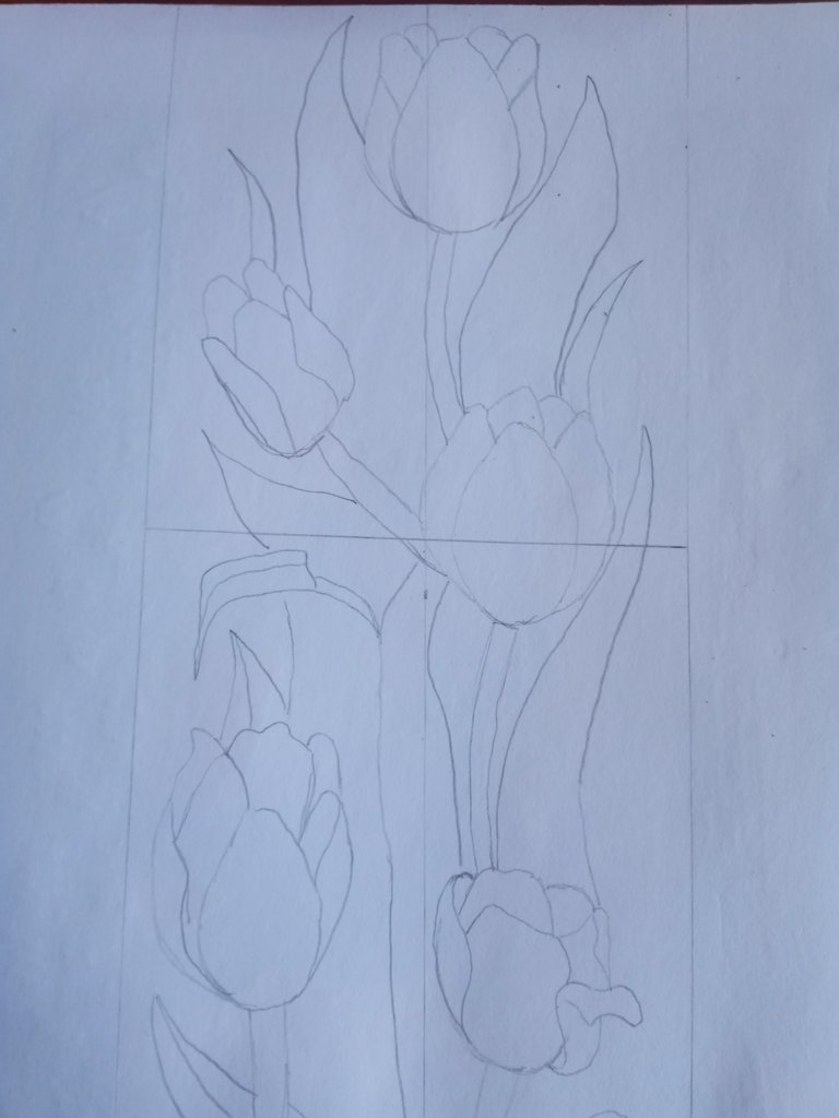
Una vez que tengamos nuestras herramientas de dibujo a la mano y la imagen de referencia, comenzamos a crear nuestro espacio de trabajo, primero comenzamos a elaborar un rectángulo, el cual puede ser de 20 centímetros de alto y 11 centímetros de ancho.
Después lo dividimos por cuatro partes iguales, esto nos permitirá tener mayor orden al momento de realizar las partes del dibujo.
Luego comenzamos a realizar el boceto de nuestro dibujo, por lo general este tipo de dibujo no se puede realizar de un solo golpe, sino que debemos trabajar por partes, así que comenzaré por la flor de color morado, primero podemos borrar con la ayuda de nuestro borrador, las líneas que hemos implementado, traten de no borrar mucho las líneas, al menos que sean casi visibles para saber en donde vamos a trazar nuestras nuevas líneas con el color.
Once we have our drawing tools at hand and the reference image, we begin to create our workspace, first we start to draw a rectangle, which can be 20 centimeters high and 11 centimeters wide.
Then we divide it into four equal parts, this will allow us to have more order at the time of making the parts of the drawing.
Then we begin to make the sketch of our drawing, usually this type of drawing can not be done in one stroke, but we must work in parts, so I will start with the purple flower, first we can erase with the help of our eraser, the lines that we have implemented, try not to erase the lines too much, at least that are almost visible to know where we will draw our new lines with color.
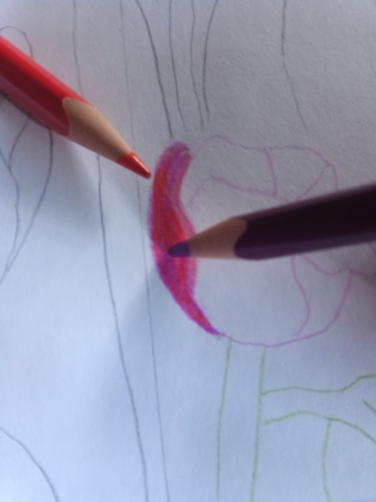
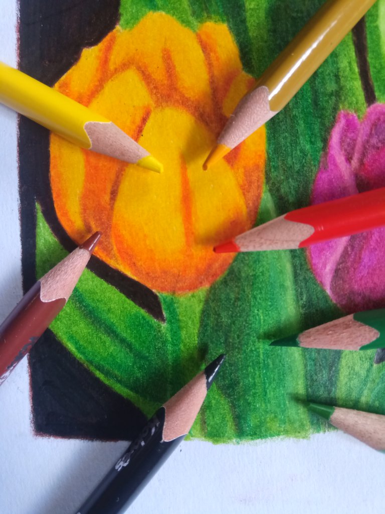
Ahora comenzamos a trabajar pétalo por pétalo en el dibujo, si nos fijamos bien en nuestra imagen en referencia, es que el pétalo donde comenzaré a trabajar tiene un color entre morado, magenta, color carne y un poco de rojo ladrillo.
Para lograr tener este color como en la imagen de referencia debemos hacer una mezcla de colores hasta llegar al punto exacto, podremos colorear el pétalo con la primera capa de color Magenta, después le agregamos el color rojo ladrillo, para luego usar el color carne en las partes donde estará el brillo del pétalo.
Recuerden que debemos rellenar mucho los poros de la hoja o cartulina donde estamos trabajando, por lo general los blocs de dibujo marca Caribe poseen hojas muy similares a la de una cartulina, lo cual es bueno.
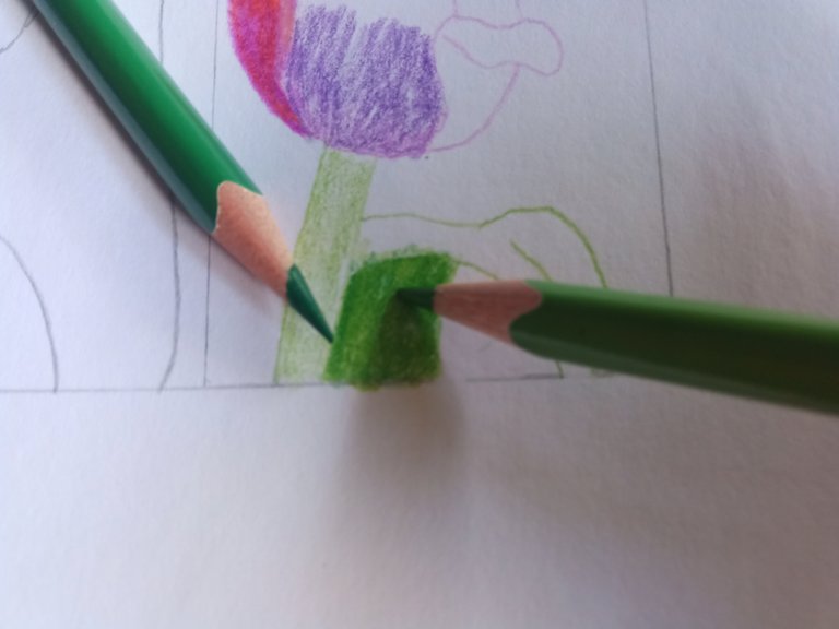
Después podemos trabajar con la grama que está por los alrededores de la planta, para ello debemos usar el verde amarillo por el tallo de la flor, también podemos hacer lo mismo con la grama que esta después del tallo de la flor, notamos que la parte superior es de color verde amarillo y la parte inferior es de color verde, dándole ese toque de profundidad a la grama.
Como mencione anteriormente, debemos trabajar al 100% cada parte del dibujo que vayamos a hacer y de agregarle color, ya que de no hacerlo podemos perder todas las partes y nos confundiremos mucho, al menos de esa manera fue que trabaje en mi dibujo, gracias la mezcla de colores que hemos realizado, para esta parte del dibujo utilice el morado, magenta, rojo ladrillo para hacer la flor, y para la grama solo utilizaremos el verde amarillo y verde.
Now we begin to work petal by petal in the drawing, if we look closely at our reference image, the petal where I will begin to work has a color between purple, magenta, flesh color and a little brick red.
To achieve this color as in the reference image we must make a mixture of colors until we reach the exact point, we can color the petal with the first layer of Magenta color, then we add the brick red color, and then use the flesh color in the parts where the brightness of the petal will be.
Remember that we must fill the pores of the sheet or cardboard where we are working, usually the Caribe sketch pads have sheets very similar to that of a cardboard, which is good.
Then we can work with the grass that is around the plant, for this we must use the yellow green for the stem of the flower, we can also do the same with the grass that is after the stem of the flower, we notice that the top is yellow green and the bottom is green, giving that touch of depth to the grass.
As I mentioned before, we must work 100% each part of the drawing that we are going to do and add color, otherwise we can lose all the parts and we will be very confused, at least that's the way I worked in my drawing, thanks to the mixture of colors that we have done, for this part of the drawing use purple, magenta, brick red to make the flower, and for the grass we will only use yellow green and green.
Para trabajar en el tallo de la flor que está del lado izquierdo de nuestro dibujo, podemos utilizar el amarillo, rojo ladrillo, amarillo cromo, un pequeño toque del color café y el negro para las partes oscuras, para las gramas utilizaremos el mismo verde amarillo y el verde.
Para poder darle ese efecto que ven en la imagen superior del texto debemos darle la primera capa de amarillo a las partes de la flor, después para darle ese pequeño toque de profundidad podemos utilizar el rojo ladrillo, y en las partes más oscuras el color café.
Para las gramas implementaremos la misma técnica que implementamos con la primera parte del dibujo, y en los lados más oscuros podemos utilizar el tono del negro, ya que esto nos permitirá agregarle un poco más de profundidad a algunas gramas.
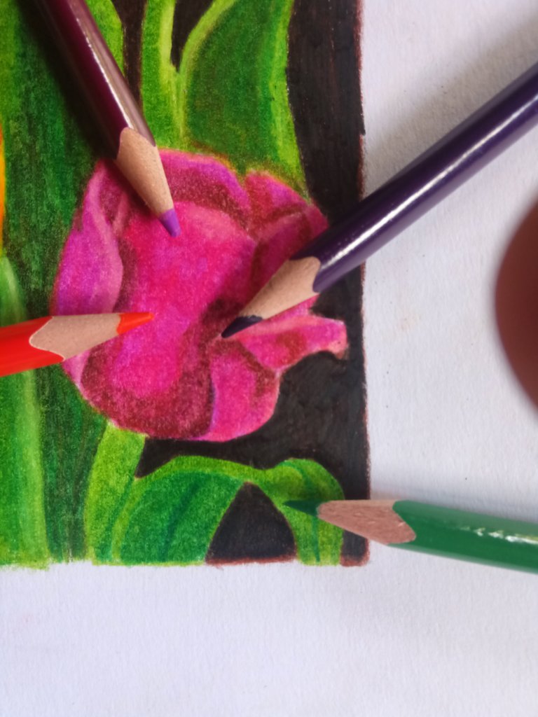
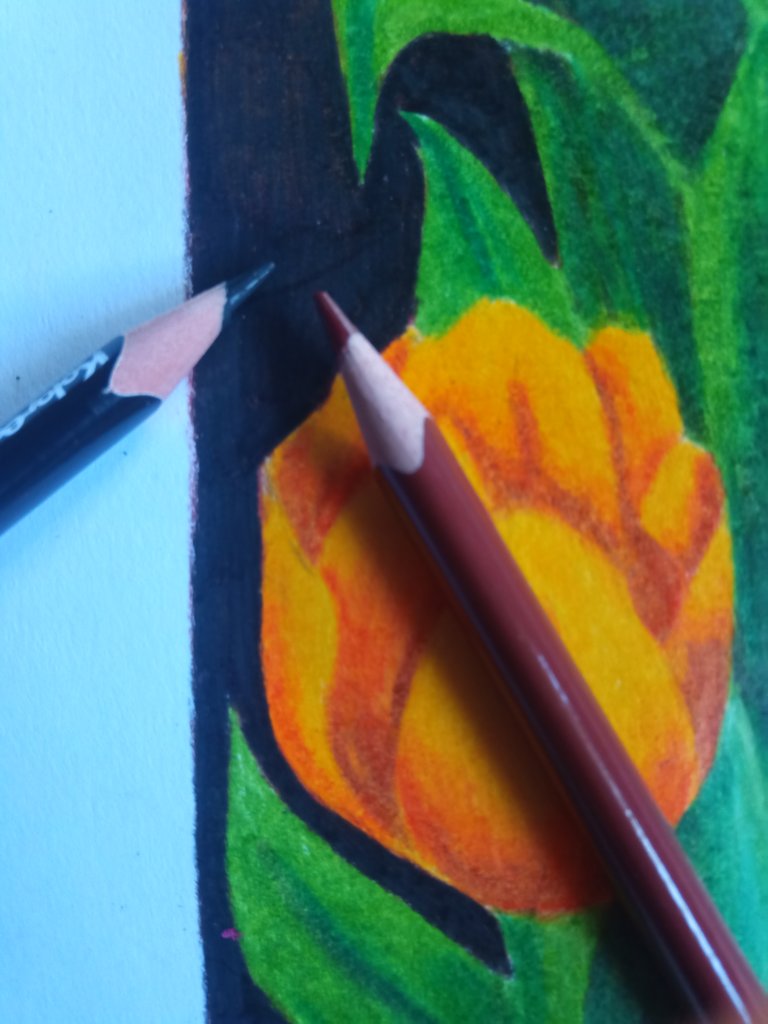
Para el fondo debemos tener cuenta que en el mundo del artista, los colores que podremos observar en algunas imágenes no son del todo negras, sino que es una mezcla entre el negro y el marrón, que en este caso para el fondo del dibujo primero le di una capa de marrón y otra de negro, podremos notar que el fondo no es de negro en su totalidad.
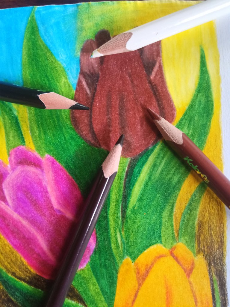
Ahora para la flor superior debemos utilizar el color café, café vandyke, negro y si lo deseamos podemos utilizar el color blanco para aclarar algunas partes, aquí implementamos las mismas técnicas que realizamos anteriormente para darle el color que deseamos a nuestra flor.
To work on the stem of the flower that is on the left side of our drawing, we can use yellow, brick red, chrome yellow, a little touch of brown and black for the dark parts, for the grasses we will use the same yellow green and green.
To give that effect that you see in the image above the text we must give the first layer of yellow to the parts of the flower, then to give that little touch of depth we can use the brick red, and in the darker parts the brown color.
For the grasses we will implement the same technique that we implemented with the first part of the drawing, and in the darker sides we can use the tone of black, as this will allow us to add a little more depth to some of the grasses.
For the background we must take into account that in the artist's world, the colors that we will be able to observe in some images are not entirely black, but it is a mixture between black and brown, in this case for the background of the drawing I first gave a layer of brown and another of black, we can notice that the background is not entirely black.
Now for the upper flower we must use the color brown, brown vandyke, black and if we want we can use the white color to lighten some parts, here we implement the same techniques that we did before to give the color we want to our flower.
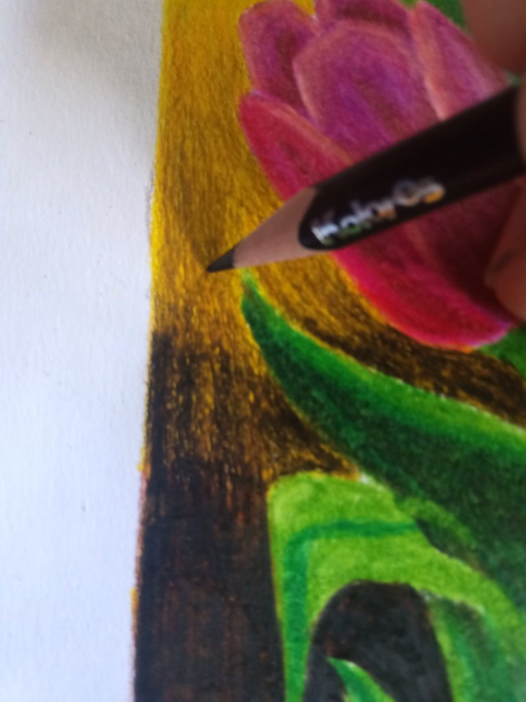
Para degradar un poco el fondo o bien mezclarlo con los otros colores, debemos trazar pequeños trazos casi visibles en nuestro dibujo, así para crear un degradado perfecto cuando trabajamos con colores.
Si implementamos las técnicas antes mencionadas tendremos un resultado como el dibujo que he creado, recuerden que deben afincar muy bien los colores para poder rellenar los poros de la hoja, y de esta manera habremos terminado nuestro dibujo.
Las fotos fueron tomadas con la ayuda de mi teléfono Bison X Designed By Umidigi.
La imagen de referencia se encuentra en la parte inferior de este texto, debajo de ella podrán encontrar la fuente de la misma, el cual los llevara a la página que utilizo para encontrar las imágenes en referencia que uso para dibujar.
Y Así finaliza la publicación de hoy amigos, espero les sea de su agrado y que hayan aprendido algo nuevo el día de hoy con mi publicación, hasta la próxima.
To degrade a little the background or mix it with the other colors, we must draw small strokes almost visible in our drawing, this way to create a perfect gradient when we work with colors.
If we implement the techniques mentioned above we will have a result like the drawing I have created, remember that you must sharpen the colors very well to be able to fill the pores of the sheet, and in this way we will have finished our drawing.
The pictures were taken with the help of my Bison X Designed By Umidigi phone.
The reference image is at the bottom of this text, below it you can find the source of it, which will take you to the page I use to find the reference images I use to draw.
And so ends today's publication friends, I hope you like it and that you have learned something new today with my publication, until next time.

Source / Fuente Castle of Castlevania
Source / Fuente Terra Blade of Terraria
Los separadores son de mi autoría, las ediciones del GIF son creados por mí.
The separators are of my authorship, the GIF edits are created by me.
Programas que utilicé para crear mi diseño es este:
This is the program I used to create my design:
Gif y portada cortesía de Canva
Gif and cover courtesy of Canva
Traducido por Deepl


Guao, espectacular, ahora estás aplicando la técnica con colores, maravilloso te felicito, seguro irás explorando más allá cada vez, he visto maravillas también hechas con marcadores acuarelables, también se que hay que tenerles mucha paciencia.
En los acuarelas los veo interesantes, pero el que mas me llama la atención hasta ahora son los de lapiceros, poco a poco voy mejorando mis tecnicas :D
El impacto visual del color a primera vista lo logras vívidamente, logras en alguna medida un poco de perspectiva, sin embargo hay áreas planas, en líneas generales buen trabajo el que nos compartes. Saludos @lionsaturbix
es verdad, debo mejorar mas mi tecnica de dibujo, hay lugares planos que debo corregir en la mayoría de ellos, poco a poco se llega a lejos y la practica hace al maestro, gracias por tu apoyo :D
Congratulations, your post has been upvoted by @dsc-r2cornell, which is the curating account for @R2cornell's Discord Community.
Enhorabuena, su "post" ha sido "up-voted" por @dsc-r2cornell, que es la "cuenta curating" de la Comunidad de la Discordia de @R2cornell.
¡Felicitaciones!
Estás participando para optar a la mención especial que se efectuará el domingo 19 de junio del 2022 a las 8:00 pm (hora de Venezuela), gracias a la cual el autor del artículo seleccionado recibirá la cantidad de 1 HIVE transferida a su cuenta.
¡También has recibido 1 ENTROKEN! El token del PROYECTO ENTROPÍA impulsado por la plataforma Steem-Engine.
1. Invierte en el PROYECTO ENTROPÍA y recibe ganancias semanalmente. Entra aquí para más información.
2. Contáctanos en Discord: https://discord.gg/hkCjFeb
3. Suscríbete a nuestra COMUNIDAD y apoya al trail de @Entropia y así podrás ganar recompensas de curación de forma automática. Entra aquí para más información sobre nuestro trail.
4. Visita nuestro canal de Youtube.
Atentamente
El equipo de curación del PROYECTO ENTROPÍA