Design principle: Hierarchy
Designers use the principle of Hierarchy to arrange elements in their order of importance, to influence the viewer's perception, or to guide the viewer to take action.
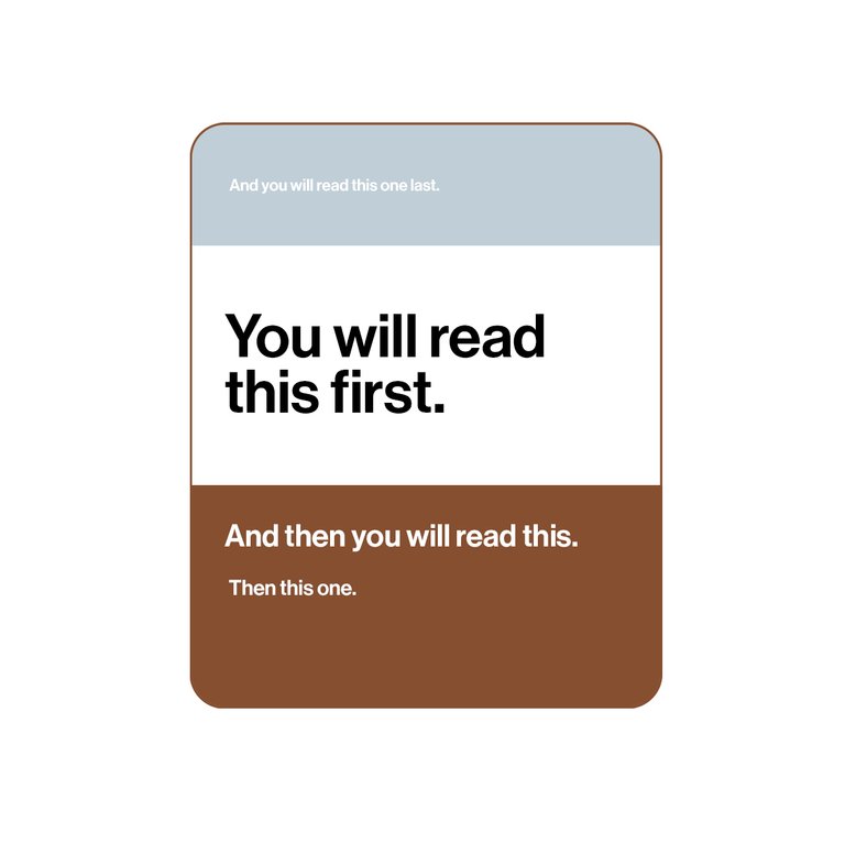
If you've ever scanned a brochure, or a website, and had a hard time figuring out where you should be looking, it's likely the layout was missing a clear hierarchy.
You'll notice in the above image that I've used the design elements of size, colour, typography and contrast to achieve a layout with a strong visual hierarchy, influencing where you looked, and in the order I wanted you to.
I'm sharing this insight because I think it's important to remember that designers, after all, are trained in the art of visual communication. This means using design to communicate a key message using the principles of graphic design, so that it reaches its audience.
We know how to wrangle a message into visual form that will achieve results, and not just look good.
Making things look good is an obvious result of working with a designer, but it’s also about effectively grabbing attention, getting your message across and coaxing the viewer to take some sort of action.
It's so important for businesses to ensure that what they want to say actually reaches its audience.
Like any other decision you make for your business, getting results should be your key consideration. And using design as a tool is no different.
Do you have a marketing or communications project I can help drive results for you, using design? Visit www.leysafloresdesign.com.au