Diseño de nueva foto de perfil (logo) y fondo de portada / New profile picture (logo) and cover background design (Esp/Eng)
¡¡¡ Hora de Renovarse!!! … Saludos a todos y Bienvenidos…
Time to Renew! ... Greetings to all and Welcome...
Después de tantos meses de ausencia me pareció una buena idea un pequeño cambio de imagen… y hoy quiero compartir con ustedes un poco del proceso de realización del nuevo logo o imagen de perfil. Además, cuando comencé en esta red social, todo fue como muy improvisado, hacia las cosas como por probar. Pero claro, poco a poco fui aprendiendo como todos y mejorando muchas cosas; y cabe resaltar, aun me falta mucho.
After so many months of absence I thought it was a good idea a little change of image ... and today I want to share with you a little of the process of making the new logo or profile image. Also, when I started in this social network, everything was like very improvised, I did things as if I was trying. But of course, little by little I was learning like everyone else and improving many things; and it should be noted, I still have a long way to go.
Mis conocimientos en diseño gráfico, Photoshop y esas cosas, son muy básicos; y por eso estoy consciente de que mis dibujos no se pueden comparar con las maravillas que he visto publicadas por estas mismas páginas. Sin embargo, creo que logré plasmar casi lo que tenía en mi mente de una manera que me dejo satisfecha.
My knowledge in graphic design, Photoshop and those things, are very basic; and that's why I am aware that my drawings cannot be compared with the wonders that I have seen published in these same pages. However, I think I managed to capture almost what I had in my mind in a way that left me satisfied.
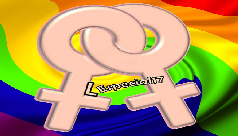
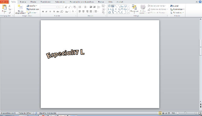
Empecé buscando en internet alguna imagen de dos símbolos femeninos entrelazados ♀♀, pero ninguno me convencía, así que opte por hacerlo en PowerPoint. Empecé desde cero, haciendo los círculos y la parte de abajo con pequeños rectángulos, para luego empezar a jugar con los efectos 3D y sombras. Disculpen no poder especificar los efectos y porcentajes aplicados, pero todo fue un ensayo y error: pintaba, borraba, movía, giraba, deshacía, hasta que quedo algo que me gusto como se veía. Por esa misma razón, no tengo imágenes detallando lo que iba haciendo.
I started looking on the internet for some image of two female symbols intertwined ♀♀ , but none of them convinced me, so I opted to do it in PowerPoint. I started from scratch, making the circles and the bottom with small rectangles, and then I started playing with 3D effects and shadows. Sorry for not being able to specify the effects and percentages applied, but it was all trial and error: painting, erasing, moving, rotating, undoing, until I got something I liked the way it looked. For that same reason, I don't have images detailing what I was doing.
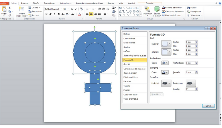
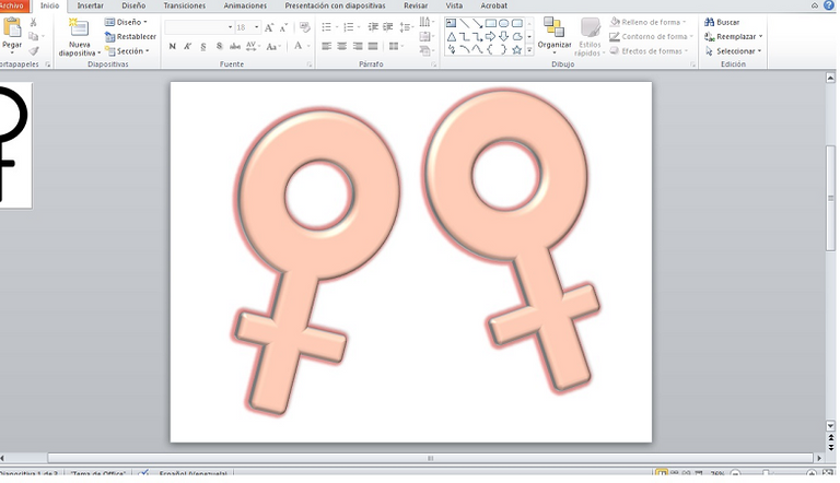
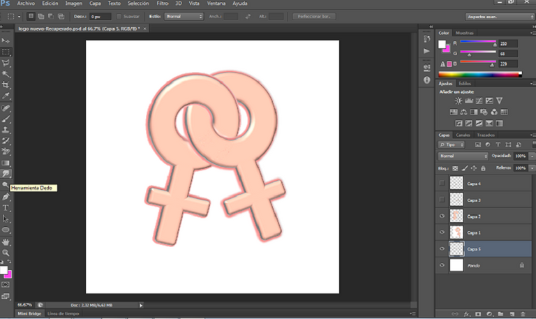
Luego, lleve la imagen a Photoshop y allí coloque ambos logos en una posición como si estuvieran entrelazados, y con las herramientas “Borrador” y “Dedo”, borre las líneas sobrepuestas para terminar de dar esa sensación.
Then, I took the image to Photoshop and there I placed both logos in a position as if they were intertwined, and with the tools "Eraser" and "Finger", I erased the overlapping lines to finish giving that feeling.
Todo el proceso lo realice utilizando Photoshop y PowerPoint, cuando veía que algo se me complicaba en Photoshop, lo hacía en PowerPoint, como fue el caso de las letras, que las hice en PowerPoint para luego pasarlas a Photoshop donde iba finalizando el diseño.
The whole process was done using Photoshop and PowerPoint, when I saw that something was complicated in Photoshop, I did it in PowerPoint, as was the case of the letters, which I did in PowerPoint and then passed them to Photoshop where I was finalizing the design.
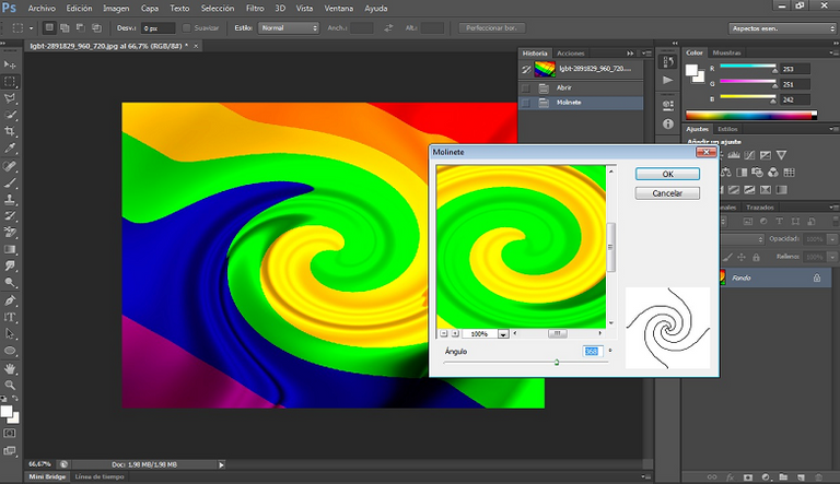
Para el fondo simplemente tome una foto de la bandera del orgullo LGBT+ y en Photoshop le aplique el efecto “Molinete”.
For the background I simply took a photo of the LGBT+ pride flag and in Photoshop I applied the "Pinwheel" effect.
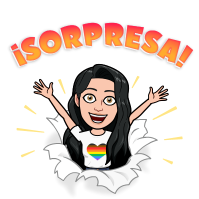
Una cosa que tenía tiempo queriendo hacer, era crearme un Bitmoji, quizás llegué tarde a la moda, pero aquí esta, jeje 😉:
One thing I had been wanting to do for a long time, was to create a Bitmoji, maybe I was late to the trend, but here it is, hehe 😉:
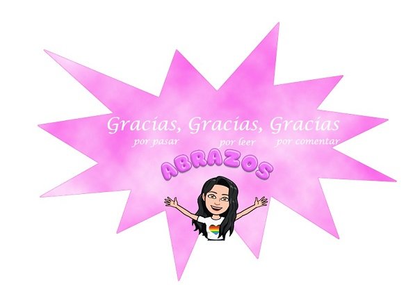
Y para terminar, la imagen del “Background” la hice degradando un fondo blanco y rosado en Photoshop y aplicando el filtro “Interpretar - Nubes”. Las letras también hechas en Photoshop en color blanco y colocadas alrededor con diferentes “Deformaciones”. Por ultimo mi pequeño Bitmoji deslizándose por un arcoíris!!
And to finish, the image of the "Background" I made it by degrading a white and pink background in Photoshop and applying the filter "Interpret - Clouds". The letters also made in Photoshop in white color and placed around with different "Deformations". Finally, my little Bitmoji sliding down a rainbow!
Quería hacer algo bonito, y alegre, que inspire cosas positivas, así como son Hive y sus comunidades en general.
I wanted to make something nice, and cheerful, that inspires positive things, just like Hive and its communities in general.
Espero les guste.
Muchas gracias.
I hope you like it.Thank you very much.
Todas las fotos son capturas de pantalla de mi pc y realizadas por mi. La traducción al Ingles fue hecha con Deepl.comAll the pictures are screenshots from my pc and made by me. The English translation was made with Deepl.com.
0
0
0.000
El fondo me gusta mucho, el rosado no es mi favorito pero se ve bien.
@tipu curate
Upvoted 👌 (Mana: 25/55) Liquid rewards.
Hola! 😀... se me había pasado tu mensaje... te confieso que el rosado tampoco es mi favorito pero cuando pensé en este diseño lo imaginaba de ese color no se porque 🙈
Hey, I really like what you did with with the bitmoji haha!
Congrats !
Es muy llamativo tu logo, haces buenas combinaciones de colores. Fue un gusto pasar por aquí. Saludos.
Muchas gracias!! 😀 un abrazo!
Me da gusto saber que implementaste un nuevo diseño para tu perfil de Hive. Siempre es una buena idea, renovar los espacios (físicos y virtuales) porque nos invita a abrirnos a nuevos caminos y conocer otros destinos.
Igual, me han gustado los colores que implementaste porque expresan libertad y vitalidad.
Bendiciones, saludos :)