💜Illustrated kawaii characters for an advertising
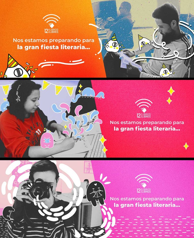
In 2018 I was commissioned to illustrate three photographs, in which the real image had to be maintained, but it had to be mixed with illustration, what we can call intervened photos. These images were part of an advertising campaign, for the celebration of the book fair that year, and were made for a publishing foundation.
Once approved, the design team generated the final designs, which you can see below. They were published on social networks such as Instagram, Twitter and Facebook, as well as on the foundation's website. For this project, 3 more illustrators worked in, using more photographs.
It was one of the most interesting commissions that I received that year, not only because of the result, but also because it was the first time that I did an illustrated work that was destinate for a real audience. So I appreciate this project.
This editorial aims to make books of many genres and for many audiences, stories, poetry, history, politics, opinion... all under very precise professional criteria. Most of the books they produce are copyright free, and can be downloaded from the website. In addition, they are in charge of carrying out various activities to promote culture and reading. I also made other graphic works in this editorial, which I would like to post later.
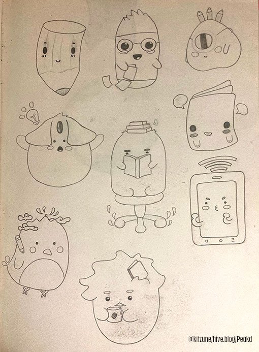
Some of the pencil sketches.
The characters that I created are based on elements that can be found inside a publishing house, also on the personalities that could be found there. And of course, in reading and the creativity and knowledge that comes from it. Another important aspect was the celebration and joyful theme of the fair that year.
☝️ These were some of my hand sketches, which were then digitized and transformed. most of them weren't used, but count as part of the process. I especially like the character that looks like a bird and has a mountain on its head, the Ávila, which is a mountain that surrounds the city where this publishing house is located, and in fact, can be seen from the windows of the place.
The results
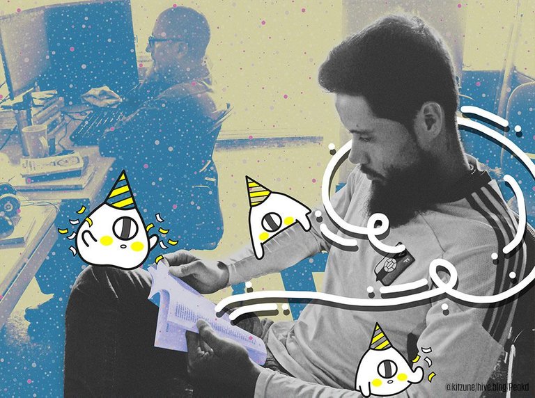
This is my second favorite, some of the characters were inspired by the work of an illustrator who calls herself Yoyo, her characters have a great Asian influence, among others.
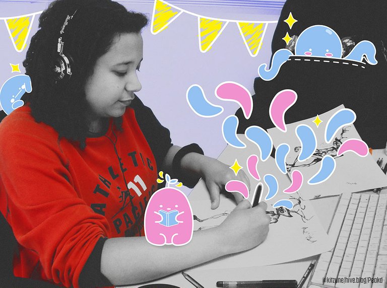
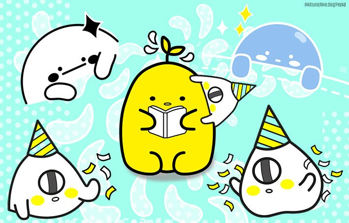
In this one the main trait is that the characters reflect joy, magic and creativity.
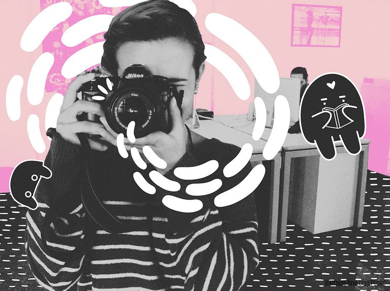
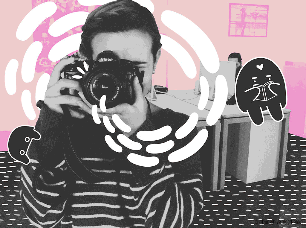
This is my favorite, because I really like the photo, and I think the characters are funny. In general, I was inspired by the cute or so-called "kawaii" style that many Japanese video game characters, animations, mascots, and advertisements have. But adapted to the theme and public of this campaign.
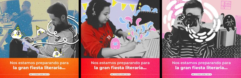
These are the final advertisements that were generated with the photographs.
Some of the characters in a different layout.
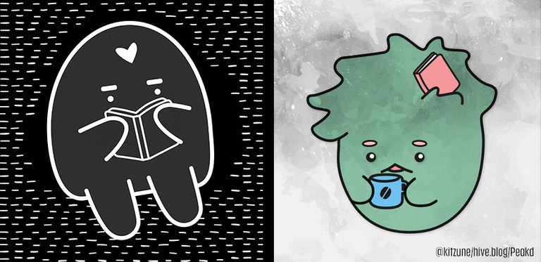
Fun fact: Most editors in the place had messy hair, always drank coffee, or used to have a lot of books on their desks, that's why green is like that. :) Although this character was not included in the final pieces, I like him a lot.
💙 HAVE A NICE DAY! 💙
Check my account for more stories like this an a lot of original art that I post every week. :)
 .
..
.
.
.
.
.
♥️
Follow me / Sígueme por:
Twitter
Instagram
I'm a fan of green with his messy hair and the book on the head! Your illustrations are supe fun and cute.
Thank you so much!! ❤️❤️ I’m glad you like my work!