Los cuadros ganadores del certamen de pintura Ciudad de Daimiel

Para terminar con la exposición del certamen de pintura Ciudad de Daimiel, comparto ahora las fotografías de los dos cuadros premiados en el certamen, y también muestro algunas de las obras que me faltaban. Ya comenté que eran dos las obras galardonadas: un primer premio dotado de 6000 €, que aportaba el Ayuntamiento de Daimiel, y un segundo premio de 4000 €, que aportaba la Diputación Provincial de Ciudad Real. El jurado estaba compuesto por diversos artistas de la región, más miembros del área de cultura del Ayuntamiento de Daimiel. Como ya se pudo ver en los cuadros de la entrada anterior, se permitía participar con obras de técnica y temática libres, aunque debo reconocer que he echado en falta alguna tinta o acuarela. No las suelo ver representadas en este tipo de certámenes.

On y va, de Alejandro Botubol
Nos encontramos con un cuadro interesante de aparente sencillez que posee, no obstante, con un tono marcadamente misterioso. Me gusta la composición, cómo el autor destaca el motivo central contrastando los fuertes tonos rojizos, azules y violetas de esa especie de cortina, con el ténue amarillo crema de la zona exterior del lienzo. Encuadra, así, esa abertura, que parece una ventana aunque no queda claro del todo, que solo permite una velada mirada hacia ese otro mundo de detrás. El pájaro blanco, posado en una madera que parece flotar mágicamente en el aire, añade una carga simbólica, o quizá surrealista, a la obra, que me llega a recordar algunos motivos de los cuadros de Magritte. El propio título de la obra, On y va, puede indicarnos algún tipo de relación con la idea de movimiento o cambio.
También destacaría la técnica del pintor en la ejecución de este óleo, su capacidad de plasmar el color, el volumen y la iluminación de esa cortina o visillo, que en ocasiones se aprecia algo transparente y deja entrever el rojo del fondo. En fin, que se trata de una obra muy atractiva y sugerente que invita al espectador a reflexionar sobre sus significados y simbolismos.
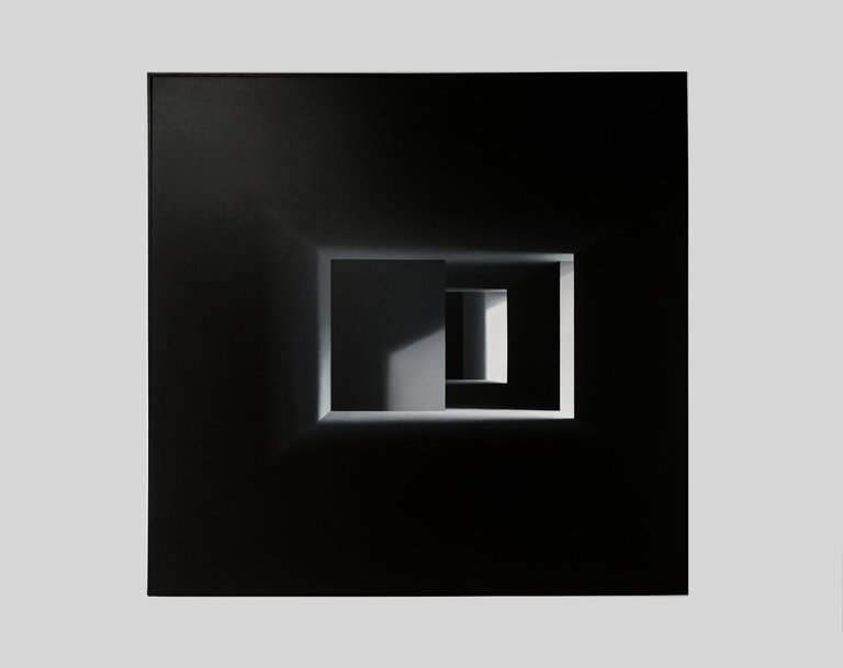
Empty Perception, de Mónica Dixon
Un cuadro que me terminó gustando muchísimo. Al principio se nos aparece como una abstracción geométrica en escala de grises con predominio del negro, salvo en la zona central, donde se distinguen varios cuadriláteros: rectángulos y trapecios en tonos blancos y agrisados. Sin embargo, cuando llevas un rato mirándolo, te llega la revelación, de repente, y te das cuenta de que, detrás de aparente fachada de cuadro abstracto conceptual se esconde un cuadro figurativo, una representación tridimensional monocromática de un especio de interior, de una especie de pasillo vacío que se extiende hacia el fondo, donde se distinguen las paredes y la confluencia con varios pasillos de iluminación desigual que se cruzan con el principal. Todo en ausencia de líneas curvas. Una vez que has traspasado el umbral, es muy difícil volver a percibir la obra en su dimensión puramente geométrica y abstracta. Otra obra misteriosa que escondía mucho más de lo que parecía a primera vista, y ejecutada con maestría para lograr ese efecto pues, al acercarte, te das cuenta de los ténues difuminados de los ángulos, que es lo que finalmente te conducen hacia esa sensación de tridimensionalidad.
Y, a continuación, os dejo los cuadros que me faltaban por compartir.
Waterloo, de Carol Solar
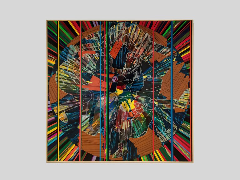
Serie Universos Cíclicos IV, de Francisco Javier Tercero Moreno
El silencio de las palabras, de Mercè Humedas Parés
Me encanta la representación de esas baldosas.

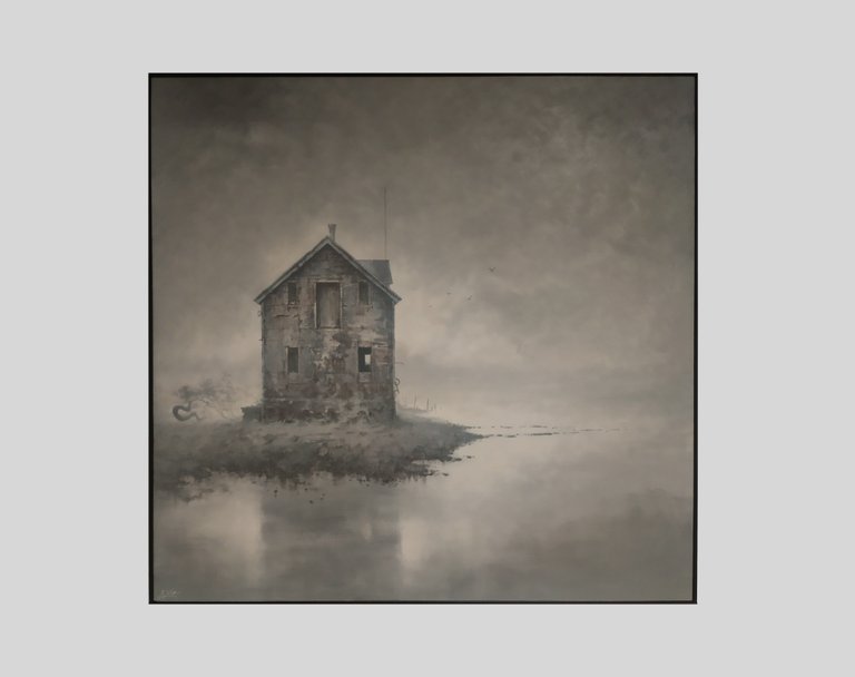
Paso elevado nº1, de Juan Manuel Álvarez Cebrián
Excentricidad V. La lectura de una modelo llamada Celta, de Javier Soria Ortega
Inner Sanctum, de Juan José Vicente Ramírez
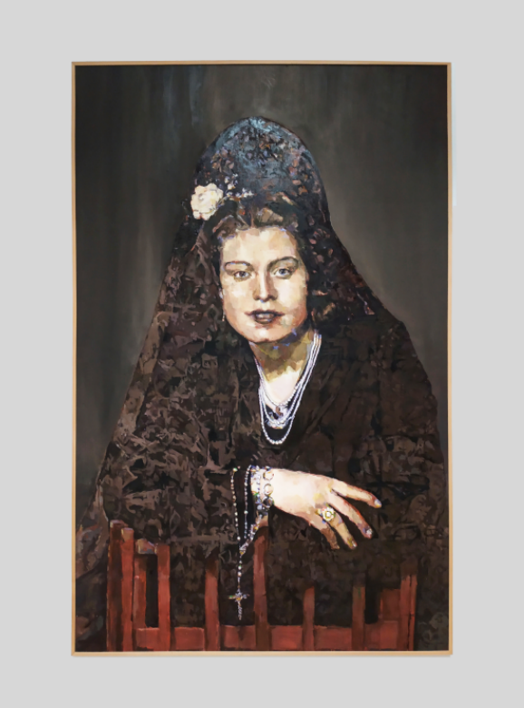
Promesa a la Virgen de las Cruces, de Ana María Cencerrado García de la Galana
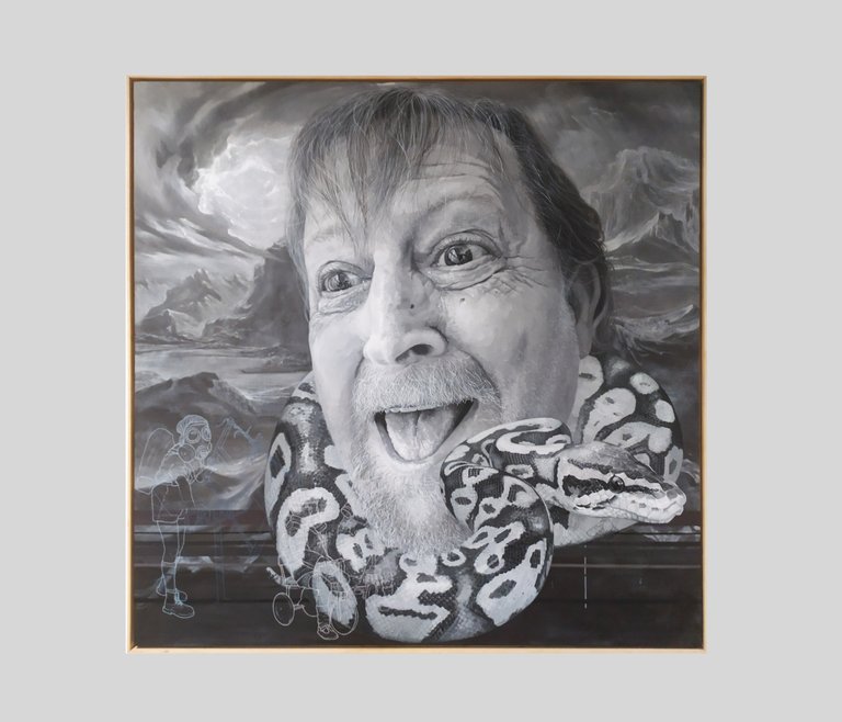
La vida aprieta pero no ahoga, ¿o sí?, de Verónica Bueno Salgado
Y, para finalizar, un cuadro que llama muchísimo la atención en la sala. Esa cabeza gigantesca que no solo llena el lienzo, sino todo el espacio donde está colgado.
Si he de mencionar algo negativo de esta exposición, es el poco cuidado que han puesto en la elaboración del folleto informativo. El diseño es bastante malo, está mal maquetado, he visto erratas, y la impresión y presentación final deja mucho que desear. No se parece a otros folletos y catálogos que han preparado para otras exposiciones que han tenido lugar en la misma sala, da una sensación muy cutre, de dejadez, que contrasta con el nivel de la exhibición.
¡Saludos, y feliz año nuevo a todos!
To finish with the exhibition of the painting competition Ciudad de Daimiel, I now share the photographs of the two winning paintings in the competition, and I also show some of the works that I was missing. I have already mentioned that there were two prize-winning works: a first prize of 6000 €, provided by the Daimiel Town Council, and a second prize of 4000 €, provided by the Provincial Council of Ciudad Real. The jury was made up of various artists from the region, plus members of the cultural department of Daimiel Town Council. As could already be seen in the paintings in the previous post, it was possible to participate with works of free technique and subject matter, although I must admit that I missed some ink or watercolour. I don't usually see them represented in this type of competition.
On y va, by Alejandro Botubol
This is an interesting painting of apparent simplicity, which nevertheless has a distinctly mysterious tone. I like the composition, how the artist emphasises the central motif by contrasting the strong reddish, blue and violet tones of this sort of curtain with the faint creamy yellow of the outer area of the canvas. He thus frames this opening, which resembles a window, although this is not entirely clear, a window that provides only a veiled glimpse of the other world hidden behind it. The white bird, perched on a piece of wood that seems to float magically in the air, adds a symbolic, or perhaps surrealist, charge to the work that reminds me of some of the motifs in Magritte's paintings. The very title of the work, On y va, may indicate some kind of relation to the idea of movement or change.
I would also highlight the painter's technique in the execution of this oil painting, his ability to capture the colour, volume and lighting of the drapery or net curtain, which is sometimes somewhat transparent and allows a glimpse of the red of the background. In short, this is a very attractive and suggestive work that invites the viewer to reflect on its meanings and symbolism.
Empty Perception, de Mónica Dixon
A painting that I ended up liking very much. At first it appears to us as a geometric abstraction in greyscale with a predominance of black, except in the central area, where several quadrilaterals can be distinguished: rectangles and trapezoids in white and greyish tones. However, when you have been looking at it for a while, you suddenly realise that, behind the apparent façade of an abstract conceptual painting, a figurative painting is hidden, a monochromatic three-dimensional representation of an interior space, of a kind of empty corridor that extends towards the back, where you can make out the walls and the confluence with several corridors of uneven lighting that intersect with the main one. All in the absence of curved lines. Once you have crossed the threshold, it is very difficult to perceive the work in its purely geometric and abstract dimension. Another mysterious work that hid much more than it seemed at first glance, and masterfully executed to achieve this effect because, if you get closer, you notice the faint blurring of the angles, which is what finally leads you to this sensation of three-dimensionality.
And here are the paintings I have yet to share.
Waterloo, by Carol Solar
Cyclic Universes Series IV, by Francisco Javier Tercero Moreno
The silence of words, by Mercè Humedas Parés
I love the representation of these tiles.
Flyover No. 1, by Juan Manuel Álvarez Cebrián
Eccentricity V. The reading of a model called Celta, by Javier Soria Ortega
Inner Sanctum, de Juan José Vicente Ramírez
Promise to the Virgen de las Cruces, by Ana María Cencerrado García de la Galana
Life is tight but it doesn't suffocate, does it?, de Verónica Bueno Salgado
And finally, a painting that attracts a lot of attention in the room. That gigantic head that not only fills the canvas, but the entire space where it is hung.
If I have to mention something negative about this exhibition, it is the lack of care taken in the preparation of the information brochure. The design is quite bad, it is poorly layout, I have seen typos, and the printing and final presentation do not reach the expected quality. It doesn't look like other brochures and catalogues that have been prepared for other exhibitions that have taken place in the same hall, it gives a very shabby and neglected feeling, which contrasts with the level of the exhibition.
Greetings, and happy new year to all!
las imágenes usadas en el artículo son de mi autoría.
Puedes leerme también en mi Gabinete de historias curiosas, un blog dedicado a curiosidades históricas y otro tipo de contenido relacionado con el arte, la música y las humanidades, o en Va de romanos, mi web dedicada al mundo de la antigua Roma. O seguirme en mis redes sociales:


También puedes hacerte con alguno de mis diseños y trabajos artísticos en impresión bajo demanda en esta dirección..
Congratulations @iaberius! You have completed the following achievement on the Hive blockchain And have been rewarded with New badge(s)
Your next target is to reach 57000 upvotes.
You can view your badges on your board and compare yourself to others in the Ranking
If you no longer want to receive notifications, reply to this comment with the word
STOPCheck out our last posts:
Support the HiveBuzz project. Vote for our proposal!