[ESP-ING] Conmemorando el Día Internacional del Diseño | Commemorating International Design Day
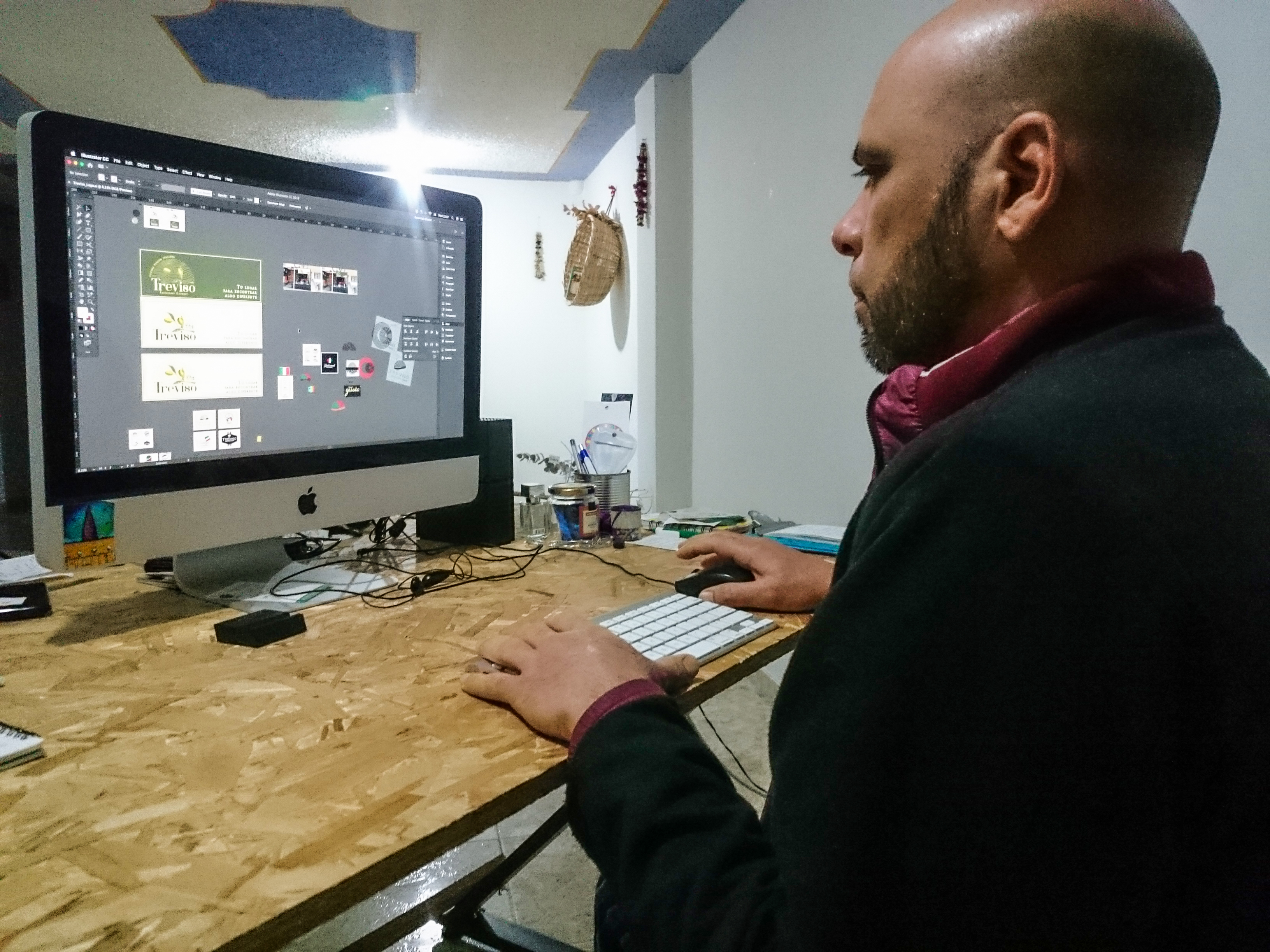
Foto: @zailecita | Photo: @zailecita
Toda profesión tiene su día especial de celebración, siempre para recordar los logros y propósitos de los que ejercen dicha profesión. Cada 27 de abril se conmemora el "Día Internacional del Diseño", festejando las noblezas de los diseñadores gráficos y como a lo largo del tiempo, estos han transformados a la sociedad y al comercio. Por esta y muchas razones más, hoy aprovechan para darle la importancia que se merecen. Me desempeño en esta área desde hace algún buen tiempo y a pesar que no soy egresado de nugún instituto de diseño, considero que el aprendizaje autodidacta que he tenido ha sido bien organizado y estructurado. Siempre en constante aprendizaje. Hoy quiero aprovechar la oportunidad de compartir un trabajo que realicé hace poco, a pesar que no tuvo un comienzo tan fácil.
Every profession has its special day of celebration, always to remember the achievements and purposes of those who practice the profession. Every April 27 is commemorated the "International Design Day", celebrating the nobility of graphic designers and how over time, they have transformed society and commerce. For this and many other reasons, today we take the opportunity to give them the importance they deserve. I have been working in this area for some time and although I am not a graduate of any design institute, I consider that the self-taught learning I have had has been well organized and structured. Always in constant learning. Today I want to take the opportunity to share a work I did recently, although it did not have such an easy start.
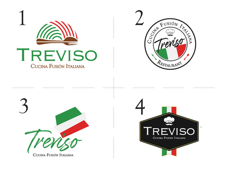
Propuestas iniciales rechazadas por el cliente | Initial proposals rejected by the client
Treviso es un marca que pretende entrar al mercado con cocina italiana, especialmente con la elaboración de pastas artesanal y pizzas. Cuando el cliente me contactó para crearle la identidad gráfica de su negocio, todo estuvo en orden, no entendimos a la perfección, aparentemente. Con frecuencia suelo aplicar, una vez terminada la reunión, un cuentionario para recopilar datos para elaborar mi briefing, que no es mas que unas instruciones iniciales para arrancar el trabajo y no desviarme de lo que se requiere para la identidad. Luego de un par de semanas trabajando en ello, elaboré 4 propuestas que fueron rechazadas de insofacto penas el cliente las vio.
Treviso is a brand that intends to enter the market with Italian cuisine, especially with the production of handmade pastas and pizzas. When the client contacted me to create the graphic identity for his business, everything was in order, we didn't understand each other perfectly, apparently. I often apply, once the meeting is over, a questionnaire to collect data to prepare my briefing, which is nothing more than some initial instructions to start the work and not to deviate from what is required for the identity. After a couple of weeks working on it, I elaborated 4 proposals that were rejected out of hand when the client saw them.
Boceto proporcionado con el cliente | Sketch provided with client
En ese justo momento me hizo recordar porque ejercer el diseño es tan complicado, tenia entendido que había comprendido lo que deseaba. Quizás por esto es que el diseño es unas de las profesiones menos comprendidas y en muchas ocasiones no tan valorada. Muchas veces el tiempo invertido, la invetigación y el esfuerzo por reflejar la idea que se tiene en el papel no siempre son percibidos claramente. El cliente fue muy claro y directo: "ninguna gusta", exclamó, "no queremos que la iamgen se relacione con Italia tan directamente". Fue implacable recibir eso, sin embargo, el alivia la situación comentaod que había realizado una especie de boceto, que quería mejorar eso y darle el toque estético característico de algo profesional y bien hecho. Así mismo manifestó que le había dado pena pasarlo antes por miedo al rechazo y respetando mi creatividad.
At that very moment it made me remember why design is so complicated, I understood that I had understood what I wanted. Perhaps this is why design is one of the least understood professions and often not so valued. Many times the time invested, the research and the effort to reflect the idea on paper are not always clearly perceived. The client was very clear and direct: "we don't like any of them", he exclaimed, "we don't want the image to relate to Italy so directly". He was relentless in receiving that, however, he relieved the situation by commenting that he had made a kind of sketch, that he wanted to improve it and give it the aesthetic touch characteristic of something professional and well done. He also said that he had been embarrassed to pass it before for fear of rejection and respecting my creativity.
Fotografías proporcionadas con el cliente | Photographs provided with the customer
En ese momento le pedí algunas imágenes del local para tener una idea más clara de lo que conservaba en su cabeza. Efectivamente, el ya estaba trabajando todo el local tomando aquello que me había pasado. Rara vez y cliente está tan claro y determinado en su idea de negocio e imagen. Treviso es una ciudad de Italia, la cual el visitó hace uno año y de allí el nombre, y lo relacionó con el olivo que se produce allá. Esos fueron los recursos gráficos que tomó a consideración para su identidad gráfica. A mi me agradó mucho su idea, pero el gusto hubíese sido mayor sabiéndolo desde el inicio. Una vez realizado mis ajustes le compartí mis imágenes para debatir y elegir, entre algo bastante sobrio y algo un poco mas llamativo con una paleta de colores mas viva.
At that moment I asked him for some images of the place to get a clearer idea of what he had in his head. Indeed, he was already working on the whole place taking what he had passed me. Rarely is a client so clear and determined in his business idea and image. Treviso is a city in Italy, which he visited a year ago and hence the name, and he related it to the olive tree that is produced there. Those were the graphic resources he took into consideration for his graphic identity. I was very pleased with his idea, but I would have liked it even more if I had known it from the beginning. Once I made my adjustments, I shared with him my images to discuss and choose between something quite sober and something a little more striking with a more vivid color palette.
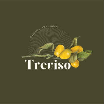
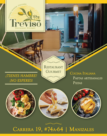
Propuestas definitivas | Final proposals
Ecogímos la paleta que contenía el color amarillo, se ve bastante agradable, fresco, conservador y no deja de ser sobrio y elegante. Una vez concretada la identidad gráfica, la comunicación visual entra en juega de manera crucial, llevando los bocetos e ideas a la funcionalidad, tomando en cuenta el público y la zona. Nuestro trabajo acá se centra en comunicar de manera visual el mensaje del negocio, por lo que empezamos por la fachada, para darle identidad al local, buscando llame la atención de muchos. Para ello, con una de las fotos que me envió le hice un fotomontaje con las propuestas de banner que le había realizado, y de esta manera visualizara como se vería. Escogió el de fondo claro.
We chose the palette that contained the yellow color, it looks quite nice, fresh, conservative and yet sober and elegant. Once the graphic identity was finalized, the visual communication comes into play in a crucial way, taking the sketches and ideas to functionality, taking into account the public and the area. Our work here focuses on visually communicating the message of the business, so we start with the facade, to give identity to the store, seeking to attract the attention of many. To do this, with one of the photos he sent me, I made a photomontage with the banner proposals I had made, so he could visualize how it would look like. He chose the one with a light background.
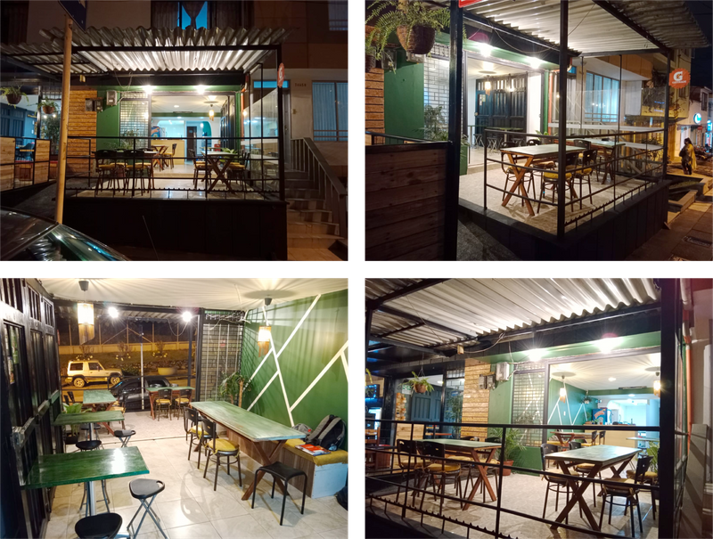
Publicidad exterior y Mockup | Outdoor advertising and Mockup
Avanzando con el trabajo, ya en este punto pensamos en la estación del cliente en el local, por lo que procedimos a diseñar la carta de su restaurante. En este punto me manifestó que los restaurante que había visita en su paso por Treviso, Italia, notó un factor común en las cartas, y es que no tenían fotos de los platos ni nada. Conesa información recurrí a diseñar algo bastante minimalista. Una carta doblada en 3 partes fue lo que consideré mas práctica y funcional. Tomando en cuenta que en la fachada se usó el color claro, y que el local por dentro empleó el color verde, procedí a gestionarlo de esa manera, con la carta verde.
Moving forward with the work, at this point we thought about the client's station in the restaurant, so we proceeded to design the menu of his restaurant. At this point he told me that the restaurants he had visited during his visit to Treviso, Italy, he noticed a common factor in the menus, and that is that they did not have pictures of the dishes or anything. With that information I resorted to design something quite minimalist. A menu folded in 3 parts was what I considered the most practical and functional. Taking into account that the façade used a light color, and that the inside of the restaurant used green, I proceeded to manage it that way, with the green menu.
Carta del restaurante | Restaurant menu
Para hacer promoción física del restaurante proseguimos con el diseño de flyer para captar la atención de futuros clientes, buscando sobretodo, una acción en las personas. Para ello evalué la calidad de las imáges del local que me envió respecto al tamaño del flyer para impresión y considerar su uso para ello. Por fortuna, la imágen que tomé conservaba una calidad aceptable para imprimir, claro, el tamãno del flyer no exigia tanto. Además, para hacer más evidente a lo que se dedicaba el restaurante, tomé en consideración el uso de alusivas a la raíz de las preparaciones que ofrecerían, pastas artesanales y pizzas. Las fotos son libres de derecho, y las descargue de manera gratuita de Freepik.
To promote the restaurant physically, we continued with the flyer design to capture the attention of future customers, seeking above all, an action in people. To do so, I evaluated the quality of the images of the restaurant that he sent me regarding the size of the flyer to be printed and considered its use for this purpose. Fortunately, the image I took kept an acceptable quality for printing, of course, the size of the flyer did not require so much. In addition, to make it more evident what the restaurant was dedicated to, I took into consideration the use of allusive to the root of the preparations they would offer, handmade pastas and pizzas. The photos are royalty free, and I downloaded them for free from Freepik.
Link de las imágenes de derecha a izquierda.
Link to the images from right to left.
Volante publicitario del restaurante | Flyer advertising the restaurant
Finalmente, quedamos muy contentos con el resultado final, tanto el cliente como yo trabajo en la personalidad de un nuevo comercio. El cliente manifestó su conformidad con el trabajo realizado comentando: "Pero todo quedó como se quería hermano. Gracias a ti por este trabajo tan espectacular". A pesar que es complejo entender las ideas iniciales de los clientes, siendo muy abstractas en un comienzo, con paciencia y tolerancia he podído conseguir buenos resultados y generando buena simpatía a los clientes con mi trabajo. Es lo fácil y lo difícil de ejercer el Diseño Gráfico.
Finally, we were very happy with the final result, both the client and I worked on the personality of a new business. The client expressed his satisfaction with the work done by commenting: "But everything was as wanted brother. Thanks to you for such a spectacular job". Although it is complex to understand the initial ideas of the clients, being very abstract in the beginning, with patience and tolerance I have been able to achieve good results and generating good sympathy to the clients with my work. This is the easy and the difficult part of working in Graphic Design.
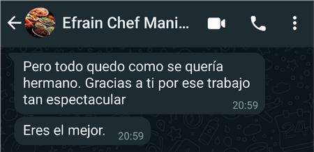
Comentario de agrado vía whatsapp | Comment of liking via whatsap

Translated with www.DeepL.com/Translator (free version)
Hablo de mí
Creo en la creatividad y en el arte, en sus distintas manifestaciones, como herramientas de transformación. Considero que son pilares fundamentales para expresarnos y mostrarnos. El arte, con el tiempo, me ha dado una visión distinta del entorno y del mundo.
I talk about my
I believe in creativity and art, in its different manifestations, as tools for transformation. I consider them fundamental pillars to express and show ourselves. Art, over time, has given me a different vision of the environment and the world.
Your content has been voted as a part of Encouragement program. Keep up the good work!
Use Ecency daily to boost your growth on platform!
Support Ecency
Vote for new Proposal
Delegate HP and earn more
Thanks a lot.
Chrees...
Su post ha sido valorado por @ramonycajal
Muy agradecido con su valoración.
Saludos
https://twitter.com/hectgranate/status/1519568737438949382
The rewards earned on this comment will go directly to the person sharing the post on Twitter as long as they are registered with @poshtoken. Sign up at https://hiveposh.com.
Muchas personas no entienden cuán importantes son los diseñadores en la actualidad. El mundo va muy rápido, la competencia crece y muchas veces los que marcan la diferencia son los diseños. Bien pueden impulsar un proyecto como frenarlo, en dependencia de la calidad de la obra. Muchas felicidades! ! ! Disfruté el post. Se nota la pasión.
Así es, todo va extremadamente rápido, y lo visual cada vez toma mas relevancia en todos los aspectos.
Me alegra te haya gustado. Agradecido con tu estancia aquí, @leydilr.
Saludos
Como siempre buen post bro, tu visión siempre me ha gustado sobre el diseño. Felicidades.
Muchas gracias por tu apreciación Mr. Zod.
Agradezco tu tiempo por acá.
Cheers