UN VIAJE DE SENSACIONES Y COLORES EN PRODUCTOS COMESTIBLES (SUPERMERCADOSRIOVIDA)
Ahora bien, haciendo uso de la plataforma tuve que hacer uso de la edición para darle vida a cada producto, puesto que en la vida real la persecución de los colores es más notoria y sentimos que lo que vemos puede transmitir un gusto, textura y sensación de satisfacción o repugnancia; para esta ocasión moví un poco el contraste y la saturación para darle más vida al producto, para que al momento de que vean las fotos se sientan que la comida que les muestro habla y los inviten a comprar.
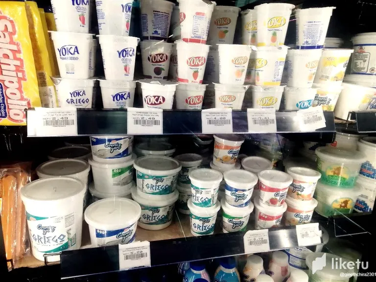
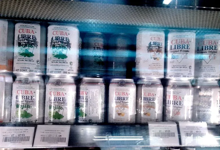
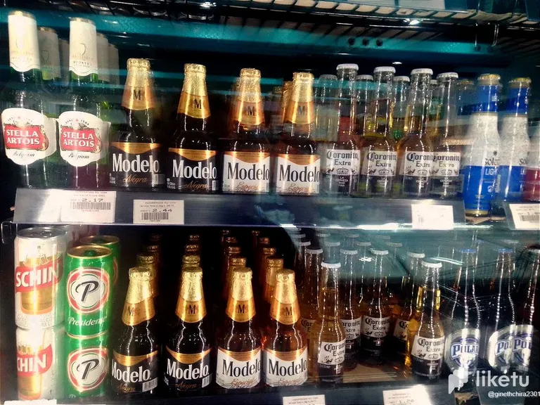
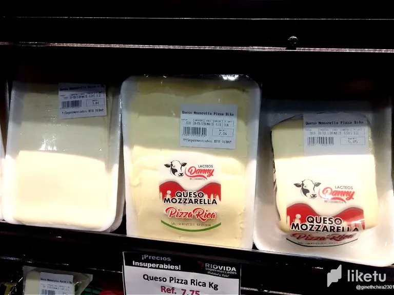
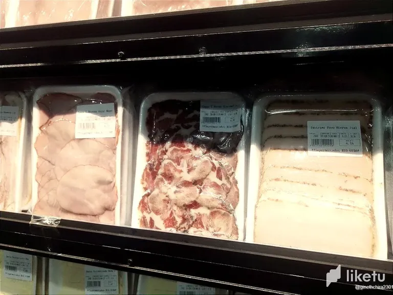
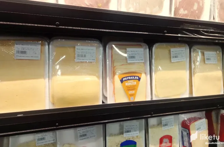
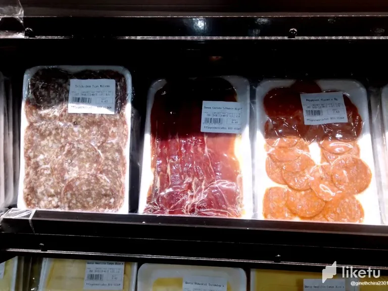
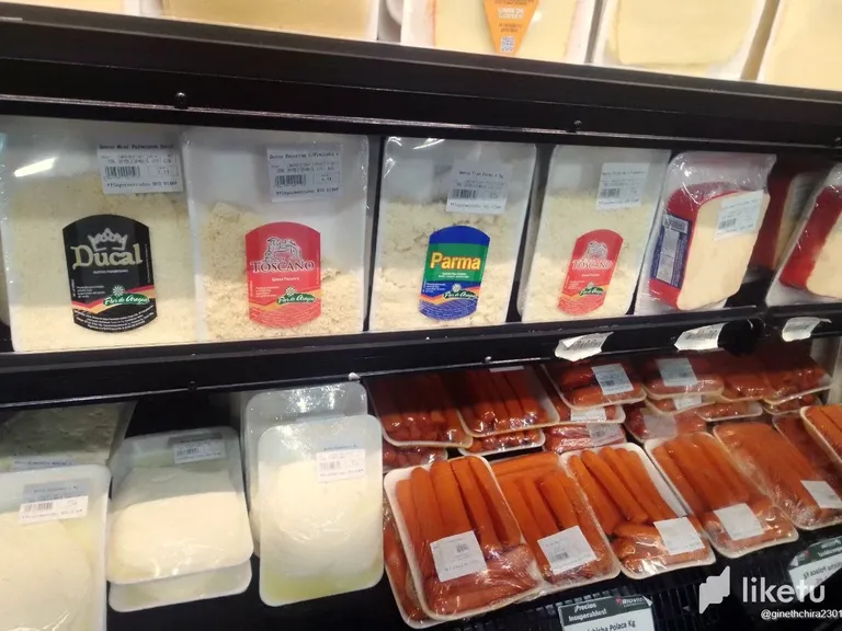
El producto estrella considero que es la Cuba libre que hay en presentación de Mojito y Piña Colada; el unico defecto fue que mi billetera estaba vacia; aun así los diferentes tipos de jamón como de queso me dejaron con ganas de realizar una pizza, puesto que son tan diversos que su combinación puede ser igual a tocar el cielo y luego está el estante del café que me pareció realmente buena idea el juntar en un mismo sitio, las distintas marcas de café nacional, para su promoción,comercio como venta y ya por último el Yogur o Yoka que es la parte única, digamos que saludable que había en el mercado y que me llamo la atención por la cantidad diversa de colores y que de cierta manera siempre está organizada por patrones de colores comenzando por el Azul que suele ser utilizado para productos Light y luego le sigue el amarillo para representar el color de piña,el naranja para el melocotón y el rojo para la frambuesa o fresa.
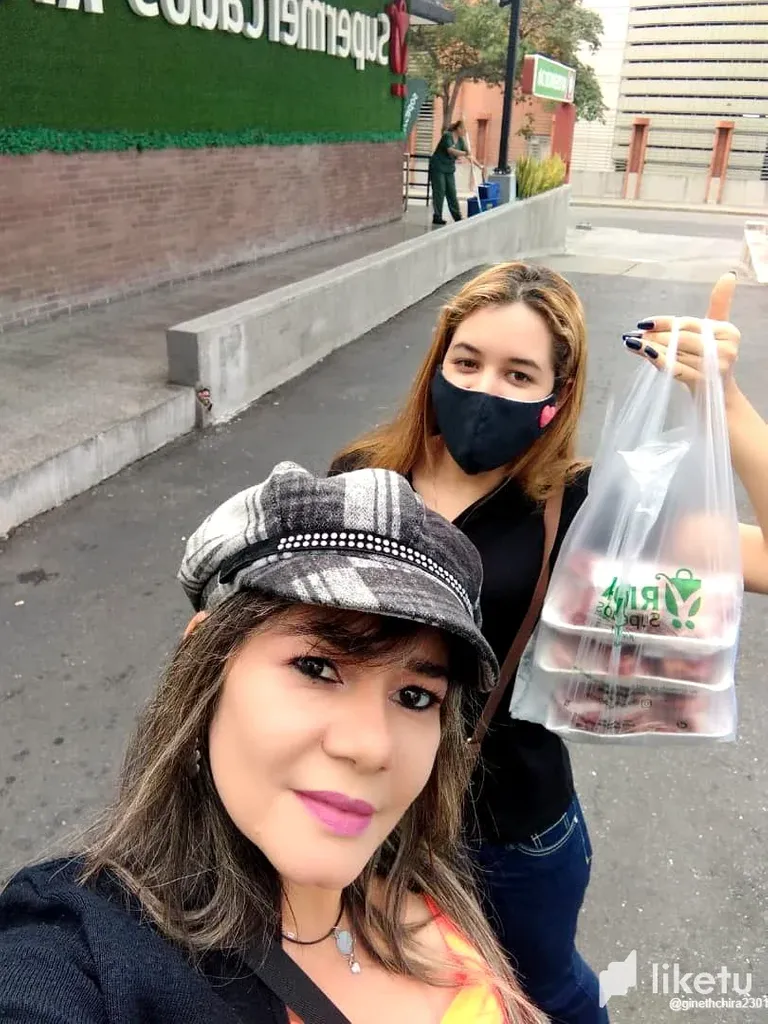
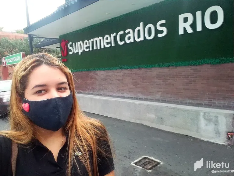
Hello, today I went with my mother to a new supermarket that has very good prices for cuts of meat, so after seeing various publications we went to see what products the Rio Vida Supermarket had on display and boy did I get a super -pleasant surprise to see the great variety of products that were there; Among the most outstanding and that left me wanting to buy the product was the Delicatessen part.
Now, using the platform, I had to use editing to bring each product to life, since in real life the pursuit of colors is more noticeable and we feel that what we see can convey a taste, texture, and sensation. of satisfaction or disgust; For this occasion I moved the contrast and saturation a bit to give the product more life, so that when they see the photos they feel that the food I show them speaks and invites them to buy.
I consider the star product to be the Cuba libre that is in presentation of Mojito and Piña Colada; the only flaw was that my wallet was empty; even so, the different types of ham and cheese left me wanting to make a pizza, since they are so diverse that their combination can be equal to touching the sky and then there is the coffee shelf that I thought was a really good idea to put together the same place, the different brands of national coffee, for its promotion, trade and sale and finally the Yogurt or Yoka which is the only part, let's say the healthy one that was on the market and that caught my attention due to the diverse quantity of colors and that in a certain way is always organized by color patterns starting with Blue, which is usually used for Light products, and then yellow to represent the color of pineapple, orange for peach and red for raspberry or strawberry.
For the best experience view this post on Liketu
Has sido votado por
PROYECTO ENLACE
'Conectando Ideas y Comunidades'
PROYECTO ENLACE es un proyecto de curación de habla hispana enfocado en recompensar contenido de calidad y apoyar autores en su proceso de crecimiento en HIVE.
Creemos y apostamos por el futuro de esta gran plataforma, y estamos muy emocionados de poder hacerla crecer junto a esta comunidad. Así que te invitamos a publicar en nuestra COMUNIDAD y estar atento a todas las actividades que tenemos preparadas y que estaremos publicando en breve.
¿QUIERES AUTOMATIZAR TUS GANANCIAS DE CURACIÓN? SE PARTE DEL PROYECTO ENLACE APOYANDO A NUESTRO TRAIL EN HIVE.VOTE INGRESA AQUÍ PARA CONOCER LOS DETALLES.
¿QUIERES INVERTIR ENLACE? DESCUBRE COMO HACERLO Y GENERAR INGRESOS DE FORMA SEMANAL MEDIANTE TU DELEGACIÓN DE HP AQUÍ TE EXPLICAMOS COMO.
Te invitamos a participar en nuestro servidor de Discord: https://discord.gg/3S9y7BbWfS
Atentamente
EQUIPO ENLACE 2023
Thank you 😁🙏🏻