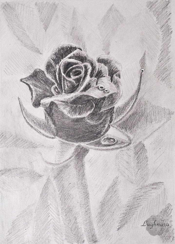
Black rose (pencil graphic)
Hi friends!
Black and white drawing is a special kind of graphics. Under it, you need to carefully select the plot so that it looks no less (and ideally more) advantageous than in color.
It was the task of the next competition - to make a black and white drawing with simple pencils
One day I saw in a magazine a black and white photo of an iris photographed in contrasting lighting. It was delicious!
I wanted to try to draw something like this
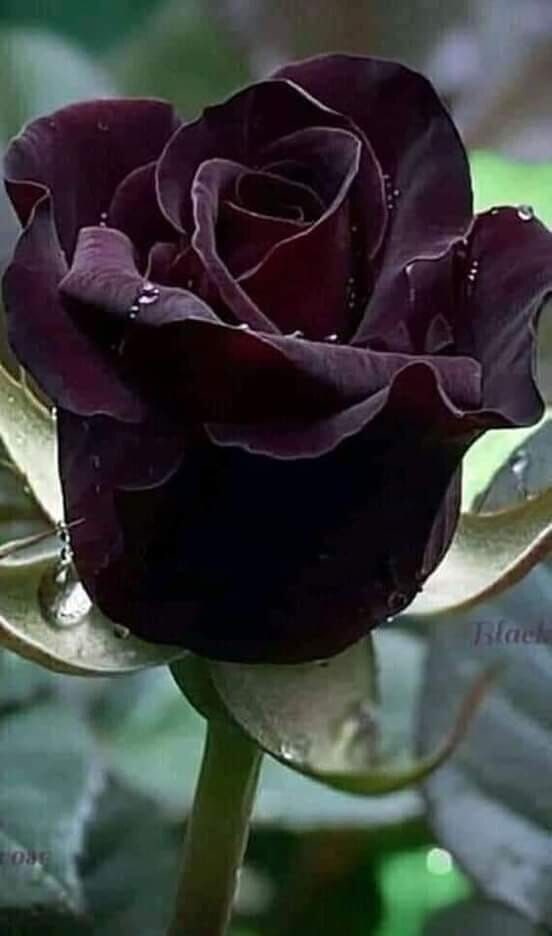
I found beautiful black rose on Pinterest as a ref.
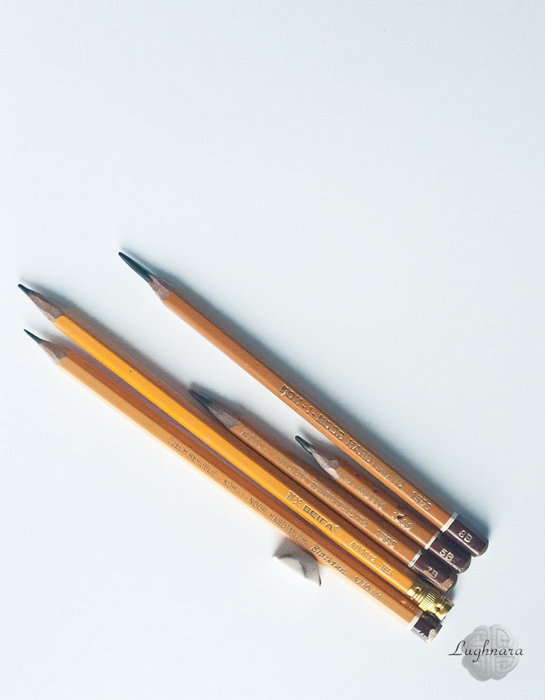
I used five pencils of varying degrees of softness in my work, a sharp-edged eraser and plain paper for sketching.
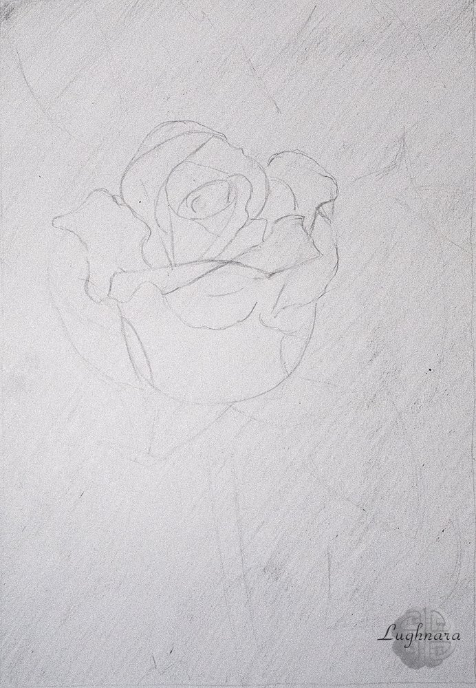
Sketch
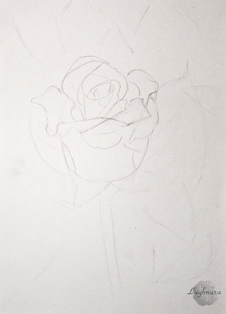
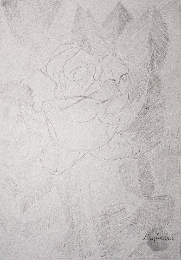
With an HB pencil, I shade the entire finished sketch in an even layer in one direction.
This is a middle tone.
Leaves in the background.
Since the flower is the most contrasting and darkest element in the picture, the space surrounding it will be much lighter.
I stroke the leaves in different directions, with different efforts, trying to alternate darker and lighter areas so that the background does not look boring.
For this I use HB and 2B pencils.
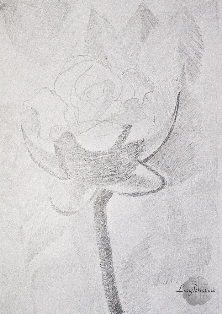
For the flower, I left the softest pencils, giving a bold and dark stroke.
But I also started working from the lightest areas - from the sepals and from the illuminated areas of the petals. The stem of the rose is also quite dark compared to the background.
I also use different shading (with 2В and 5В pencils): I make the outer edges of the sepals with straight short strokes, the inner ones with arched ones to emphasize their concave shape.
The same with the petals. On the stem I try to show its cylindrical shape, I make one edge a little darker, I also darken the very top part, which goes under the flower.
Yes, the light comes from above
I start painting the flower from the core.
The structure of the rose is complex, the petals lie, bending over each other. Therefore, it is important here to apply tones on two adjoining planes so that they do not merge. At the central petals, I leave only a narrow strip at the top light, closer to the inside of the flower I shade strongly, almost to black.
The farther the petals are located from the core, the lighter they become closer to the outer edge.
I take this aspect into account in hatching, picking up one or the other pencil so that the transition from one tone to another is smooth.
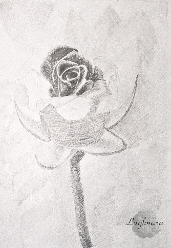
Some of the petals bend very nicely, each such plane also needs to be hatched with different tones to show the shape of the bend. And do not forget that the lightest areas (glare) are at the fractures of the form, in rose petals this is an area from the edge.
Approximately in the same vein, I continue to work.
At the petals, they are in an unlit zone, within the boundaries of the lower petal, I show only a fragment of their upper part, and I take everything else to a black tone.
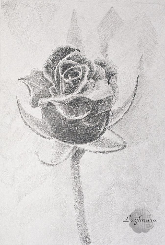
At the last stage, I wanted to complicate the background a little, and I made gradient extensions on individual leaves (and redrawn the left corner altogether).
Well, I decided to add some more dew drops on the petals in order to focus more on the flower itself.
More or less like this
Yes, sometimes just draw in black and white, without color spots - this is a variety in painting
Have a nice and creative day!
Regards
https://twitter.com/GerdanaNeis/status/1494892015909314560
The rewards earned on this comment will go directly to the person sharing the post on Twitter as long as they are registered with @poshtoken. Sign up at https://hiveposh.com.
Wow so beautiful and stunning sketch 😍. Love your technique, you are so talented ❤. Best wishes
@anusrimollick, many thanks)
Lots of love dear ❤
This piece looks really beautiful
@artsbreezy01, thanks a lot!
You’re welcome