Today's AI Generated Art Study The addition of "blue" and a comma
Now that I have done a couple tests with the basic terms "brush stroke" and "brush strokes", I want to see how adding a color will effect image creation. I know it will change the main color but I also wanted to know how it will effect the style and stroke size and directions.
Here is "brush strokes, blue" (note the comma) compared to the "brush strokes" image.
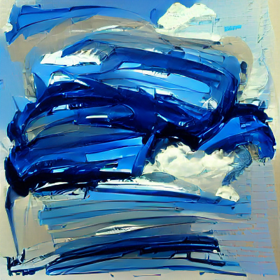
"brush strokes, blue"
vs
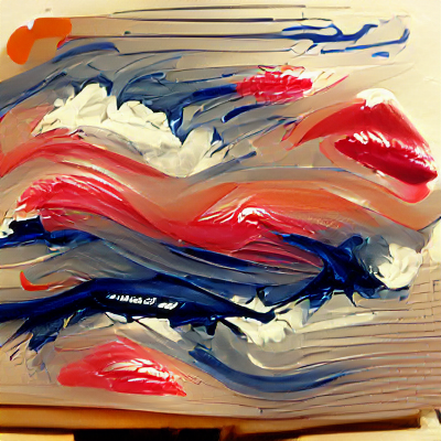
"brush strokes"
The first major change is there is no red in "brush strokes, blue", this will be a common and probably obvious theme in today's study. Both images tend to keep most of the brush strokes in the center of the image and have those cloud like white spots. The blue image has more vertical lines on the bottom.
Now let's take a look at "brush strokes blue", no comma, compared to the first "brush strokes" image. Notice how removing the comma made a difference and created an image less similar to the first "brush strokes" image. Adding the word "blue" with out the comma also seemed to make the software try to create a signature or what looks like what is suppose to be a signature. You will see that at times. Usually the "signature" looks like a very scribbled version of one or more of your tags.
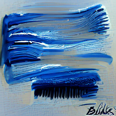
"brush strokes blue"
vs

"brush strokes"
When I put the word "blue" in the front of the tags the software once again creates a much different image, other than the general minimalist style and color scheme.
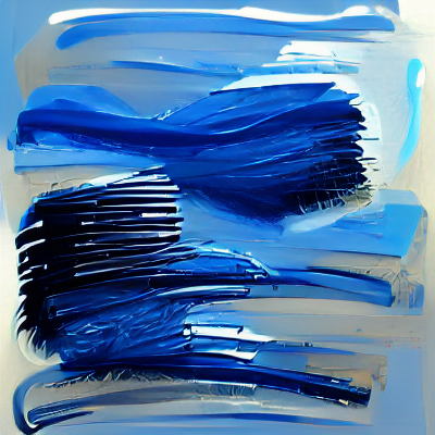
"blue brush strokes"
Here is a tag test I did with the singular " blue brush stroke" compared the earlier "brush stroke" tag test I did.
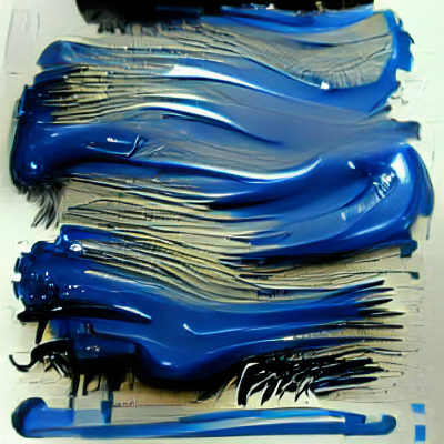
"blue brush stroke"
vs
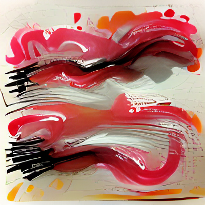
"brush stroke"
The placement of the majority of the "paint" in the top and bottom is similar but "blue brush stroke" has a much thicker paint texture that it looks a more realistic as well. So far, adding a color tag makes the image at least a little bit more complicated, and not doesn't just change the color scheme.
The word "blue" is also more than just a color. It's also an emotional state. Orange is also another word that isn't just a color and I've seen the software add the color while at other times it adds more of an abstract orange, the fruit.
!PIZZA
!LUV
<><
@courtneyjensen, you've been given LUV from @chunkysoupsvc.
Check the LUV in your H-E wallet. (1/1)
@courtneyjensen! I sent you a slice of $PIZZA on behalf of @chunkysoupsvc.
Did you know Pizzabot in Discord has a bunch of useful commands? (1/10)