BROCA TOKEN LOGO PROPOSAL [ENG-ESP]
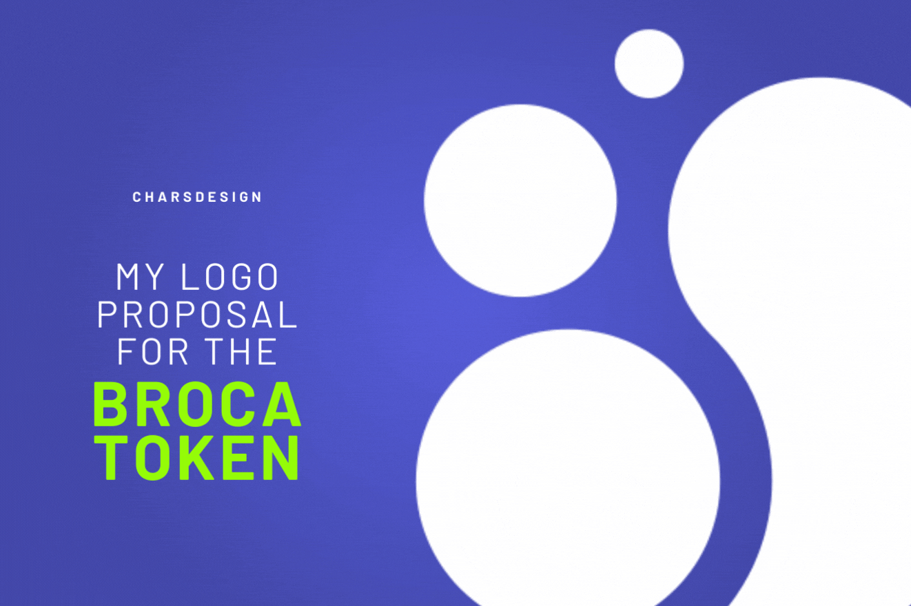
To conclude with the first batch of logos of the SPK Network tokens, in the next lines I will tell you why my proposal for the BROCA token. I say first batch because I have already prepared the second batch that in some cases includes updates and refreshments of the designs that I have initially shown you. I hope you read everything for a better understanding of the proposal.
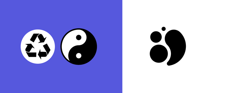
GRAPHIC CONCEPT REGENERATION
INSPIRATION
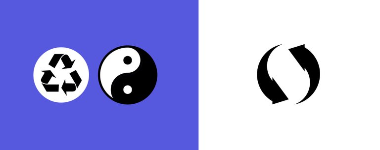
One of the main features of this token is that it can be regenerated when you have SPK in stake, something similar to how our resources are regenerated in HIVE with the help of Hive Power. And just as in Hive resources are necessary to be able to post, vote or comment, BROCA will be necessary to be able to create posts, comment, or vote in the SPK Network. With this in mind, I remembered that there are two concepts that are known worldwide that represent some of the characteristics that could be emulated in this token. The Yin and Yang and recycling icons represent, like Broca, balance, recycling, and rebirth, that is, two concepts that consume and regenerate each other.
Vectorization of universal Recycling and Yin Yang Icons by @charsdesign
GRAPHIC CONCEPT REGENERATION
ISOTYPE
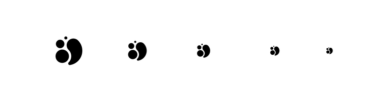
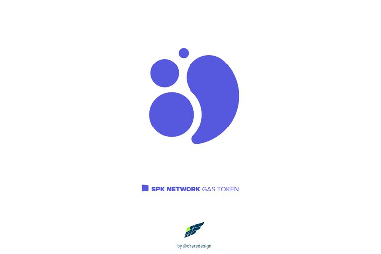
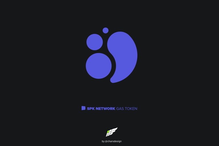
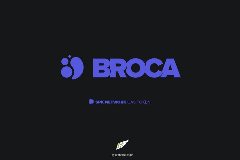
As in the previous proposals for the SPK and LARYNX tokens, the isotype I have created is based on a perfect circular graphic and represents, on its left side, the way resources regenerate until they grow and, on its right side, the way those resources are used to upload posts, comment or vote. The duality shows how everything starts over and remains in a state of infinite equilibrium. Again, the scalability and convertibility of this design to favicon or font is something primordial that I have taken into account at all times.
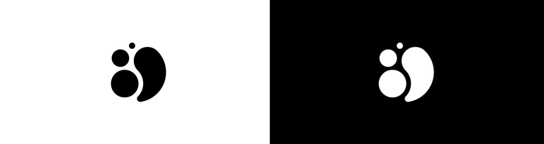
Minimalist, scalable and differentiating design of the BROCA token isotype in its black and white versions.
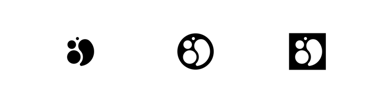
Possible isotype variants.
Scalability and ability to convert to favicon or as a type font.
GRAPHIC CONCEPT AROUND SPK NETWORK
COLORS
I had already told you that in order to maintain the concept and relationship with SPK Network I suggest the use of the color that the platform uses on its website.
GRAPHIC CONCEPT AROUND SPK NETWORK
TYPOGRAPHY
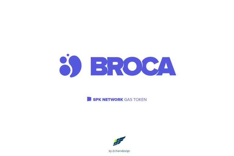
The font used to accompany the isotype is Proxima Nova in its Black style, but, unlike the previous two proposals, I have used a negative kerning to paste the letters in such a way that it has even more relation with the SPK Network logo, but additionally I have edited the font creating some corners in the parts where the letters are pasted, so it is easier to understand or read the token's name.
GRAPHIC CONCEPT MOCK UP
COIN
Below you can see a version of the logo in a coin mockup.

GRAPHIC CONCEPT FAVICON
APPLICATION
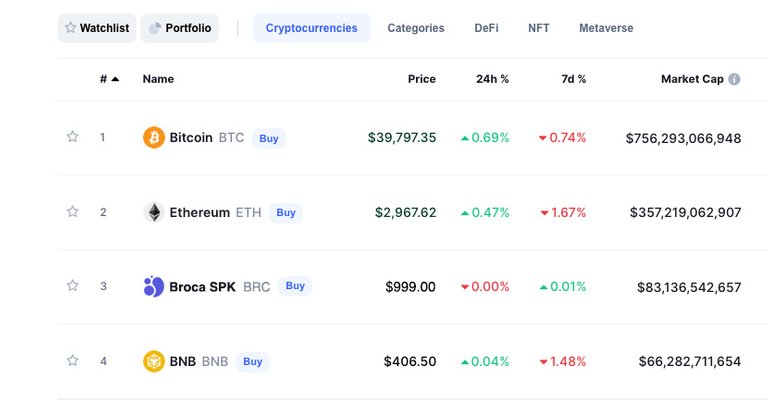
To recreate the application of this token let's see its actual behavior in the sale of coinmarketcap.com cryptocurrencies. Notice how the BROCA icon is easily recognizable and visible.
I hope you find these drafts of the BROCA token isotype and imagotype interesting. If so, I invite you to followme.
I have also participated in the following contests:
• OCD logo contest 1 • OCD logo contest 2 • OCD logo contest 3 Winner!
• POSH logo contest Winner!
• artECENCY contest Winner!
If you want to see other of my professional designs in the Editorial, Web and Advertising areas, I invite you to see my portfolio at Upwork.com

All designs, images and concepts shown in this post are my authorship.
All rights reserved @charsdesign.
Vectorization: Adobe Illustrator
Images edition: Adobe Photoshop
Banners: Canva
Translation: DeepL • Google Translate
EN ESPAÑOL
Para concluir con la primera tanda de logos de los tokens de SPK Network, en las próximas líneas les comentaré el por qué de mi propuesta para el token BROCA. Digo primera tanda porque ya tengo preparada la segunda tanda que en algunos casos incluye actualizaciones y refrescamientos de los diseños que inicialmente les he mostrado. Espero que lean todo para el mejor entendimiento de la propuesta.
CONCEPTO GRÁFICO REGENERACIÓN
INSPIRACIÓN
Una de las principales características de este token es que se podrá regenerar cuando se tenga SPK en stake, algo similar a como se regeneran nuestros recursos en HIVE con la ayuda del Hive Power. Y así como en Hive son necesarios recursos para poder publicar, votar o comentar, BROCA será necesario para poder crear posts, comentar o votar en la red de SPK Network. Teniendo en cuenta esto, recordé que existen dos conceptos que son conocidos mundialmente y que representan algunas de las características que podrían emularse en este token. Los íconos del Yin y Yang y del reciclaje representan al igual que Broca el equilibrio, el reciclaje y el renacimiento, es decir, dos conceptos que se consumen y regeneran entre sí.
Íconos universales del Reciclaje y del Yin y Yang
CONCEPTO GRÁFICO REGENERACIÓN
ISOTIPO
Como en las anteriores propuestas de los tokens SPK y LARYNX, el isotipo que he creado está basado en un gráfico circular perfecto y representa, en su lado izquierdo, la forma como los recursos se regeneran hasta crecer y, en su lado derecho, la manera como esos recursos son usados para subir o cargar publicaciones, comentar o votar. La dualidad muestra como todo vuelve a comenzar y se mantiene en un estado de equilibrio infinito. De nuevo la capacidad de escalabilidad y de conversión de este diseño a favicon o fuente tipográfica es algo primordial que he tomado en cuenta en todo momento.
Diseño minimalista escalable y diferenciador del isotipo del token SPK en sus versiones blanco y negro.
Posibles variantes del isotipo.
Capacidad de escalabilidad y de conversión en favicon o como fuente tipográfica.
CONCEPTO GRÁFICO HOMOLOGACIÓN CON SPK NETWORK
COLORES
Ya les había comentado que para mantener el concepto y relación con SPK Network sugiero el uso del color que la plataforma usa en su página web.
CONCEPTO GRÁFICO SPK NETWORK
TIPOGRAFÍA
La fuente usada para acompañar el isotipo es Proxima Nova en su estilo Black, pero, a diferencia de las dos anteriores propuestas, he usado un interletraje negativo para pegar las letras de manera tal que tenga aún mayor relación con el logotipo de SPK Network, pero adicionalmente he editado la fuente creando algunas comisuras en las partes que las letras se pegan, de modo que sea más fácil entender o leer el nombre del token.
CONCEPTO GRÁFICO MOCK UP
MONEDA
Abajo pueden apreciar una versión del logo en un mockup de moneda.
CONCEPTO GRÁFICO FAVICON
APLICACIÓN
Para recrear la aplicación de este token veamos su comportamiento real en la ventana de las criptomonedas de coinmarketcap.com. Noten como se reconoce y es fácilmente visible el ícono de BROCA.
Espero que estos borradores del isotipo e imagotipo del token BROCA le resulten interesantes. Si fuera así le invito a seguirme
También he participado en los siguientes concursos:
• Concurso OCD logo 1 • Concurso OCD logo 2 • Concurso OCD logo 3 ¡Ganador!
• Concurso POSH logo ¡Ganador!
• Concurso artECENCY ¡Ganador!
Si quieres ver otros de mis diseños profesionales en las áreas Editorial, Web y Publicitaria, te invito a ver mi portafolio en Upwork.com
Todos los diseños, imágenes y conceptos mostrados en este post son de mi autoría.
Derechos reservados @charsdesign.
Vectorización: Adobe Illustrator
Edición de imágenes: Adobe Photoshop
Banners: Canva
Traducción: DeepL • Google Translate • Corrección y estilos propia
https://twitter.com/cHaRsgraphic/status/1517952044212101120
https://twitter.com/la_santacruz/status/1517955338749636608
The rewards earned on this comment will go directly to the person sharing the post on Twitter as long as they are registered with @poshtoken. Sign up at https://hiveposh.com.
¡Eres un genio del diseño!, muy linda tu creación, me gusto como te inspiraste y los elementos que usaste para el logo, es una gran idea usar el Yin y Yang y el reciclaje, además el acabado final me recuerda a la patita de un perro o gato y eso para mi lo hace adorable. te felicito amigo por tu buen trabajo. @charsdesign
Hola, @soyunasantacruz! Ojalá todo el mundo pensara como tú, así tendría mucho trabajo y fuera millonario 🤣🤣🤣 y lo de la patita del perro o gato no me había dado cuenta.
Muchas gracias por tu lindo comentario y tu apreciación hacia mi trabajo, eso lo agradezco desde el corazón. 🤗
Eres millonario en creatividad !! 🤣
Me encantan tus diseños. Son minimalistas, limpios. Y la explicación super profesional. Me gusta como se ve el logotipo en la moneda.
Creo que es muy importante explicar cómo se desarrolla y cuál es la lectura de un isotipo cuando se requiere la más absoluta abstracción visual. De lo contrario sería simplemente un grafismo sin sentido. Muchas gracias por tu excelente comentario @jomarbym.
I think it is very important to explain how an isotype is developed and what is the reading of an isotype when absolute visual abstraction is required. Otherwise it would simply be meaningless graphics. Thank you very much for your excellent comment @jomarbym.
Me encantó tu propuesta. Inspirarte en los iconos del reciclaje y del Ying y el yang fué una excelente Idea. Lo veo como ese cambio de energia,lo que tú llamas regeneración
¡Exacto! Cambio de energía que se renueva o regenera. Muchas gracias por comentar y apoyar mis diseños. 😄