(ESP - ENG ) Mi nueva identidad visual en la comunidad
Introducción | Introduction
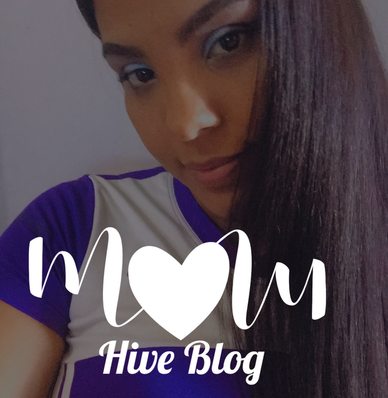
Hello dear maternity community I am happy with the content that I bring, because it is about giving color and style to my presence in @hive , so I decided to create a visual identity that represents me every time I make a publication and thus customize every step I take on this platform. For all the love that the @maternity group has given me, I have dedicated the identity to this beautiful family, here I feel very comfortable writing and sharing my experiences as a mom. So I want to contribute the process and development to create my visual identity and this way you can have a basic scheme and if you like it, include it in your publications.
Proceso creativo|Creative process
1) El nombre: Es lo esencial, porque es el elemento que te caracteriza, es el título por el que serás recordado, en mi caso no quise hacerlo tan complicado, mientras sea legible, entendible y fácil de pronunciar, tendrás mejores resultados. Y por supuesto el tema del nombre debe ser acorde a lo que quieres representar. Mi elección fue MOM ya que me basé en esta comunidad y cumple con los principios característicos de un nombre representativo.
1) The name: it is essential, because it is the element that characterizes you, it is the title by which you will be remembered, in my case I did not want to make it so complicated, as long as it is legible, understandable and easy to pronounce, you will have better results. And of course the theme of the name must be according to what you want to represent. My choice was MOM since I based it on this community and it fulfills the characteristic principles of a representative name.

2) tipografía: Para explicarlo de forma sencilla, es el tipo de letra que se utilizará para definir el estilo que se empleará para las letras del nombre que se ha seleccionado. Los tipos de letra que elegí fueron 2, es lo más recomendable, ya que se utilizará uno principal y otro secundario.Mi elección fue un tipo de letra finito para las letras maestras y un tipo de letra medio-grueso para las letras secundarias.
2) typography: to explain it in a simple way, it is the typeface that will be used to define the style that will be used for the letters of the name that has been selected. The typefaces I chose were 2, it is the most advisable, since a main and a secondary one will be used.My choice was a finite typeface for the master letters and a medium-thick typeface for the secondary letters.
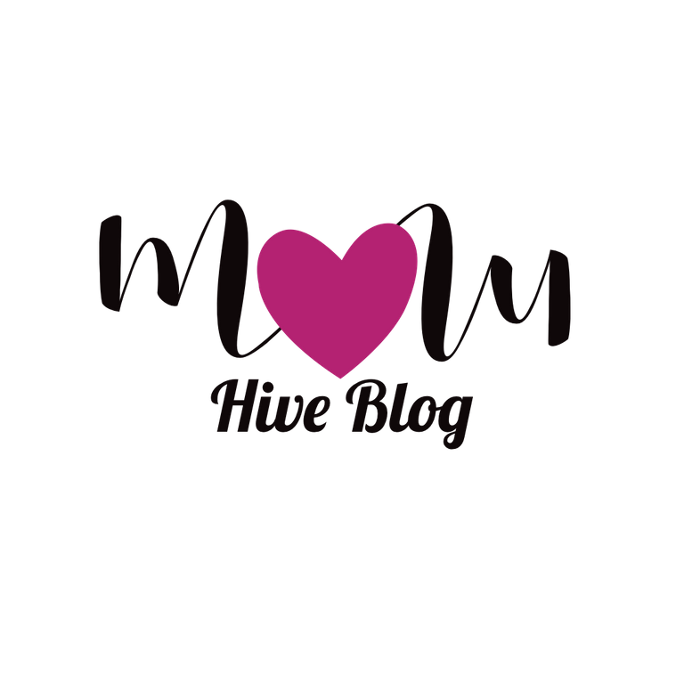
3) El símbolo: Se refiere a la imagen simbólica que te representará si lo deseas, puedes optar por ella o utilizar sólo letras. En mi caso he utilizado un corazón, que he intercalado para asemejar la letra O y hacer una mejor composición de la imagen.
3. The symbol: It refers to the symbolic image that will represent you if you wish, you can opt for it or use only letters. In my case I have used a heart, which I have interspersed to resemble the letter O and make a better composition of the image.
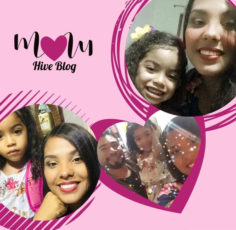
4) Colores: Esta es la parte que más me gusta y a veces es difícil decidir, confieso que cambié el color unas 3 veces, pero me encanta combinar paletas de colores y me gustan los cambios constantes, pero me decidí por 3 colores. Que podéis detallar en cada imagen que he mostrado, un color para la tipografía, otro color para los elementos y otro para el fondo de la foto. Aunque el orden puede variar según el diseño.
4) Colors: This is the part that I like the most and sometimes it is difficult to decide, I confess that I changed the color about 3 times, but I love to combine color palettes and I like constant changes, but I decided for 3 colors. That you can detail in each image that I have shown, one color for the typography, another color for the elements and another for the background of the photo. Although the order may vary according to the design.
Congratulations @anniess! You have completed the following achievement on the Hive blockchain and have been rewarded with new badge(s):
Your next target is to reach 2500 upvotes.
You can view your badges on your board and compare yourself to others in the Ranking
If you no longer want to receive notifications, reply to this comment with the word
STOPCheck out the last post from @hivebuzz:
Support the HiveBuzz project. Vote for our proposal!